Refinement
Last updated on 2024-08-06 | Edit this page
Download Chapter notebook (ipynb)
Mandatory Lesson Feedback Survey
Overview
Questions
- How do different evaluation metrics differ?
- What techniques are used to improve on chance prediction?
- What are the limitations of a confusion matrix?
- How can normalisation and hyperparameter tuning help to improve the results?
- How could test data leakage be avoided?
Objectives
- Introducing different types of metrics for model evaluation.
- Understanding the permutation score.
- Illustrating model evaluation using the confusion matrix.
- working with normalisation and hyperparameter tuning.
- The concept of progressive adjustment.
Import functions
PYTHON
from numpy import mgrid, linspace, c_, arange, mean, array
from numpy.random import uniform, seed
from sklearn.datasets import make_circles
from mpl_toolkits import mplot3d
from matplotlib.pyplot import subplots, axes, scatter, xticks, show

from sklearn.ensemble import RandomForestClassifier, ExtraTreesClassifier, GradientBoostingClassifier, AdaBoostClassifier
from sklearn.tree import DecisionTreeClassifier
from sklearn.svm import SVC, LinearSVC
from sklearn.neural_network import MLPClassifier
from sklearn.neighbors import KNeighborsClassifier

RANDOM_STATE = 111

classifiers = {
    'Random Forest': RandomForestClassifier(random_state=RANDOM_STATE),
    'AdaBoost (Random Forest)': AdaBoostClassifier(RandomForestClassifier(random_state=RANDOM_STATE)),
    'Extra Trees': ExtraTreesClassifier(random_state=RANDOM_STATE),
    'AdaBoost (Extra Tree)': AdaBoostClassifier(ExtraTreesClassifier(random_state=RANDOM_STATE)),
    'Decision Tree': DecisionTreeClassifier(random_state=RANDOM_STATE),
    'SVC (RBF)': SVC(random_state=RANDOM_STATE),
    'SVC (Linear)': LinearSVC(random_state=RANDOM_STATE),
    'Multi-layer Perceptron': MLPClassifier(max_iter=5000, random_state=RANDOM_STATE)
}
Revision Example with Circular Test Data
For our classification problem, we will use the
make_circles function. See the documentation
The parameters for noise level and relative size of the two circles are such that the task becomes difficult.
PYTHON
seed(RANDOM_STATE)

X, y = make_circles(n_samples=500, factor=0.5, noise=.3, random_state=RANDOM_STATE)

feature_1, feature_2 = 0, 1
ft_min, ft_max = X.min(), X.max()

print('Shape of X:', X.shape)

fig, ax = subplots(figsize=(10, 5), nrows=1, ncols=2)

ax[0].scatter(X[:, feature_1], X[:, feature_2], c=y, s=4, cmap='bwr');
ax[0].set_xlabel('Feature 1')
ax[0].set_ylabel('Feature 1')
ax[1].hist(X);
ax[1].set_xlabel('Value')
ax[1].set_ylabel('Count')

show()
OUTPUT
Shape of X: (500, 2)
For training, we use the same classifiers as in the previous Lesson. We train on the whole data set and then use a meshgrid of the state space for prediction.
PYTHON
ft_min, ft_max = -1.5, 1.5

# Constructing (2 grids x 300 rows x 300 cols):
grid_1, grid_2 = mgrid[ft_min:ft_max:.01, ft_min:ft_max:.01]

# We need only the shape for one of the grids (i.e. 300 x  300):
grid_shape = grid_1.shape

# state space grid for testing
new_obs = c_[grid_1.ravel(), grid_2.ravel()]
PYTHON
contour_levels = linspace(0, 1, 6)

fig, all_axes = subplots(figsize=[15, 5], ncols=4, nrows=2, sharey=True, sharex=True)

for ax, (name, clf) in zip(all_axes.ravel(), classifiers.items()):

    clf.fit(X, y)

    y_pred = clf.predict(new_obs)
    y_pred_grid = y_pred.reshape(grid_shape)
    print("")

    ax.scatter(X[:, feature_1], X[:, feature_2], c=y, s=1, cmap='bwr_r')
    ax.contourf(grid_1, grid_2, y_pred_grid, cmap='gray_r', alpha=.2, levels=contour_levels);

    ax.set_ylim(ft_min, ft_max)
    ax.set_xlim(ft_min, ft_max)
    ax.set_yticks([ft_min, 0, ft_max])
    ax.set_xticks([ft_min, 0, ft_max])
    ax.set_title(name, fontsize=10);

show()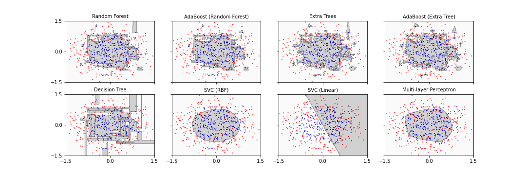
Seven of the eight classifiers are able to separate the inner data set from the outer data set successfully. The main difference is that some algorithms ended up with a more rectangular shape of the boundary whereas the others find a more circular form which reflects the original data distribution more closely. One classifier simply fails: SVC (linear). It tries to fit a straight line to separate the classes which in this case is impossible.
Note
Code: Note how the keyword argument
sharey is used in the call of subplots to have
y-axis only labelled once. The name of the classifier is extracted from
the dictionary as its key and used to set up the title of each
panel.
Metrics
We already used the score to evaluate the model performance. Here are some further metrics used in machine learning.
Accuracy is a metric that evaluates the integrity of the model by comparing true labels with their predicted counterparts. It produces a value between 0 and 1, where 1 is the best possible outcome, and \(1 / n_{classes}\) represents the probability of a random guess. See the Scikit-learn documentation for the accuracy_score. The mathematical formula can be found in the metrics and scoring section of the documentation.
Recall is a metric that evaluates the ability of a classification model to find true positive labels. The measure produces a scalar value between 0 and 1, where 1 is the perfect outcome. See the Scikit-learn documentation for the recall_score. The recall is the percentage of true predictions of the overall number of predictions. It is also known as sensitivity.
Average Precision, also referred to as AP, is a metric that produces a scalar value for the precision-recall curve between and with being the outcome. The metric obtains this value by weighing:
- the mean of precisions (P) at each threshold (n),
- the increase in recall (R) from the previous threshold (n-1).
The metric is mathematically defined as follows:
\[ AP = \sum_{n}^{}(R_n - R_{n-1}) \cdot P \]
Average precision vs AUC
As you may have noticed, the AUC metric also evaluates the area under the precision-recall curve using the trapezoid rule and with linear interpolation. The interpolation, however, may cause the resulting output to be better than it actually is. In other words, the AUC measure evaluates the outcome rather optimistically.
F1 Score Another useful metric to evaluate a classification model that relies on precision and recall is the F1 Score, see the Scikit-learn documentation. It is mathematically defined as:
\[ F_1 = 2 \cdot \frac{P\cdot R}{P+R} \]
where \(P\) and \(R\) represent precision and recall, respectively.
Wikipedia has a nice summary of the measures and connections between them.
In Scikit-learn, these measures can be used in a standardised
fashion. Here is an example using the recall_score.
PYTHON
from sklearn.model_selection import train_test_split

X_train, X_test, y_train, y_test = train_test_split(X, y, test_size=.5, random_state=RANDOM_STATE, shuffle=True)

print(X_train.shape, X_test.shape)
OUTPUT
(250, 2) (250, 2)PYTHON
from sklearn.metrics import recall_score

fig, all_axes = subplots(figsize=[15, 5], ncols=4, nrows=2, sharey=True, sharex=True)

for ax, (name, clf) in zip(all_axes.ravel(), classifiers.items()):

    # Training the model using training data:
    clf.fit(X_train, y_train)

    y_pred_gr = clf.predict(new_obs)
    y_pred_grid = y_pred_gr.reshape(grid_shape)

    y_predicted = clf.predict(X_test)
    print("")
    # Evaluating the score using test data:
    score = clf.score(X_test, y_test)
    recall = recall_score(y_test, y_predicted)

    # Scattering the test data only:
    ax.scatter(X_test[:, feature_1], X_test[:, feature_2], c=y_test, s=4, cmap='bwr', marker='.')
    print("")
    ax.contourf(grid_1, grid_2, y_pred_grid, cmap='gray_r', alpha=.2, levels=contour_levels)

    ax.set_ylim(ft_min, ft_max)
    ax.set_xlim(ft_min, ft_max)
    ax.set_yticks([-1.5, 0, 1.5])
    ax.set_xticks([-1.5, 0, 1.5])

    label = '{} - Recall: {:.2f}'.format(name, recall)
    ax.set_title(label , fontsize=10);

show()
Reducing Bias on Test Data
Whilst SciKit Learn provides us with a dedicated function
to obtain accuracy, the value it provides depends on how our training
and test data have been split. Using the train-test-split, we can
randomly shuffle the data to address this very problem. However, this
implicitly assumed that our original data followed a specific
distribution which is best represented by shuffling the data. That may
not always be the case. In practice, we can never fully eliminate this
type of bias. What we can do, however, is to split, shuffle, and permute
the samples in the original dataset repeatedly to minimise the
likelihood of bias.
Permutation Score
When dealing with biological and medical data, the results of machine learning often are not clear-cut. The question remains whether or not to trust a predictor as being truly above chance levels. An effective technique to address this is to randomly shuffle the labels independently of the data. I.e. we permutate only the labels, and check whether the classification score actually decreases. The permutation score then quantifies how trustworthy the result with the correct labels is. See the Scikit-learn documentation for details.
Now that we know about evaluation metrics, we are set to properly begin
the evaluation process. We can use so-called cross-validators for
testing the models if a test is run many times on data with differently
permuted labels. To facilitate this, Scikit-learn provides the function
permutation_test_score.
Note
The process of cross-validation is computationally expensive, as is the process of repeatedly permuting, fitting, and testing our models. In this context, we will be using both processes to complement each other. This makes the operation time-consuming and slow.
When possible, Scikit-learn provides us the with ability to use multiple
CPU cores to speed up intensive computations through multiprocessing.
Where available, this can be achieved by setting the n_jobs
argument of a function or a class to the number of CPU cores we wish to
use. Conveniently, it can be set to n_jobs=-1 to use all
available CPU cores (see e.g. the Hyperparameter Tuning
section below). Here, we have shown the use of only one core with
n_jobs=1 which is computationally slow. You can adjust it
according to the machine you are using to make it faster.
The keyword argument n_permutations is set to 100 by
default. You can speed the cross-validation up by choosing a smaller
number.
PYTHON
from sklearn.model_selection import permutation_test_score

n_classes = 2

chance = 1 / n_classes

fig, axes = subplots(figsize=[16, 12], ncols=4, nrows=2, sharey=True, sharex=True)

for ax, (name, clf) in zip(axes.ravel(), classifiers.items()):

    score, permutation_scores, pvalue = permutation_test_score(clf, X, y, scoring="accuracy", n_jobs=1,n_permutations=100)

    score_label = 'Score: {:.3f}, (p={:.4f})'.format(score, pvalue)
    print("")
    chance_label = 'Chance: {:.3f}'.format(chance)

    ax.hist(permutation_scores)
    ax.axvline(score,  c='g', label=score_label,  linewidth=3.0)
    ax.axvline(chance, c='r', label=chance_label, linewidth=3.0)
    ax.set_title(name, fontsize=10)
    ax.legend(fontsize=8)

show()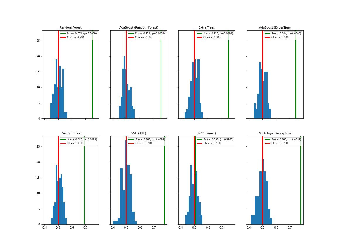
Apart from SVC (linear), all classifiers show satisfactory separation of the permutation test (blue distribution with red mean value) from the data score (green line). Apart from SVC (linear), the p-values are below 0.01.
Here is a Scikit-learn example using permutations with the Iris data.
Confusion Matrix
Another useful method to evaluate a model and demonstrate its integrity is to produce a confusion matrix. The matrix demonstrates the number of correctly predicted labels against the incorrect ones. As such it can, however, only be used for classification problems with two labels.
Scikit-learn provides a function to create a confusion matrix. Here is an expanded function to simplify the visualisation of this matrix.
PYTHON
def plot_confusion_matrix(y_test, y_pred, classes, normalize=False, ax=None):
    """
    This function prints and plots the confusion matrix.
    y_test (array)
    y_pred (array)
    classes (array)
    normalize (bool) Normalize the results (True), or show them as integer numbers (False).
    ax Visualization axis.
    The function is an adaptation of a SciKit Learn example.
    """

    from itertools import product
    from numpy import asarray, newaxis
    from sklearn.metrics import confusion_matrix
    cm = confusion_matrix(y_test,y_pred)
    n_classes = len(classes)

    if normalize:
        cm = asarray(cm).astype('float32') /cm.sum(axis=1)[:, newaxis]

    if not ax:
        from matplotlib.pyplot import subplots, show
        fig, ax = subplots()

    ticks = range(n_classes)
    ax.imshow(cm, interpolation='nearest', cmap='Blues')
    ax.set_xticks(ticks)
    ax.set_xticklabels(classes, rotation=90)
    ax.set_yticks(ticks)
    ax.set_yticklabels(classes)
    fmt = '.2f' if normalize else 'd'
    thresh = 3*cm.max() / 4
    cm_dim = cm.shape

    # Matrix indices:
    indices_a = range(cm_dim[0])
    indices_b = range(cm_dim[1])
    # Cartesian product of matrix indices:
    indices = product(indices_a, indices_b)
    fmt = '.2f' if normalize else 'd'

    for ind_a, ind_b in indices:
      label = format(cm[ind_a, ind_b], fmt)
      color = "white" if cm[ind_a, ind_b] > thresh else "black"
      ax.text(ind_b, ind_a, label, ha="center", color=color)
    ax.set_ylabel('True label')
    ax.set_xlabel('Predicted label')

    return ax
PYTHON
class_names = ('False (0)', 'True (1)')

fig, axes = subplots(figsize=(17, 12), ncols=4, nrows=2, sharey=True, sharex=True)


for ax, (name, clf) in zip(axes.ravel(), classifiers.items()):

    clf.fit(X_train, y_train)

    y_pred = clf.predict(X_test)

    plot_confusion_matrix(y_test, y_pred, classes=class_names, normalize=True, ax=ax)

    ax.set_title(name, fontsize=10);


show()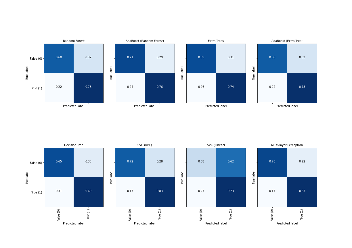
Ideally, the diagonal fields are both white and the off-diagonal fields maximally dark.
Further Refinements
Once we decide what algorithm to use, we start by training that algorithm with its default settings and evaluate the results. If not satisfied, we can make further adjustments to the hyper-parameters of the algorithm to improve the results. As always in machine learning, it is of great importance that we avoid overfitting, i.e. maintain the generalisability of the model whilst improving its performance.
We start by creating a classification problem with 3 features and 2
labels using the make_classification function. Data are now
displayed in pseudo-3D.
PYTHON
from sklearn.datasets import make_classification

X, y = make_classification(
    n_samples=500,
    n_features=3,
    n_classes=2,
    n_informative=2,
    n_redundant=0,
    n_repeated=0,
    n_clusters_per_class=2,
    class_sep=.7,
    scale=3,
    random_state=RANDOM_STATE
)

fig, ax = subplots()

ax.hist(X);
ax.set_xlabel('Value')
ax.set_ylabel('Count')

show()
PYTHON
from mpl_toolkits.mplot3d import Axes3D

fig, ax = subplots(figsize=(10, 8), subplot_kw=dict(projection='3d'))

ax.scatter(X[:, 0], X[:, 1], X[:, 2], c=y, s=5, cmap='bwr');
show()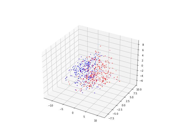
PYTHON
fig, axes = subplots(figsize=(12, 3), ncols=3, sharex=True, sharey=True)

axes[0].scatter(X[:, 0], X[:, 1], c=y, s=2, cmap='bwr')
axes[1].scatter(X[:, 0], X[:, 2], c=y, s=2, cmap='bwr')
axes[2].scatter(X[:, 1], X[:, 2], c=y, s=2, cmap='bwr');

show()
Note
Code: Note the setting up of 3D axis. Some examples with code to learn 3D plotting are provided in these tutorials.
We can now go ahead and use our classifier dictionary – which contains the classifiers with their default settings – to train and evaluate the models. We use the train-test split to evaluate the performance.
PYTHON
X_train, X_test, y_train, y_test = train_test_split(X, y, test_size=.8, random_state=RANDOM_STATE, shuffle=True)

for name, clf in classifiers.items():
    clf.fit(X_train, y_train)
    score = clf.score(X_test, y_test)
    print('{:<30} Score: {:.2f}'.format(name, score))
MLPClassifier(max_iter=5000, random_state=111)In a Jupyter environment, please rerun this cell to show the HTML representation or trust the notebook.
On GitHub, the HTML representation is unable to render, please try loading this page with nbviewer.org.
MLPClassifier(max_iter=5000, random_state=111)
Normalisation
Depending on the nature of the data, it might be beneficial to normalise the data before fitting a classifier. This is widely done in machine learning but needs thought in each case.
Normalisation can be done in various ways. One common way to normalise data is to require that they have mean 0 and variance 1. This is used for example, when calculating the Pearson correlation coefficient. Another popular way in machine learning is to normalise data to Euclidean norm 1. For a data point in an m-dimensional feature space (m is the number of features), the Euclidean norm of a single point (one sample or row) is normalised such that the distance of the point from the origin is 1.
Let us first see an example: some data points are spread between 1 and 4.
PYTHON
from sklearn.preprocessing import Normalizer

some_data = array([[1, 4], [3, 1], [4, 4], [2, 3]])

norm_skl         = Normalizer()
some_data_normed = norm_skl.fit_transform(some_data)

print('Normalised data:', '\n', some_data_normed)

from numpy import amax

fig, ax = subplots(nrows=1, ncols=2)

scaling = amax(some_data)*1.1

ax[0].scatter(some_data[:, 0], some_data[:, 1])
ax[0].set_xlim(0, scaling)
ax[0].set_ylim(0, scaling)
ax[0].set_xlabel('Some data')

ax[1].scatter(some_data_normed[:, 0], some_data_normed[:, 1], c='r')
ax[1].set_xlim(0, scaling)
ax[1].set_ylim(0, scaling);
ax[1].set_xlabel('Normalised data')

show()
OUTPUT
Normalised data:
 [[0.24253563 0.9701425 ]
 [0.9486833  0.31622777]
 [0.70710678 0.70710678]
 [0.5547002  0.83205029]]
(0.0, 4.4)
(0.0, 4.4)
(0.0, 4.4)
Effectively, all normalised data are positioned on a circle around the origin with radius 1. Depending on correlations existing between the features this leads to different distortions of the original data.
Let us now apply this normalisation to our artificial data set.
PYTHON
norm = Normalizer()

X_normed = norm.fit_transform(X)

fig, ax = subplots(figsize=(8, 8), subplot_kw=dict(projection='3d'))

ax.scatter(X_normed[:, 0], X_normed[:, 1], X_normed[:, 2], c=y, s=5, cmap='bwr');
ax.view_init(30, 50);
show()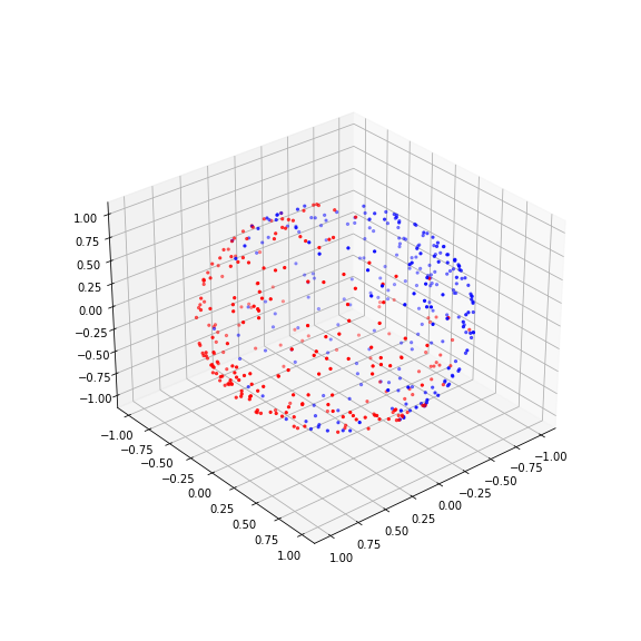
PYTHON
fig, axes = subplots(figsize=(10, 3), ncols=3, sharex=True, sharey=True)

axes[0].scatter(X_normed[:, 0], X_normed[:, 1], c=y, s=2, cmap='bwr')
axes[1].scatter(X_normed[:, 0], X_normed[:, 2], c=y, s=2, cmap='bwr')
axes[2].scatter(X_normed[:, 1], X_normed[:, 2], c=y, s=2, cmap='bwr');

show()
The normalisation projects the data on the unit sphere. And now we can do the training on the normalised data:
PYTHON
X_train, X_test, y_train, y_test = train_test_split(X_normed, y, test_size=.8, random_state=RANDOM_STATE, shuffle=True)

for name, clf in classifiers.items():
    clf.fit(X_train, y_train)
    score = clf.score(X_test, y_test)
    print('{:<30} Score: {:.2f}'.format(name, score))
MLPClassifier(max_iter=5000, random_state=111)In a Jupyter environment, please rerun this cell to show the HTML representation or trust the notebook.
On GitHub, the HTML representation is unable to render, please try loading this page with nbviewer.org.
MLPClassifier(max_iter=5000, random_state=111)
Due to the homogeneous nature of the artificial data, the results here are comparable for the data and their normalised version. But this may change when using data with inconsistent distributions of the columns. For an example, see the breastcancer data used in the assignment.
Hyperparameter Tuning
Once we decide on what algorithm to use, we often start by training that algorithm with its default settings and evaluate the results. If not satisfied, we can go further and make adjustments to the hyper-parameters of the algorithm to improve the results. As always in machine learning, it is of great importance that we maintain the generalisability of our model whilst improving its performance. We use the data from the above classification problem with 3 features and 2 labels.
Progressive Adjustment
After we have compared original and normalised data and obtained their
scores, we now can try to progressively improve the performance of the
algorithms. Each classification algorithm uses a unique set of
hyper-parameters, the details of which are outlined in their respective
documentations on Scikit-learn. The optimum parameters are
those that produce the best fit whilst maintaining the generalisability
of a model. One way to obtain the optimum settings is to test different
parameters and compare the model scores over and over again. However, as
outlined before, by doing so we may risk leaking our test data,
and end up over-fitting the model to the test data. (We also learned
above that we can use different cross-validators to address this
problem.)
Scikit-learn provides us with a tool entitled
GridSearchCV to define different values for different
parameters. It then applies different combinations of different
parameters to the model and evaluates the outcome using data that it
generates from a cross-validation algorithm. Once finished, it provides
us with the parameters that produce the best score for our data. This is
referred to as progressive adjustment.
Note that this process can be lengthy, and may need to be refined
several times, so it is a good idea to set n_jobs=-1 and
thereby take advantage of different CPU core on the computer. For
demonstration, we use SVC(rbf) as a classifier. With certain problems,
its training may lead to poor results with the default parameters.
PYTHON
clf = SVC(kernel='rbf', C=1, gamma=100, tol=0.0001)

clf.fit(X_train, y_train)

score = clf.score(X_test, y_test)

print('{:<30} Score: {:.2f}'.format('SVC (RBF)', score))
SVC(C=1, gamma=100, tol=0.0001)In a Jupyter environment, please rerun this cell to show the HTML representation or trust the notebook.
On GitHub, the HTML representation is unable to render, please try loading this page with nbviewer.org.
SVC(C=1, gamma=100, tol=0.0001)
OUTPUT
SVC (RBF) Score: 0.68Progressive adjustment of some of the parameters may lead to an improved model.
Check
the documentation for the meaning and the default values of
regularisation parameters C, kernel coeffcient
gamma, and tolerance setting tol.
PYTHON
from sklearn.model_selection import StratifiedShuffleSplit
from sklearn.model_selection import GridSearchCV

param_grid = dict(C=[1e-4, 1e-3, 1e-2, 1e-1, 1, 10],
                  gamma=[100, 1000, 10000, 100000],
                  tol=[1e-4, 1e-3, 1e-2, 1e-1])

cv = StratifiedShuffleSplit(n_splits=5, test_size=0.2, random_state=RANDOM_STATE)
clf = SVC(kernel='rbf', random_state=RANDOM_STATE)

grid = GridSearchCV(clf, param_grid=param_grid, cv=cv, n_jobs=1)

grid.fit(X, y)

print("ORIGINAL: Best parameters {}   Score: {:.2f}".format(grid.best_params_, grid.best_score_))

grid.fit(X_normed, y)

print("NORMED:   Best parameters {}    Score {:.2f}".format(grid.best_params_, grid.best_score_))
ORIGINAL: Best parameters {'C': 0.0001, 'gamma': 1000, 'tol': 0.0001} Score: 0.65
NORMED: Best parameters {'C': 1, 'gamma': 100, 'tol': 0.0001} Score 0.75In this case, while both optimised scores are better than the original one, there is also a notable improvement when using the normalised data. Let us similarly check the Random Forest classifier, first with default settings.
PYTHON
clf = RandomForestClassifier(random_state=RANDOM_STATE)

clf.fit(X_train, y_train)

score = clf.score(X_test, y_test)

print('{:<30} Score: {:.2f}'.format('Random Forest', score))RandomForestClassifier(random_state=111)In a Jupyter environment, please rerun this cell to show the HTML representation or trust the notebook.
On GitHub, the HTML representation is unable to render, please try loading this page with nbviewer.org.
RandomForestClassifier(random_state=111)
OUTPUT
Random Forest Score: 0.77And now a grid over some of its parameters.
PYTHON
from sklearn.model_selection import StratifiedShuffleSplit
from sklearn.model_selection import GridSearchCV

param_grid = dict(
    n_estimators=[5, 10, 15, 20, 50, 60, 70],
    max_features=[None, 'auto', 'sqrt', 'log2'],
    min_samples_split=[2, 3, 4, 5],
    max_depth=[1, 2, 3, 4]
)

cv = StratifiedShuffleSplit(n_splits=5, test_size=0.2, random_state=RANDOM_STATE)

clf = RandomForestClassifier(random_state=RANDOM_STATE)

grid = GridSearchCV(clf, param_grid=param_grid, cv=cv, n_jobs=1)

grid.fit(X, y)

print("ORIGINAL: Best parameters {}   Score: {:.2f}".format(grid.best_params_, grid.best_score_))

grid.fit(X_normed, y)

print("NORMED:   Best parameters {}    Score {:.2f}".format(grid.best_params_, grid.best_score_))
ORIGINAL: Best parameters {'max_depth': 4, 'max_features': None, 'min_samples_split': 2, 'n_estimators': 15} Score: 0.84
NORMED: Best parameters {'max_depth': 3, 'max_features': 'auto', 'min_samples_split': 4, 'n_estimators': 10} Score 0.81
In this case, our (arbitrary) search did not lead to a substantial improvement. This shows that the default settings are in fact a good starting point.
Leakage in progressive adjustments
We have already highlighted unequivocally the importance of not exposing our test data to our model during the training process; but where does training end? After deciding on an algorithm, we often attempt to improve its performance by adjusting its hyper-parameters as done above. We make these adjustments on our model repeatedly until we obtain optimal results in a specific metric that scores the performances based exclusively on our test data. In such cases, we risk leaking our test data and thereby over-fit our model to the test data through progressive adjustments. This means that the evaluation metrics on the generalisability of our model are no longer reliable.
One way to address this problem is to split our original data into 3 different datasets: training, test, and validation. Whilst this is a valid approach that may be used in specific circumstances, it might also introduce new problems, e.g. after splitting the available data into 3 subsets, there might just not be enough data to train the classifier properly.
See for example the discussion in part 2 of this paper on predictive modelling for brain stimulation. The above leaking is there referred to as “snooping”.
Exercises
End of chapter Exercises
As a suggestion, take the breast cancer dataset.
Using all features create a summary boxplot to see the medians and distributions of the features.
Train the above introduced classifiers using the train_test split to generate testing and training data and pick a small training set of e.g. 10% to make the classification task difficult. Obtain the recall scores to compare classifiers.
Plot the confusion matrix for each case.
Do a permutation test with default settings to get the p-values to reject the null hypothesis that the scores are compatible with random predictions. If it takes too long, reduce
n_permutations.Repeat the workflow with normalised data and compare the results.
Perform a hyperparameter tuning with the Random Forest classifier. For the optimal parameter settings, re-run the training and plot the feature importances to see the contributions of each feature to the outcome.
The breast cancer data can be imported from the
scikit-learn.
PYTHON
from sklearn.datasets import load_breast_cancer

data = load_breast_cancer()

X = data.data
y = data.target
Feel free to try and do any other testing or plotting that you find important. This assignment is not meant to get a correct answer. It should help you to increase flexibility when facing a complex machine learning problem.
PYTHON
from numpy import mgrid, linspace, c_, arange, mean, array
from numpy.random import uniform, seed
from matplotlib.ticker import LinearLocator, FormatStrFormatter
from mpl_toolkits import mplot3d
from matplotlib.pyplot import subplots, axes, scatter, xticks

from sklearn.datasets import load_breast_cancer
from sklearn.datasets import make_circles
from sklearn.model_selection import train_test_split
from sklearn.metrics import recall_score

from sklearn.ensemble import RandomForestClassifier, ExtraTreesClassifier, GradientBoostingClassifier, AdaBoostClassifier
from sklearn.tree import DecisionTreeClassifier
from sklearn.svm import SVC, LinearSVC
from sklearn.neural_network import MLPClassifier
from sklearn.neighbors import KNeighborsClassifier

from sklearn.model_selection import permutation_test_score

from sklearn.model_selection import StratifiedShuffleSplit
from sklearn.model_selection import GridSearchCV

RANDOM_STATE = 111

classifiers = {
    'Random Forest': RandomForestClassifier(random_state=RANDOM_STATE),
    'AdaBoost (Random Forest)': AdaBoostClassifier(RandomForestClassifier(random_state=RANDOM_STATE)),
    'Extra Trees': ExtraTreesClassifier(random_state=RANDOM_STATE),
    'AdaBoost (Extra Tree)': AdaBoostClassifier(ExtraTreesClassifier(random_state=RANDOM_STATE)),
    'Decision Tree': DecisionTreeClassifier(random_state=RANDOM_STATE),
    'SVC (RBF)': SVC(random_state=RANDOM_STATE),
    'SVC (Linear)': LinearSVC(random_state=RANDOM_STATE, dual=False),
    'Multi-layer Perceptron': MLPClassifier(max_iter=5000, random_state=RANDOM_STATE)
    }
Notice that the linear Support Vector classifier is imported with the
keyword argument dual=False. This is to reduce the number
of (pink) warnings that occur when the classifier struggles to find a
good solution.
Q1
To get the feature names, you can access them as follows:
OUTPUT
array(['mean radius', 'mean texture', 'mean perimeter', 'mean area',
       'mean smoothness', 'mean compactness', 'mean concavity',
       'mean concave points', 'mean symmetry', 'mean fractal dimension',
       'radius error', 'texture error', 'perimeter error', 'area error',
       'smoothness error', 'compactness error', 'concavity error',
       'concave points error', 'symmetry error',
       'fractal dimension error', 'worst radius', 'worst texture',
       'worst perimeter', 'worst area', 'worst smoothness',
       'worst compactness', 'worst concavity', 'worst concave points',
       'worst symmetry', 'worst fractal dimension'], dtype='<U23')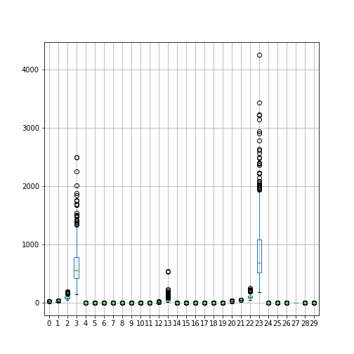
Data are differently distributed. Features with indices 3 and 23 have largest medians and variances.
Q2 Train-test split and classification of original data
Only a small training set is used.
PYTHON
X_train, X_test, y_train, y_test = train_test_split(X, y, test_size=.9, random_state=RANDOM_STATE, shuffle=True)

print(X_train.shape, X_test.shape)
PYTHON
fig, all_axes = subplots(figsize=[15, 5], ncols=4, nrows=2, sharey=True, sharex=True)

for ax, (name, clf) in zip(all_axes.ravel(), classifiers.items()):
    # Training the model using training data:
    clf.fit(X_train, y_train)

    y_predicted = clf.predict(X_test)

    # Evaluating the score using test data:
    score = clf.score(X_test, y_test)
    recall = recall_score(y_test, y_predicted)

    # Scattering two features of test data only:
    ax.scatter(X_test[:, 0], X_test[:, 1], c=y_test, s=4, cmap='bwr', marker='.')

    label = '{} - Recall Score: {:.2f}'.format(name, recall)
    ax.set_title(label , fontsize=10);

show()
Q3 Confusion Matrix
PYTHON
def plot_confusion_matrix(y_test, y_pred, classes, normalize=False, ax=None):
    """
    This function prints and plots the confusion matrix.
    y_test (array)
    y_pred (array)
    classes (array)
    normalize (bool) Normalize the results (True), or show them as integer numbers (False).
    ax Visualization axis.
    The function is an adaptation of a SciKit Learn example.
    """

    from itertools import product
    from numpy import asarray, newaxis

    from sklearn.metrics import confusion_matrix
    cm = confusion_matrix(y_test, y_pred)
    n_classes = len(classes)

    if normalize:
        cm = asarray(cm).astype('float32') / cm.sum(axis=1)[:, newaxis]

    if not ax:
        from matplotlib.pyplot import subplots
        fig, ax = subplots()

    ticks = range(n_classes)
    ax.imshow(cm, interpolation='nearest', cmap='Blues')
    ax.set_xticks(ticks)
    ax.set_xticklabels(classes, rotation=90)
    ax.set_yticks(ticks)
    ax.set_yticklabels(classes)
    fmt = '.2f' if normalize else 'd'
    thresh = 3*cm.max() / 4
    cm_dim = cm.shape

    # Matrix indices:
    indices_a = range(cm_dim[0])
    indices_b = range(cm_dim[1])
    # Cartesian product of matrix indices:
    indices = product(indices_a, indices_b)
    fmt = '.2f' if normalize else 'd'

    for ind_a, ind_b in indices:
        label = format(cm[ind_a, ind_b], fmt)
        color = "white" if cm[ind_a, ind_b] > thresh else "black"
        ax.text(ind_b, ind_a, label, ha="center", color=color)
    ax.set_ylabel('True label')
    ax.set_xlabel('Predicted label')

    return ax
PYTHON
class_names = ('False (0)', 'True (1)')

fig, axes = subplots(figsize=(17, 12), ncols=4, nrows=2, sharey=True, sharex=True)

for ax, (name, clf) in zip(axes.ravel(), classifiers.items()):

    clf.fit(X_train, y_train)

    y_pred = clf.predict(X_test)

    plot_confusion_matrix(y_test, y_pred, classes=class_names, normalize=True, ax=ax)

    ax.set_title(name, fontsize=10);

show()
Q4 Permutation Test Score
PYTHON
n_classes = 2
chance = 1 / n_classes

fig, axes = subplots(figsize=[16, 12], ncols=4, nrows=2, sharey=True, sharex=True)

for ax, (name, clf) in zip(axes.ravel(), classifiers.items()):

    score, permutation_scores, pvalue = permutation_test_score(clf, X, y,
                                                               scoring="accuracy",
                                                               n_jobs=1,
                                                               n_permutations=100)

    score_label = 'Score: {:.3f}, (p={:.4f})'.format(score, pvalue)

    chance_label = 'Chance: {:.3f}'.format(chance)

    ax.hist(permutation_scores)
    ax.set_ylim(0, 30)
    ax.axvline(score,  c='g', label=score_label,  linewidth=3.0)
    ax.axvline(chance, c='r', label=chance_label, linewidth=3.0)
    ax.set_title(name, fontsize=10)
    ax.legend(fontsize=8)

show()
The classification result is good in that the green score for the data is separate from the score distribution of permutated data. However, the permutated data are distributed systematically above 0.5. This is presumably due to the strongly skewed distributions of some of the features (see the boxplots above). For both SVCs, there are cases where the classifier fails to converge, and thus data are missing. (There would have been many warnings, but warnings were switched off (see abvove under ‘Import Functions’).
Q5 Normalisation
The code for three common scalers is shown below. Figures were
obtained with the Normaliser. Note that this changes the
y-scale of the data, but does not affect the skewness of the
distribution.
Train-test split and classification of normalised data
PYTHON
X_normed_train, X_normed_test, y_train, y_test = train_test_split(X_normed, y, test_size=.9, random_state=RANDOM_STATE, shuffle=True)

print(X_normed_train.shape, X_normed_test.shape)
PYTHON
fig, all_axes = subplots(figsize=[15, 5], ncols=4, nrows=2, sharey=True, sharex=True)

for ax, (name, clf) in zip(all_axes.ravel(), classifiers.items()):
    # Training the model using trainiang data:
    clf.fit(X_normed_train, y_train)

    y_predicted = clf.predict(X_normed_test)

    # Evaluating the score using test data:
    score = clf.score(X_normed_test, y_test)
    recall = recall_score(y_test, y_predicted)

    # Scattering two features of test data only:
    ax.scatter(X_normed_test[:, 0], X_normed_test[:, 1], c=y_test, s=4, cmap='bwr', marker='.')

    label = '{} - Recall Score: {:.2f}'.format(name, recall)
    ax.set_title(label , fontsize=10);

show()
In the normalised data, the recall score is high. The SVCs even achieve scores of 1.0. The Recall is the ability of the classifier to find all the positive samples.
Confusion Matrix
PYTHON
class_names = ('False (0)', 'True (1)')

fig, axes = subplots(figsize=(17, 12), ncols=4, nrows=2, sharey=True, sharex=True)

for ax, (name, clf) in zip(axes.ravel(), classifiers.items()):

    clf.fit(X_normed_train, y_train)

    y_pred = clf.predict(X_normed_test)

    plot_confusion_matrix(y_test, y_pred, classes=class_names, normalize=True, ax=ax)

    ax.set_title(name, fontsize=10);

show()
Notice how both SVC perform badly! All true positive were found (see above) but they struggled to detect the false negatives. In this specific case, the single recall score would be quite misleading.
If instead of the Normaliser, we apply the Standard Scaler, yielding mean 0 and variance 1 for all features, the results look a bit better.
PYTHON
from sklearn.preprocessing import StandardScaler

std_skl       = StandardScaler()
X_normed = std_skl.fit_transform(X)

df = DataFrame(X_normed)

df.boxplot();


X_normed.shape
PYTHON
X_normed_train, X_normed_test, y_train, y_test = train_test_split(X_normed, y, test_size=.9, random_state=RANDOM_STATE, shuffle=True)

print(X_normed_train.shape, X_normed_test.shape)

fig, all_axes = subplots(figsize=[15, 5], ncols=4, nrows=2, sharey=True, sharex=True)

for ax, (name, clf) in zip(all_axes.ravel(), classifiers.items()):
    # Training the model using trainiang data:
    clf.fit(X_normed_train, y_train)

    y_predicted = clf.predict(X_normed_test)

    # Evaluating the score using test data:
    score = clf.score(X_normed_test, y_test)
    recall = recall_score(y_test, y_predicted)

    # Scattering two features of test data only:
    ax.scatter(X_normed_test[:, 0], X_normed_test[:, 1], c=y_test, s=4, cmap='bwr', marker='.')

    label = '{} - Recall Score: {:.2f}'.format(name, recall)
    ax.set_title(label , fontsize=10);

show()
PYTHON
class_names = ('False (0)', 'True (1)')

fig, axes = subplots(figsize=(17, 12), ncols=4, nrows=2, sharey=True, sharex=True)

for ax, (name, clf) in zip(axes.ravel(), classifiers.items()):

    clf.fit(X_normed_train, y_train)

    y_pred = clf.predict(X_normed_test)

    plot_confusion_matrix(y_test, y_pred, classes=class_names, normalize=True, ax=ax)

    ax.set_title(name, fontsize=10);

show()
Q6 Hyperparameter Tuning
PYTHON
clf = RandomForestClassifier(random_state=RANDOM_STATE)

clf.fit(X_train, y_train)

score = clf.score(X_test, y_test)

print('Score: {:.2f}'.format(score))
PYTHON
param_grid = dict(
    n_estimators=[30, 50, 70, 90],
    max_features=[None, 'auto', 'sqrt', 'log2'],
    min_samples_split=[2, 3, 4],
    max_depth=[2, 3, 4, 5, 6]
)

cv = StratifiedShuffleSplit(test_size=0.9, random_state=RANDOM_STATE)

clf = RandomForestClassifier(random_state=RANDOM_STATE)

grid = GridSearchCV(clf, param_grid=param_grid, cv=cv, n_jobs=1)

grid.fit(X, y)

print("ORIGINAL data: Best parameters {}   Score: {:.2f}".format(grid.best_params_, grid.best_score_))

grid.fit(X_normed, y)

print("NORMED data:   Best parameters {}    Score {:.2f}".format(grid.best_params_, grid.best_score_))
PYTHON
clf = RandomForestClassifier(max_depth=4,
                             max_features=None,
                             min_samples_split=2,
                             n_estimators=50,
                             random_state=RANDOM_STATE)

clf.fit(X_train, y_train)

score = clf.score(X_test, y_test)

print('Random Forest Score: {:.2f}'.format(score))
Arbitrary parameter searches do not necessarily lead to improved performance. The reason our score differs from the score reported in the grid search is that the grid search used 10 splits into different train and test data.
Feature Importances
PYTHON
importances = clf.feature_importances_

bins = arange(importances.shape[0])

fig, ax = subplots()

ax.bar(bins, importances);
ax.set_ylabel('Feature Importance', fontsize=16);

show()
PYTHON
# Most important features
threshold = 0.1

feature_indices = bins[importances > threshold]

feature_names = data.feature_names[feature_indices]

print('Indices of features with importance above ', threshold, ':', sep='')
print(list(feature_indices))
print('Feature Name(s):', feature_names)
It turns out that with the used settings, the classification is dominated by a single feature.
Key Points
- The function
permutation_test_scoreevaluates the significance of a cross-validated score with permutations. - Confusion matrix demonstrates the number of correctly predicted labels against the incorrect ones.
- Adjustment of hyper-parameters of the algorithms may improve the results.
-
GridSearchCVis a tool to simultaneously define different values of different parameters for optimisation. - Progressive adjustments may lead to model over-fitting and require a validation data set.
