Data Frames - Part 2
Last updated on 2024-09-22 | Edit this page
Download Chapter notebook (ipynb)
Mandatory Lesson Feedback Survey
Overview
Questions
- What is bivariate or multivariate analysis?
- How are bivariate properties of data interpreted?
- How can a bivariate quantity be explained?
- When to use a correlation matrix?
- What are ways to study relationships in data?
Objectives
- Practise working with Pandas DataFrames and NumPy arrays.
- Bivariate analysis of Pandas DataFrame / NumPy array.
- The Pearson correlation coefficient (\(PCC\)).
- Correlation Matrix as an example of bivariate summary statistics.
Prerequisites
- Python Arrays
- Basic statistics, in particular, the correlation coefficient
- Pandas DataFrames: import and handling
Remember
Any dataset associated with this lesson is present in
Data folder of your assignment repository, and can also be
downloaded using the link given above in Summary
and Setup for this Lesson.
The following cell contains functions that need to be imported, please execute it before continuing with the Introduction.
PYTHON
# To import data from a csv file into a Pandas DataFrame
from pandas import read_csv

# To import a dataset from scikit-learn
from sklearn import datasets

# To create figure environments and plots
from matplotlib.pyplot import subplots, show

# Specific numpy functions, description in the main body
from numpy import corrcoef, fill_diagonal, triu_indices, arange
Note
In many online tutorials you can find the following convention when importing functions:
(or similar). In this case, the whole library is imported and any
function in that library is then available using
e.g. pd.read_csv(my_file)
We don’t recommend this as the import of the whole library uses a lot of working memory (e.g. on the order of 100 MB for NumPy).
Introduction
In the previous lesson, we obtained some basic data quantifications using the describe function. Each of these quantities was calculated for individual columns, where each column contained a different measured variable. However, in data analysis in general (and in machine learning in particular), one of the main points of analysis is to try and exploit the presence of information that lies in relationships between variables (i.e. columns in our data).
Quantities that are based on data from two variables are referred to as bivariate measures. Analyses that make use of bivariate (and potentially higher order) quantities are referred to as bivariate or more broadly, multivariate data analyses.
When we combine uni- and multivariate analyses, we can often obtain a thorough, comprehensive overview of the basic properties of a dataset.
Example: The diabetes dataset
Using the diabetes dataset (introduced in the Data Handling 1 lesson), we can begin by looking at the data from three of its columns: The upper row of the below figure shows three histograms. A histogram is a summarising plot of the recordings of a single variable. The histograms of columns with indices 3, 4, and 5 have similar means and variances, which can be explained by prior normalisation of the data. The shapes differ, but this does not tell us anything about a relationship between the measurements.
Before the application of any machine learning methods, its is important to understand whether there is evidence of any relationships between the individual variables in a DataFrame. One potential relationships is that the variables are ‘similar’. One way to check for the similarity between variables in a dataset, is to create a scatter plot. The bottom row of the figure below contains the three scatter plots between variables used to create the histograms in the top row.
(Please execute the code in order to generate the figures. We will describe the scatter plot and its features, later.)
PYTHON
# Figure Code

diabetes = datasets.load_diabetes()

diabetes_data = diabetes.data

fig, ax = subplots(figsize=(21, 10), ncols=3, nrows=2)

# Histograms
ax[0,0].hist(diabetes_data[:,3], bins=20)
ax[0,0].set_ylabel('Count', fontsize=20)

ax[0,1].hist(diabetes_data[:,4], bins=20)
ax[0,1].set_ylabel('Count', fontsize=20)

ax[0,2].hist(diabetes_data[:,5], bins=20)
ax[0,2].set_ylabel('Count', fontsize=20)

# Scatter plots
ax[1,0].scatter(diabetes_data[:,3], diabetes_data[:,4]);
ax[1,0].set_xlabel('Column 3', fontsize=20)
ax[1,0].set_ylabel('Column 4', fontsize=20)

ax[1,1].scatter(diabetes_data[:,4], diabetes_data[:,5]);
ax[1,1].set_xlabel('Column 4', fontsize=20)
ax[1,1].set_ylabel('Column 5', fontsize=20)

ax[1,2].scatter(diabetes_data[:,5], diabetes_data[:,3]);
ax[1,2].set_xlabel('Column 5', fontsize=20)
ax[1,2].set_ylabel('Column 3', fontsize=20);

show()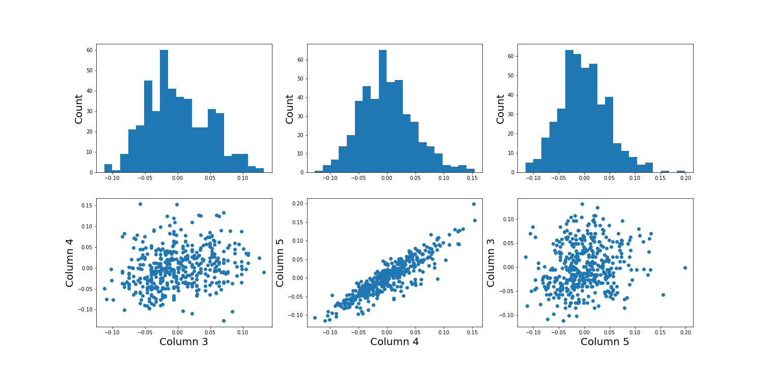
When plotting the data against each other in pairs (as displayed in the bottom row of the figure), data column 3 plotted against column 4 (left) and column 5 against 3 (right) both show a fairly uniform circular distribution of points. This is what would be expected if the data in the two columns were independent of each other.
In contrast, column 4 against 5 (centre, bottom) shows an elliptical, pointed shape along the main diagonal. This shows that there is a clear relationship between these data. Specifically, it indicates that the two variables recorded in these columns (indices 4 and 5) are not independent of each other. They exhibit more similarity than would be expected of independent variables.
In this lesson, we aim to obtain an overview of the similarities in a dataset. We will firstly introduce bivariate visualisation using Matplotlib. We will then go on to demonstrate the use of NumPy functions in calculating correlation coefficients and obtaining a correlation matrix, as a means of introducing multivariate analysis. Combined with the basic statistics covered in the previous lesson, we can obtain a good overview of a high-dimensional dataset, prior to the application of machine learning algorithms.
Work-Through: Properties of a Dataset
Univariate properties
For recordings of variables that are contained, for example, in the columns of a DataFrame, we often assume the independence of samples: the measurement in one row does not depend on the recording present in another row. Therefore results of the features obtained under the output of the describe function, for instance, will not depend on the order of the rows. Also, while the numbers obtained from different rows can be similar (or even the same) by chance, there is no way to predict the values in one row based on the values of another.
Contrastingly, when comparing different variables arranged in columns, this is not necessarily the case. Let us firstly assume that they are consistent: that all values in a single row are obtained from the same subject. The values in one column can be related to the numbers in another column and, specifically, they can show degrees of similarity. If, for instance, we have a number of subjects investigated (some of whom have an inflammatory disease and some of whom are healthy controls) an inflammatory marker might be expected to be elevated in the diseased subjects. If several markers are recorded from each subject (i.e. more than one column in the data frame), the values of several inflammatory markers may be elevated simultaneously in the diseased subjects. Thus, the profiles of these markers across the whole group will show a certain similarity.
The goal of multivariate data analysis is to find out whether or not any relationships exist between recorded variables.
Let us first import a demonstration dataset and check its basic statistics.For a work-through example, we can start with the ‘patients’ dataset. Let’s firstly import the data from the .csv file using the function read_csv from Pandas and load this into a DataFrame. We can then assess the number of columns and rows using the len function. We can also determine the data type of each column, which will reveal which columns can be analysed, quantitatively.
PYTHON
# Please adjust path according to operating system & personal path to file
df = read_csv('data/patients.csv')

df.head()
print('Number of columns: ', len(df.columns))
print('Number of rows: ', len(df))
df.head()
OUTPUT
   Age  Height  Weight  Systolic  Diastolic  Smoker  Gender
0   38      71   176.0     124.0       93.0       1    Male
1   43      69   163.0     109.0       77.0       0    Male
2   38      64   131.0     125.0       83.0       0  Female
3   40      67   133.0     117.0       75.0       0  Female
4   49      64   119.0     122.0       80.0       0  Female
Number of columns:  7
Number of rows:  100
   Age  Height  Weight  Systolic  Diastolic  Smoker  Gender
0   38      71   176.0     124.0       93.0       1    Male
1   43      69   163.0     109.0       77.0       0    Male
2   38      64   131.0     125.0       83.0       0  Female
3   40      67   133.0     117.0       75.0       0  Female
4 49 64 119.0 122.0 80.0 0 FemaleOUTPUT
The columns are of the following data types:
Age            int64
Height         int64
Weight       float64
Systolic     float64
Diastolic    float64
Smoker         int64
Gender        object
dtype: object
Out of the seven columns, three contain integers, three contain floating-point (decimal) numbers, and the last one contains gender specification as ‘female’ or ‘male’ - held as string data. The sixth column in this dataset contains a binary classification, with a value of ‘0’ indicating a non-smoker individual and ‘1’ indicating a smoker. Numerical analysis can thus be restricted to columns with indices 0 to 4.
Practice Exercise 1
Univariate properties of the patients dataset
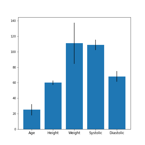
Obtain the basic statistical properties of the first five columns using the
describefunction.Plot a bar chart of the means of each column. To access a row by its name, you can use the convention
df_describe.loc['name'].Optional: In the bar chart of the means, try to add the standard deviation as an errorbar, using the keyword argument
yerrin the formyerr = df_describe.loc['std'].
PYTHON
df = read_csv('data/patients.csv')
df_describe = df.iloc[:, :5].describe()
df_describe.round(2)
OUTPUT
          Age  Height  Weight  Systolic  Diastolic
count  100.00  100.00  100.00    100.00     100.00
mean    38.28   67.07  154.00    122.78      82.96
std      7.22    2.84   26.57      6.71       6.93
min     25.00   60.00  111.00    109.00      68.00
25%     32.00   65.00  130.75    117.75      77.75
50%     39.00   67.00  142.50    122.00      81.50
75%     44.00   69.25  180.25    127.25      89.00
max     50.00   72.00  202.00    138.00      99.00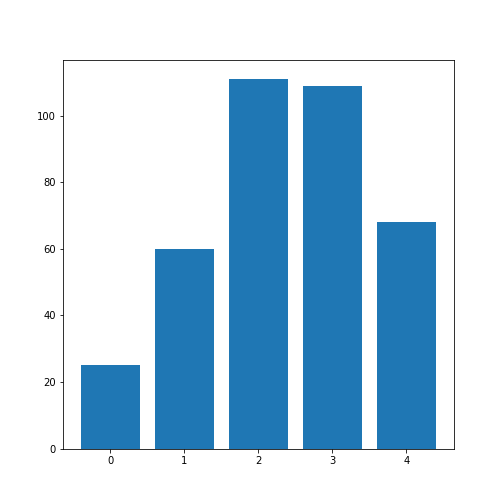
Visual Search for Similarity: the Scatter Plot
In Matplotlib, the function scatter allows a user to plot
one variable against another. This is a common way to visually eyeball
your data for relationships between individual columns in a DataFrame.
PYTHON
# Scatter plot
fig, ax = subplots();

ax.scatter(df['Weight'], df['Height']);
ax.set_xlabel('Weight (pounds)', fontsize=16)
ax.set_ylabel('Height (inches)', fontsize=16)

show()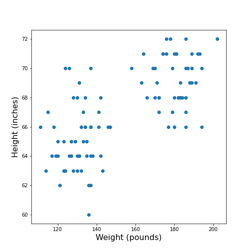
The data points appear to be grouped into two clouds. We will not deal with this qualitative aspect further, at this point. Grouping will be discussed in more detail in L2D’s later lessons on Unsupervised Machine Learning and Clustering.
However, from the information shown on the plot, it is reasonable to suspect a trend where heavier people are also taller. For instance, we note that there are no points in the lower right corner of the plot (weight >160 pounds and height < 65 inches).
## Practice Exercise 2
DIY2: Scatter plot from the patients data
Plot systolic against diastolic blood pressure. Do the two variables appear to be independent, or related?
Scatter plots are useful for the inspection of select pairs of data. However, they are only qualitative and thus, it is generally preferred to have a numerical quantity.
PYTHON
fig, ax = subplots();
ax.scatter(df['Systolic'], df['Diastolic']);
ax.set_xlabel('Systolic', fontsize=16)
ax.set_ylabel('Diastolic', fontsize=16)

show()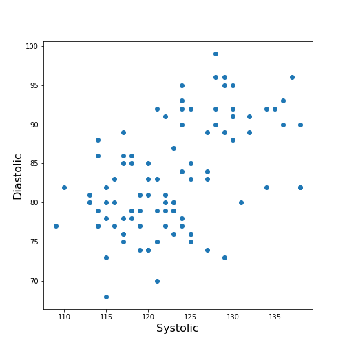
From the plot one might suspect that a larger systolic value is connected with a larger diastolic value. However, the plot in itself is not conclusive in that respect.
The Correlation Coefficient
Bivariate measures are quantities that are calculated from two variables of data. Bivariate features are the most widely used subset of multivariate features - all of which require more than one variable in order to be calculated.
The concept behind many bivariate measures is to quantify “similarity” between two datasets. If any similarity is observed, it is assumed that there is a connection or relationship in the data. For variables exhibiting similarity, knowledge of one understandably leads to an expectation surrounding the other.
Here we are going to look at a specific bivariate quantity: the Pearson correlation coefficient \(PCC\).
The formula for the \(PCC\) is set up such that two identical datasets yield a \(PCC\) of 1. Technically, this is achieved by normalising all variances to be equal to 1. This also implies that all data points in a scatter plot of one variable plotted against itself are aligned along the main diagonal (with a positive slope).
In two perfectly antisymmetrical datasets, where one variable can be obtained by multiplying the other by -1, a value of -1 is obtained. This implies that all data points in a scatter plot are aligned along the negative, or anti diagonal, (with a negative slope). All other possibilities lie in between. A value of 0 refers to precisely balanced positive and negative contributions to the measure. However - strictly speaking - the latter does not necessarily indicate that there is no relationship between the variables.
The \(PCC\) is an undirected measure. This means that its value for the comparison between dataset 1 and dataset 2 is exactly the same as the \(PCC\) between dataset 2 and dataset 1.
A method to directly calculate the \(PCC\) of two datasets, is to use the
function corr and apply this to your DataFrame. For
instance, we can apply it to the Everleys dataset:
OUTPUT
          calcium    sodium
calcium  1.000000 -0.258001
sodium  -0.258001  1.000000
The result as a matrix of two-by-two numbers. Along the diagonal (top left and bottom right) are the values for the comparison of a column to itself. As any dataset is identical with itself, the values are one by definition.
The non-diagonal elements indicate that \(CC \approx-0.26\) for the two datasets. Both \(CC(12)\) and \(CC(21)\) are given in the matrix, however because of the symmetry, we would only need to report one out of the two.
Note
In this lesson we introduce how to calculate the \(PCC\) but do not discuss its significance. For example, interpreting the value above requires consideration of the fact that we only have only 18 data points. Specifically, we refrain from concluding that because the \(PCC\) is negative, a high value for the calcium concentration is associated with a small value for sodium concentration (relative to their respective means).
One quantitative way to assess whether or not a given value of the \(PCC\) is meaningful or not, is to use surrogate data. In our example, we could create random numbers in an array with shape (18, 2), for instance - such that the two means and standard deviations are the same as in the Everley dataset, but the two columns are independent of each other. Creating many realisations, we can check what distribution of \(PCC\) values is expected from the randomly generated data, and compare this against the values obtained from the Everleys dataset.
Much of what we will cover in the Machine Learning component of L2D will involve NumPy arrays. Let us, therefore, convert the Everleys dataset from a Pandas DataFrame into a NumPy array.
OUTPUT
array([[  3.4555817 , 112.69098   ],
       [  3.6690263 , 125.66333   ],
       [  2.7899104 , 105.82181   ],
       [  2.9399    ,  98.172772  ],
       [  5.42606   ,  97.931489  ],
       [  0.71581063, 120.85833   ],
       [  5.6523902 , 112.8715    ],
       [  3.5713201 , 112.64736   ],
       [  4.3000669 , 132.03172   ],
       [  1.3694191 , 118.49901   ],
       [  2.550962  , 117.37373   ],
       [  2.8941294 , 134.05239   ],
       [  3.6649873 , 105.34641   ],
       [  1.3627792 , 123.35949   ],
       [  3.7187978 , 125.02106   ],
       [  1.8658681 , 112.07542   ],
       [  3.2728091 , 117.58804   ],
       [  3.9175915 , 101.00987   ]])
We can see that the numbers remain the same, but the format has changed; we have lost the names of the columns. Similar to a Pandas DataFrame, we can also make use of the shape function to see the dimensions of the data array.
OUTPUT
(18, 2)We can now use the NumPy function corrcoef to calculate the Pearson correlation:
PYTHON
from numpy import corrcoef

corr_matrix = corrcoef(everley_numpy, rowvar=False)

print(corr_matrix)
OUTPUT
[[ 1.         -0.25800058]
 [-0.25800058  1.        ]]
The function corrcoef takes a two-dimensional array as its
input. The keyword argument rowvar is True by default,
which means that the correlation will be calculated along the rows of
the dataset. As we have the data features contained in the columns, the
value of rowvar needs to be set to False. (You can check
what happens if you set it to ‘True’. Instead of a 2x2 matrix for two
columns you will get a 18x18 matrix for eighteen pair comparisons.)
We mentioned that the values of the \(PCC\) are calculated such that they must lie between -1 and 1. This is achieved by normalisation with the variance. If, for any reason, we don’t want the similarity calculated using this normalisation, what results is the so-called covariance. In contrast to the \(PCC\), its values will depend on the absolute size of the numbers in the data array. From the NumPy library, we can use the function cov in order to calculate the covariance:
OUTPUT
[[  1.70733842  -3.62631625]
 [ -3.62631625 115.70986192]]
The result shows how covariance is strongly dependent on the actual numerical values in a data column. The two values along the diagonal are identical with the variances obtained by squaring the standard deviation (calculated, for example, using the describe function).
Practice Exercise 3
Correlations from the patients dataset
Calculate the Pearson \(PCC\) between the systolic and the diastolic blood pressure from the patients data using:
The Pandas DataFrame and
The data as a NumPy array.
PYTHON
df_SysDia_numpy = df[['Systolic', 'Diastolic']].to_numpy()

df_SysDia_corr = corrcoef(df_SysDia_numpy, rowvar=False)

print('Correlation coefficient between Systole and Diastole:', round(df_SysDia_corr[0, 1], 2))
OUTPUT
Correlation coefficient between Systole and Diastole: 0.51
It is worth noting that it is equally possible to calculate the
correlation between rows of a two-dimension array
(i.e. rowvar=True) but the interpretation will differ.
Imagine a dataset where for two subjects a large number, call it \(N\), of metabolites were determined
quantitatively (a Metabolomics dataset). If that dataset is of shape (2,
N) then one can calculate the correlation between the two rows. This
would be done to determine the correlation of the metabolite profiles
between the two subjects.
The Correlation Matrix
If we have more than two columns of data, we can obtain a Pearson correlation coefficient for each pair. In general, for N columns, we get \(N^2\) pairwise values. We will omit the correlations of each column relative to itself, of which there are \(N\), which means we are left with \(N*(N-1)\) pairs. Since each value appears twice, due to the symmetry of the calculation, we can ignore half of them, leaving us with \(N*(N-1) / 2\) coefficients for \(N\) columns.
Here is an example using the ‘patients’ data:
OUTPUT
ValueError: could not convert string to float: 'Male'If we do the calculation with the Pandas DataFrame, the ‘Gender’ is automatically ignored and, by default, we get \(6*5/2=15\) coefficients for the remaining six columns. Note that the values that involves the ‘Smoker’ column are meaningless, since they represent a True/False-like binary.
Let us now convert the DataFrame into a NumPy array, and check its shape:
OUTPUT
(100, 7)Next, we can try to calculate the correlation matrix for the first five columns of this data array. If we do this directly to the array, we get an AttributeError: ‘float’ object has no attribute ‘shape’.
This is amended by converting the array to a floating point prior to
using the corrcoef function. For this, we can convert the
data type using the method astype(float):
PYTHON
cols = 5

patients_numpy_float = patients_numpy[:, :cols].astype(float)

patients_corr = corrcoef(patients_numpy_float, rowvar=False)

patients_corr
OUTPUT
array([[1.        , 0.11600246, 0.09135615, 0.13412699, 0.08059714],
       [0.11600246, 1.        , 0.6959697 , 0.21407555, 0.15681869],
       [0.09135615, 0.6959697 , 1.        , 0.15578811, 0.22268743],
       [0.13412699, 0.21407555, 0.15578811, 1.        , 0.51184337],
       [0.08059714, 0.15681869, 0.22268743, 0.51184337, 1.        ]])
The result is called the correlation matrix. It contains all the bivariate comparisons possible for the five chosen columns.
In the calculation above, we used the \(PCC\) in order to calculate the matrix. In general, any bivariate measure can be used to obtain a matrix of the same shape.
Heatmaps in Matplotlib
To get an illustration of the correlation pattern in a dataset, we can plot the correlation matrix as a heatmap.
Below are three lines of code, that make use of functionality within
Matplotlib, to plot a heatmap of the correlation matrix
from the ‘patients’ dataset. We make use of the function
imshow:
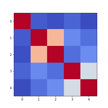
Note: we have specified the colour map coolwarm, using the
keyword argument cmap. For a list of
Matplotlib colour maps, please refer to the gallery
in the documentation. The names to use in the code are on the left
hand side of the colour bar.
Firstly, in order to highlight true correlations stand out (rather than the trivial self-correlations along the diagonal, which are always equal to 1) we can deliberately set the diagonal as being equal to 0. To achieve this, we use the NumPy function fill_diagonal.
Secondly, the imshow function, by default, will scale the
colours to the minimum and maximum values present in the array. As such,
we do not know what red or blue means. To see the colour bar, it can be
added to the figure environment ‘fig’ using colorbar.
PYTHON
from numpy import fill_diagonal

fill_diagonal(patients_corr, 0)

fig, ax = subplots(figsize=(7,7))

im = ax.imshow(patients_corr, cmap='coolwarm');

fig.colorbar(im, orientation='horizontal', shrink=0.7);

show()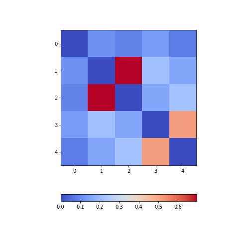
The result is that the correlation between columns ‘Height’ and ‘Weight’ is the strongest, and presumably higher than would be expected if these two measures were independent. We can confirm this by plotting a scatter plot for these two columns, and refer to the scatter plot for columns 2 (Height) and 5 (Diastolic blood pressure):
Practice Exercise 4
Calculate and plot the correlation matrix of the first five columns, as above, based on the Spearman rank correlation coefficient. This is based on the ranking of values instead of their numerical values as for the Pearson coefficient. Spearman therefore tests for monotonic relationships, whereas Pearson tests for linear relationships.
To import the function in question:
from scipy.stats import spearmanrYou can then apply it:
data_spearman_corr = spearmanr(data).correlationPYTHON
from scipy.stats import spearmanr
patients_numpy = df.to_numpy()
cols = 5

patients_numpy_float = patients_numpy[:, :cols].astype(float)
patients_spearman = spearmanr(patients_numpy_float).correlation

patients_spearman
OUTPUT
array([[1.        , 0.11636668, 0.09327152, 0.12105741, 0.08703685],
       [0.11636668, 1.        , 0.65614849, 0.20036338, 0.14976559],
       [0.09327152, 0.65614849, 1.        , 0.12185782, 0.19738765],
       [0.12105741, 0.20036338, 0.12185782, 1.        , 0.48666928],
       [0.08703685, 0.14976559, 0.19738765, 0.48666928, 1.        ]])
PYTHON
from numpy import fill_diagonal
fill_diagonal(patients_spearman, 0)

fig, ax = subplots(figsize=(7,7))

im = ax.imshow(patients_spearman, cmap='coolwarm');
fig.colorbar(im, orientation='horizontal', shrink=0.7);

show()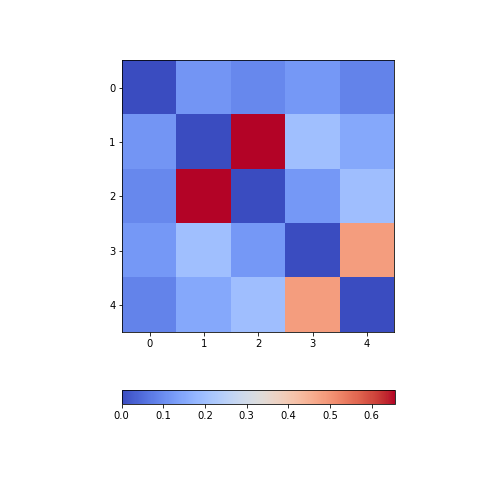
Analysis of the Correlation matrix
The Correlation Coefficients
To analyse the correlations in a dataset, we are only interested in the \(N*(N-1)/2\) unduplicated correlation coefficients. Here is a way to extract them and assign them to a variable.
Firstly, we must import the function triu_indices. It provides the indices of a matrix with specified size. The required size is obtained from our correlation matrix, using len. It is identical to the number of columns for which we calculated the \(CCs\).
We also need to specify that we do not want the diagonal to be included. For this, there is an offset parameter ‘k’, which collects the indices excluding the diagonal, provided it is set to 1. (To include the indices of the diagonal, it would have to be set to 0).
PYTHON
from numpy import triu_indices

# Get the number of rows of the correlation matrix
no_cols = len(patients_corr)

# Get the indices of the 10 correlation coefficients for 5 data columns
corr_coeff_indices = triu_indices(no_cols, k=1)

# Get the 10 correlation coefficients
corr_coeffs = patients_corr[corr_coeff_indices]

print(corr_coeffs)
OUTPUT
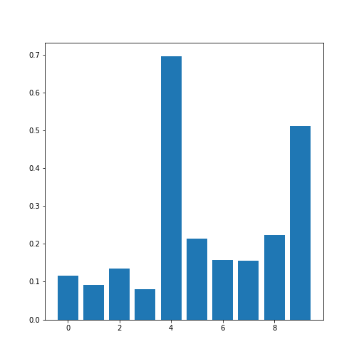
[0.11600246 0.09135615 0.13412699 0.08059714 0.6959697  0.21407555
 0.15681869 0.15578811 0.22268743 0.51184337]
Now we plot these correlation coefficients as a bar chart to see them one next to each other.
If there are a large number of coefficients, we can also display their histogram or boxplot as summary statistics.
The Average Correlation per Column
On a higher level, we can calculate the overall, or average correlation per data column. This can be achieved by averaging over either the rows or the columns of the correlation matrix. Because our similarity measure is undirected, both ways of summing yield the same result.
However, we need to consider whether the value is positive or negative.
Correlation coefficients can be either positive or negative. As such,
adding for instance +1 and -1 would yield an average of 0, even though
both indicate perfect correlation and anti-correlation, respectively.
This can be addressed by using the absolute value abs, and
ignoring the sign.
In order to average, we can use the NumPy function: mean. This function defaults to averaging over all values of the matrix. In order to obtain the five values by averaging over the columns, we specify the ‘axis’ keyword argument must be specified as 0.
PYTHON
from numpy import abs, mean

# Absolute values of correlation matrix
corr_matrix_abs = abs(patients_corr)

# Average of the correlation strengths
corr_column_average = mean(corr_matrix_abs, axis=0)

fig, ax = subplots()

bins = arange(corr_column_average.shape[0])

ax.bar(bins, corr_column_average );

print(corr_column_average)

show()
OUTPUT
[0.08441655 0.23657328 0.23316028 0.20316681 0.19438933]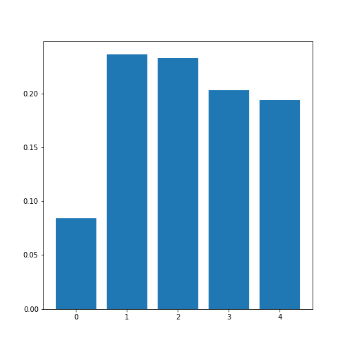
The result is that the average column correlation is on the order of 0.2 for the columns with indices 1 to 4, and less than 0.1 for the column with index 0 (which is age).
The Average Dataset Correlation
The sum over rows or columns has given us a reduced set of values to look at. We can now take the final step and average over all correlation coefficients. This will yield the average correlation of the dataset. It condenses the full bivariate analysis into a single number, and can be a starting point when comparing different datasets of the same type, for example.
PYTHON
# Average of the correlation strengths
corr_matrix_average = mean(corr_matrix_abs)

print('Average correlation strength: ', round(corr_matrix_average, 3))
OUTPUT
Average correlation strength: 0.19Application: The Diabetes Dataset
We now return to the dataset that began our enquiry into DataFrames in the previous lesson. Let us apply the above, and perform a summary analysis of its bivariate features.
Firstly, import the data. This is one of the example datasets from scikit-learn: a Python library used for Machine Learning. It is already included in the Anaconda distribution of Python, and can therefore be directly imported, if you have installed this.
PYTHON
from sklearn import datasets

diabetes = datasets.load_diabetes()

data_diabetes = diabetes.data
For the bivariate features, let us get the correlation matrix and plot it as a heatmap. We can make use of code that introduced above.
PYTHON
from numpy import fill_diagonal

data_corr_matrix = corrcoef(data_diabetes, rowvar=False)

fill_diagonal(data_corr_matrix, 0)

fig, ax = subplots(figsize=(8, 8))

im = ax.imshow(data_corr_matrix, cmap='coolwarm');

fig.colorbar(im, orientation='horizontal', shrink=0.5);

show()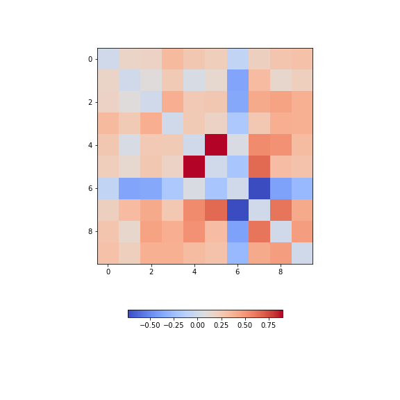
There is one strongly correlated pair (column indices 4 and 5) and one strongly anti-correlated pair (column indices 6 and 7).
Let’s calculate the \(10*9/2 = 45\) correlation coefficients and plot them as a histogram:
PYTHON
from numpy import triu_indices

data_corr_coeffs = data_corr_matrix[triu_indices(data_corr_matrix.shape[0], k=1)]

fig, ax = subplots()

ax.hist(data_corr_coeffs, bins=10);

show()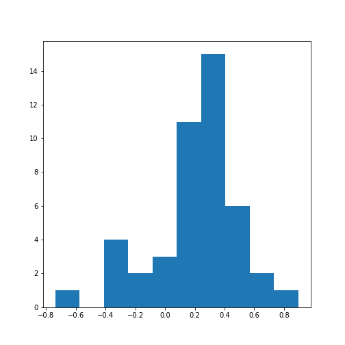
This histogram shows that the data have a distribution that is shifted towards positive correlations. However, only four values are (absolutely) larger than 0.5 (three positive, one negative).
Next, let’s obtain the average (absolute) correlation per column.
PYTHON
data_column_average = mean(abs(data_corr_matrix), axis=0)

fig, ax = subplots()

bins = arange(len(data_column_average))

ax.bar(bins, data_column_average);
ax.set_title('Average Correlation Strength per Column')
ax.set_xticks(arange(len(diabetes.feature_names)))
ax.set_xticklabels(diabetes.feature_names);

show()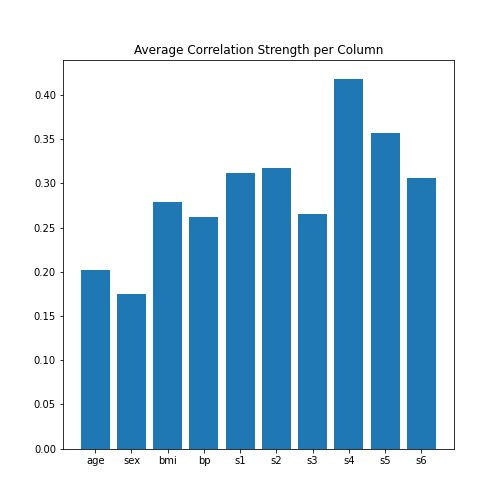
In the plot, note how the column names were extracted from the
‘diabetes’ data using diabetes.feature_names.
Finally, let’s obtain the average correlation of the entire dataset.
PYTHON
# Average of the correlation strengths
data_corr_matrix_average = mean(abs(data_corr_matrix))

print('Average Correlation Strength: ', round(data_corr_matrix_average, 3))
OUTPUT
Average Correlation Strength: 0.29Exercises
End of chapter Exercises
Assignment: The Breast Cancer Dataset
Import the breast cancer dataset using read_csv. Based on the code in this lesson, try to do the following:
Get the summary (univariate) statistics of columns 2-10 (accessing indices 1:10) using describe
Plot the means of each column as a bar chart with standard deviations displayed as error bars. Why are some bars invisible?
Extract the values as a NumPy array using the to_numpy function. The shape of the array should be (569, 31).
Calculate the correlation matrix using corrcoef from NumPy and plot it as a heatmap. The shape of the matrix should be (31, 31). Use
fill_diagonalto set the diagonal elements to 0.Calculate the average column correlation and plot it as a bar chart.
Calculate the average correlation strength of the dataset.
In case of doubt, try to get help from the respective documentation available for Pandas DataFrames, NumPy and Matplotlib.
Key Points
- Quantities based on data from two variables are referred to as bivariate measures.
- Bivariate properties can be studied and visualised using
matplotlibandNumPy. - Multivariate data analyses can help to uncover relationships between recorded variables.
- The functions
corrandcorrcoefcan be used to calculate the \(PCC\). - A correlation matrix can be visualised as a heatmap.