Time Series
Last updated on 2024-10-18 | Edit this page
Download Chapter notebook (ipynb)
Mandatory Lesson Feedback Survey
Overview
Questions
- How is time series data visualised?
- Why is it necessary to filter the data?
- How do we study correlation among time series data points?
Objectives
- Learning ways to display multiple time series.
- Understanding why filtering is required.
- Explaining the Fourier spectrum of a time series.
- Acquiring knowledge of correlation matrices of time series data.
Prerequisites
PYTHON
from pandas import read_csv

from numpy import arange, zeros, linspace, sin, pi, c_, mean, var, array
from numpy import correlate, corrcoef, fill_diagonal, amin, amax, asarray
from numpy import around
from numpy.ma import masked_less, masked_greater

from matplotlib.pyplot import subplots, yticks, legend, axis, figure, show
Python Function
Please execute code below, which defines a function of our own called
plot_series, before proceeding any further. This function
code takes data and creates a plot of all columns as time series, laid
out one above the other. When you execute the function code nothing
happens. Similar to an import statement, running a function code will
only activate it, making it available subsequent use. To action the
function itself, you must call this after it has been successfully
defined
PYTHON
def plot_series(data, sr):
    '''
    Time series plot of multiple time series
    Data are normalised to mean=0 and var=1

    data: nxm numpy array. Rows are time points, columns are recordings
    sr: sampling rate, same time units as period
    '''

    samples = data.shape[0]
    sensors = data.shape[1]

    period = samples // sr

    time = linspace(0, period, period*sr)

    offset = 5 # for mean=0 and var=1 normalised data

    # Calculate means and standard deviations of all columns
    means = data.mean(axis=0)
    stds = data.std(axis=0)

    # Plot each series with an offset
    fig, ax = subplots(figsize=(7, 8))

    ax.plot(time, (data - means)/stds + offset*arange(sensors-1,-1,-1));

    ax.plot(time, zeros((samples, sensors)) + offset*arange(sensors-1,-1,-1),'--',color='gray');

    yticks([]);

    names = [str(x) for x in range(sensors)]
    legend(names)

    ax.set(xlabel='Time')

    axis('tight');

    return fig, ax
Example: Normal and Pathological EEG
As an example, let us import two sets of time series data and convert these into NumPy arrays, that we will call data_back and data_epil. They represent a human electroencephalogram (EEG), as recorded during normal background activity and during an epileptic seizure, referred to as an absence seizure.
PYTHON
df_back = read_csv("data/EEG_background.txt", delim_whitespace=True)
df_epil = read_csv("data/EEG_absence.txt", delim_whitespace=True)

sr = 256     # 1 / seconds
period = 6   # seconds
channels = 10

d1 = df_back.to_numpy()
d2 = df_epil.to_numpy()

data_back = d1[:period*sr:, :channels]
data_epil = d2[:period*sr:, :channels]
The read_csv function is called in combination with the
keyword argument delim_whitespace. When its value is set to
True, this allows the user to import data that are
space-separated (rather than comma-separated). If you eyeball the
contents of the data .txt files, you will notice that the
numbers (which represent voltages) are indeed separated by spaces, not
commas.
Next, three constants are assigned: The sampling rate (sr) is given in the number of samples recorded per second; the duration of the recording (period) which is given in seconds; and the number of columns (channels), to be extracted from the recording. Let’s make use of the first 10 columns of data for the remainder of this lesson.
The data are then converted from Pandas DataFrame into a NumPy array.
To see the names of the channels (or recording sensors) we can use
the head method as follows:.
OUTPUT
       FP1      FP2        F3       F4  ...      EO2      EM1      EM2      PHO
0  -7.4546  22.8428   6.28159  15.6212  ...  13.7021  12.9109  13.7034  9.37573
1 -11.1060  21.4828   6.89088  15.0562  ...  13.7942  13.0194  13.7628  9.44731
2 -14.4000  20.0907   7.94856  14.1624  ...  13.8982  13.1116  13.8239  9.51796
3 -17.2380  18.7206   9.36857  13.0093  ...  14.0155  13.1927  13.8914  9.58770
4 -19.5540  17.4084  11.06040  11.6674  ...  14.1399  13.2692  13.9652  9.65654

[5 rows x 28 columns]
The row indices and column names for the seizure data look the same. The names of the recording channels are from the commonly used 10-20 system used to record voltages of brain activity from the human scalp. As an example, ‘F’ stands for the frontal lobe.
Next, we can call and make use of the plot function that we defined in the first block of code, above, in order to plot the data. If we examine the code in which we defined this function, you can see that we have set it to require the specification of two input arguments: these correspond to the dataset and sampling rate.
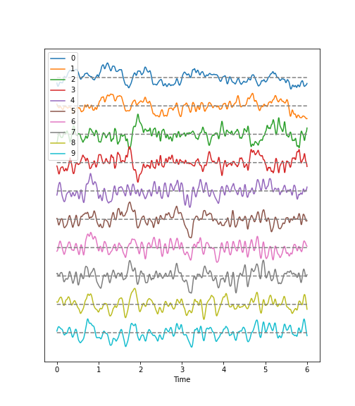
Observations
- Background:
There are irregular oscillations of all recorded brain potentials.
Oscillations recorded at different locations above the brain, differ.
Oscillations are not stable, but are modulated over time.
There are different frequency components evident in each trace.
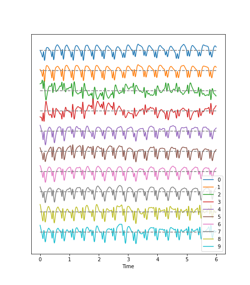
- Epileptic Seizure:
There are regular oscillations.
Oscillations recorded at different locations are not identical but similar or at least related in terms of their shape.
Despite some modulation, the oscillations are fairly stable over time.
There are repetitive motifs comprising two major components throughout the recording, a sharp spike and a slow wave.
Task
Quantify features of these time series data to obtain an overview of the data. For a univariate feature we can use the frequency content. This takes into account the fact that the rows (or samples) are not independent of each other but are organised along the time axis. In consequence, there are correlations between data points along the rows of each column and the Fourier spectrum can be used to identify these.
The Fourier spectrum assumes that the data are stationary and can be thought of as a superposition of regular sine waves with different frequencies. Its output will show which of the frequencies are present in the data and also their respective amplitudes. The Fourier spectrum is obtained through mathematical processes collectively known as the Fourier Transform, where a signal is decomposed into its constituent frequencies, allowing each individual frequency component to be analysed and inferences to be made regarding its periodic characteristics.
For a bivariate feature, we can use the cross-correlation matrix.
Work-Through Example
Check the NumPy array containing the background and seizure data.
OUTPUT
(1536, 10) (1536, 10)There are 1536 rows and 10 columns.
Display data with offset
Take a look at the code used to define the function
plot_series. Again, this is the function we are using to
create the time series plot. It requires the input of a data file where
the row index is interpreted as time. In addition, the sampling rate
(sr) is required in order to extract the time scale. The sampling rate
specifies the number of samples recorded per unit time.
The sensors, or recording channels, are assumed to be in the columns.
PYTHON
def plot_series(data, sr):
    '''
    Time series plot of multiple time series
    Data are normalised to mean=0 and var=1

    data: nxm numpy array. Rows are time points, columns are channels
    sr: sampling rate, same time units as period
    '''

    samples = data.shape[0]
    sensors = data.shape[1]

    period = samples // sr

    time = linspace(0, period, period*sr)

    offset = 5 # for mean=0 and var=1 normalised data

    # Calculate means and standard deviations of all columns
    means = data.mean(axis=0)
    stds = data.std(axis=0)

    # Plot each series with an offset
    fig, ax = subplots(figsize=(7, 8))

    ax.plot(time, (data - means)/stds + offset*arange(sensors-1,-1,-1));

    ax.plot(time, zeros((samples, sensors)) + offset*arange(sensors-1,-1,-1),'--',color='gray');

    yticks([]);

    names = [str(x) for x in range(sensors)]
    legend(names)

    ax.set(xlabel='Time')

    axis('tight');

    return fig, ax
The declaration syntax def is followed by the function
name and, in parentheses, the input arguments. This is completed with a
colon.
Following the declaration line, the function’s documentation or docstring is contained within two lines of triple backticks. This explains the function’s operation, arguments and use – and can contain any other useful information pertaining to the operation of the defined function.
Followin the docstring, the main lines of code that operate on the arguments provided by the user, when the function is called.
The function can then be closed using the optional output syntax
return and any number of returned variables, anything that
might be used as a product of running the function.
In our example, the figure environment and the coordinate system are ‘returned’ and can, in principle, be used to further modify the plot.
The code below illustrates how to call the function and then add a title and the sensor names to the displayed output:
PYTHON
(fig, ax) = plot_series(data_epil, sr)

names = df_back.columns[:channels]

fig.suptitle('Recording of Absence Seizure', fontsize=16);

legend(names);

show()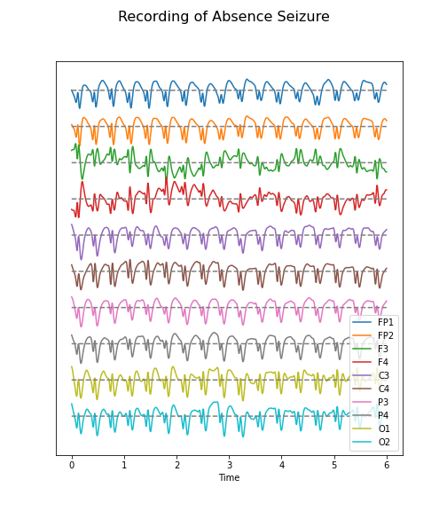
The variable(s) given to a function, and those produced by it, are referred to as input arguments, and outputs respectively. A function ordinarily accepts data or variables in the form of one or several such input arguments, processes these, and subsequently produces a specific output.
There are different ways to create functions in Python. In this course,
we will be using the keyword def to define our own
functions. This is the easiest, and by far the most common method for
defining functions. The structure of a typical function defined using
def can be see in the plot_series example:
There are several key points about functions that are worth noting:
The name of a function follows same principles as that of any other variable. It must be in lower-case characters, and it is strongly suggested that its name bears resemblance to the processes it undertakes.
The input arguments of a function, e.g. data and sr in our example, are essentially variables whose scope is confined only to the function. That is, they are only accessible within the function itself, and not from outside the function.
Variables defined inside of a function, should not use the same name as variables defined outside. Otherwise they may override each other.
When defining a function, it is important and best practice to write that function to perform only one specific task. As such, it can be used independent of the current context. Try to avoid incorporating separable tasks into a single function.
Once you start creating functions for different purposes you can start to build your own library of ready-to-use functions. This is the primary principle of a popular programming paradigm known as functional programming.
Filtering
Datasets with complex waveforms contain many different components which may or may not be relevant to a specific question.In such situations it can be useful to filter your data, ensuring that you are removing specific components from the dataset that are not relevant to your analyses or question. In this context, the term component refers to ‘frequency’, i.e. the number of cycles the waveform completes per unit of time. A small number refers to low frequencies with long periods (cycles), and a large number refers to high frequencies with short periods.
Let’s explore a simple example, demonstrating how both low- and high-frequency components can be filtered (suppressed) in our example time series.
Let’s begin by defining a simple function which takes two additional input arguments: low and high cut-off.
PYTHON
def data_filter(data, sr, low, high):
    """
    Filtering of multiple time series.

    data: nxm numpy array. Rows are time points, columns are recordings
    sr: sampling rate, same time units as period

    low:  Low cut-off frequency (high-pass filter)
    high: High cut-off frequency (low-pass filter)

    return: filtered data
    """

    from scipy.signal import butter, sosfilt

    order = 5

    filter_settings = [low, high, order]

    sos = butter(order, (low,high), btype='bandpass', fs=sr, output='sos')

    data_filtered = zeros((data.shape[0], data.shape[1]))

    for index, column in enumerate(data.transpose()):
        forward = sosfilt(sos, column)
        backwards = sosfilt(sos, forward[-1::-1])
        data_filtered[:, index] = backwards[-1::-1]

    return data_filtered
PYTHON
data_back_filt = data_filter(data_back, sr, 8, 13)

(fig, ax) = plot_series(data_back_filt, sr)

fig.suptitle('Filtered Recording of Background EEG', fontsize=16);

legend(names);

show()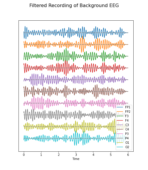
The frequency range from 8 to 13 Hz is referred to as alpha band in our EEG. It is thought that this represents a type of idling rhythm in the brain where the brain is not actively processing sensory input.
Practice Exercise 1
Band-pass filtered data
Create figures of the delta (1-4 Hz) band for both the background and the seizure EEG. Note the differences.
PYTHON
data_back_filt = data_filter(data_back, sr, 1, 4)

(fig, ax) = plot_series(data_back_filt, sr)

fig.suptitle('Delta Band of Background EEG', fontsize=16);

legend(names);

show()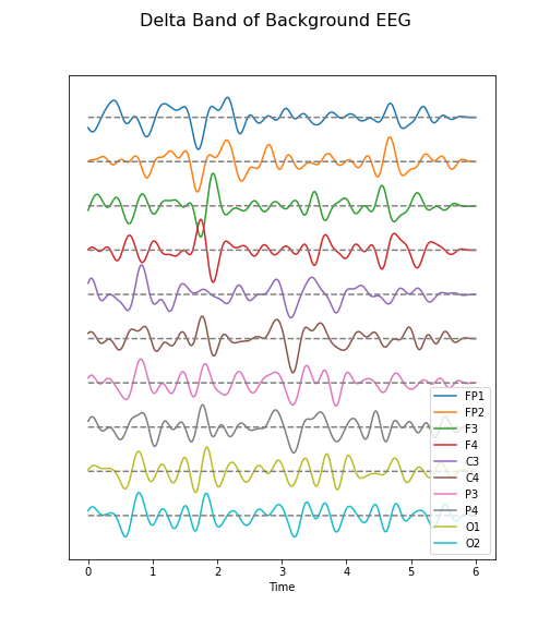
PYTHON
data_epil_filt = data_filter(data_epil, sr, 1, 4)

(fig, ax) = plot_series(data_epil_filt, sr)

fig.suptitle('Delta Band of Seizure EEG', fontsize=16);

legend(names);

show()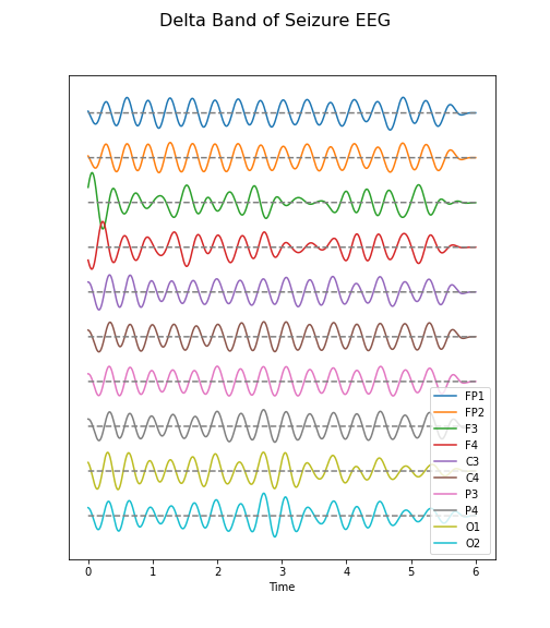
Fourier Spectrum
The Fourier spectrum decomposes the time series into a sum of sine waves. The spectrum gives the coefficients of each of the sine wave components. The coefficients are directly related to the amplitudes required to optimally fit the sum of all sine waves, in order to recreate the original data.
However, the assumption behind the Fourier Transform, is that the data are provided as an infinitely long, stationary time series. These assumptions are invalid, as the data are finite and stationarity of a biological system is rarely guaranteed. Thus, interpretation needs to be approached cautiously.
Fourier Transform of EEG data
We import the Fourier Transform function fft from the
library scipy.fftpack where it can be used to transform
all columns at the same time.
Firstly, we must obtain a Fourier spectrum for every data column. Thus, we need to define how many plots we want to have. If we take only the columns in our data, we should be able to display them all, simultaneously.
Secondly, the Fourier Transform results in twice the number of complex coefficients; it produces both positive and negative frequency components, of which we only need the first (positive) half.
Lastly, the Fourier Transform outputs complex numbers. To display the ‘amplitude’ of each frequency, we take the absolute value of the complex numbers, using the abs() function.
PYTHON
no_win = 2

rows = data_back.shape[0]

freqs = (sr/2)*linspace(0, 1, int(rows/2))

amplitudes_back = (2.0 / rows) * abs(data_back_fft[:rows//2, :2])


fig, axes = subplots(figsize=(6, 5), ncols=1, nrows=no_win, sharex=False)

names = df_back.columns[:2]

for index, ax in enumerate(axes.flat):
    axes[index].plot(freqs, amplitudes_back[:, index])
    axes[index].set_xlim(0, 8)
    axes[index].set(ylabel=f'Amplitude {names[index]}')

axes[index].set(xlabel='Frequency (Hz)');

show()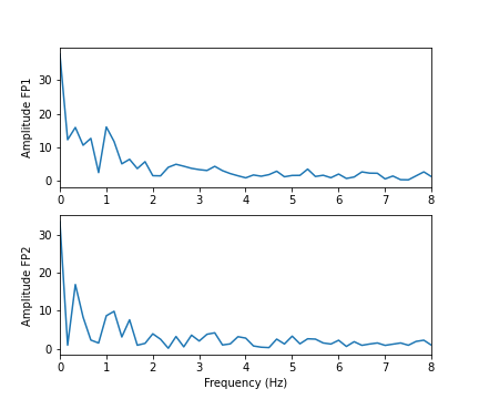
In these two channels, we can clearly see that the main amplitude contributions lie in the low frequencies, below 2 Hz.
Let us compare the corresponding figure for the case of seizure activity:
PYTHON
fig, axes = subplots(figsize=(6, 5), ncols=1, nrows=no_win, sharex=False)

names = df_epil.columns[:2]

amplitudes_epil = (2.0 / rows) * abs(data_epil_fft[:rows//2, :2])

for index, ax in enumerate(axes.flat):
    axes[index].plot(freqs, amplitudes_epil[:, index])
    axes[index].set_xlim(0, 12)
    axes[index].set(ylabel=f'Amplitude {names[index]}')

axes[index].set(xlabel='Frequency (Hz)');

show()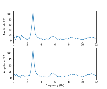
As we can see from the Fourier spectra generated above, the amplitudes are high for low frequencies, and tend to decrease as the frequency increases. Thus, it can sometimes be useful to see the high frequencies enhanced. This can be achieved with a logarithmic plot of the powers.
PYTHON
fig, axes = subplots(figsize=(6, 6), ncols=1, nrows=no_win, sharex=False)

for index, ax in enumerate(axes.flat):

    axes[index].plot(freqs, amplitudes_back[:, index])
    axes[index].set_xlim(0, 30)
    axes[index].set(ylabel=f'Amplitude {names[index]}')
    axes[index].set_yscale('log')

axes[no_win-1].set(xlabel='Frequency (Hz)');
fig.suptitle('Logarithmic Fourier Spectra of Background EEG', fontsize=16);

show()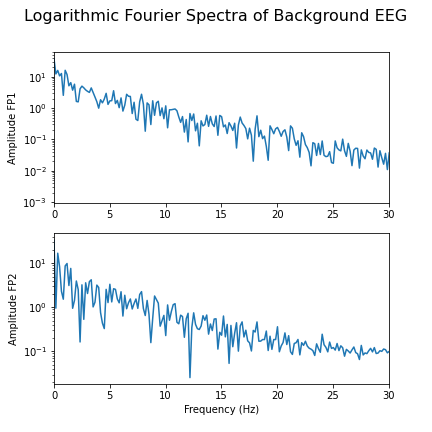
And for the seizure data:
PYTHON
fig, axes = subplots(figsize=(6, 10), ncols=1, nrows=no_win, sharex=False)

for index, ax in enumerate(axes.flat):

    axes[index].plot(freqs, amplitudes_epil[:, index])
    axes[index].set_xlim(0, 30)
    axes[index].set(ylabel=f'Power {names[index]}')
    axes[index].set_yscale('log')

axes[no_win-1].set(xlabel='Frequency (Hz)');
fig.suptitle('Logarithmic Fourier Spectra of Seizure EEG', fontsize=16);

show()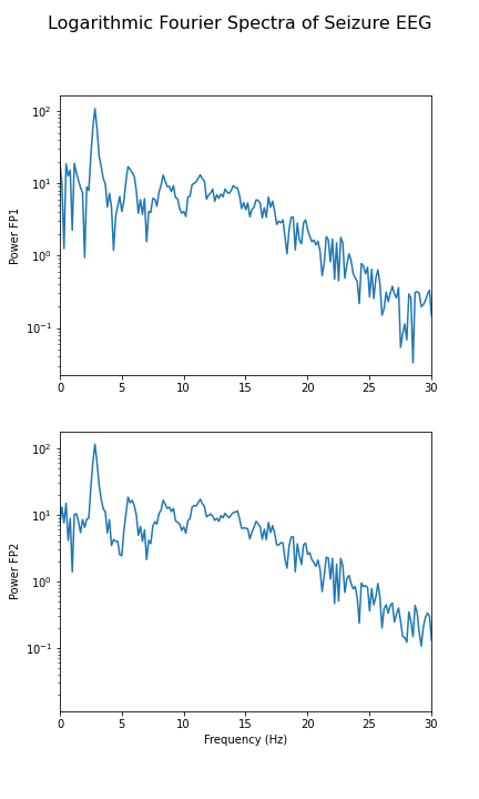
In the spectrum of the absence data, it is now more obvious that there are further maxima at 6, 9, 12 and perhaps 15Hz. These are integer multiples or ‘harmonics’ of the basic frequency at around 3Hz, which we term as the fundamental frequency.
A feature that can be used as a summary statistic, is to caclulate the band power for each channel. Band power is the total power of a signal within a specific frequency range. The band power can be obtained by calculating the sum of all powers within a specified range of frequencies; this range is also referred to as the ‘band’. The band power, thus, is given as a single number.
Practice Exercise 2
Fourier spectra of filtered data
Calculate and display the Fourier spectra of the first two channels filtered between 4 and 12 Hz for the absence seizure data. Can you find any harmonics?
PYTHON
data_epil_filt = data_filter(data_epil, sr, 4, 12)

data_epil_fft = fft(data_epil_filt, axis=0)

rows = data_epil.shape[0]

freqs = (sr/2)*linspace(0, 1, int(rows/2))

amplitudes_epil = (2.0 / rows) * abs(data_epil_fft[:rows//2, :no_win])

fig, axes = subplots(figsize=(6, 10), ncols=1, nrows=no_win, sharex=False)

for index, ax in enumerate(axes.flat):
    axes[index].plot(freqs, amplitudes_epil[:, index])
    axes[index].set_xlim(0, 12)
    axes[index].set(ylabel=f'Amplitudes {names[index]}')
axes[no_win-1].set(xlabel='Frequency (Hz)');

fig.suptitle('Fourier Spectra of Seizure EEG', fontsize=16);

show()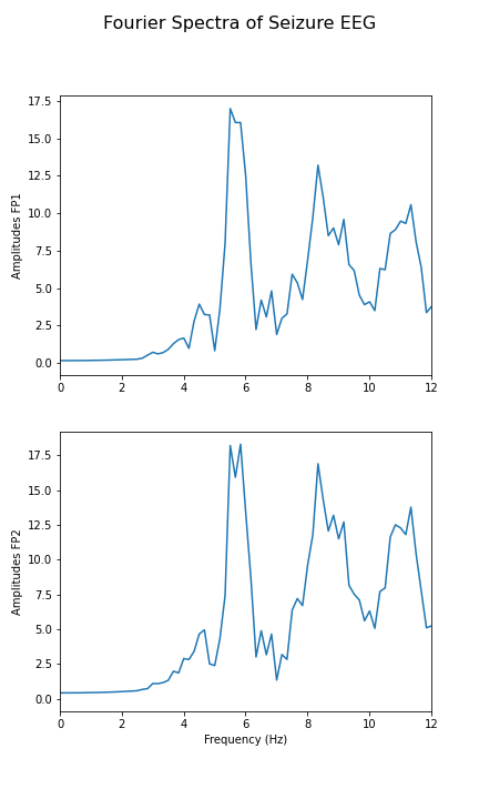
Cross-Correlation Matrix
As one example of a multivariate analysis of time series data, we can also calculate the cross-correlation matrix.
Let us calculate it for the background:
PYTHON
corr_matrix_back = corrcoef(data_back, rowvar=False)

fill_diagonal(corr_matrix_back, 0)

fig, ax = subplots(figsize = (8,8))

im = ax.imshow(corr_matrix_back, cmap='coolwarm');

fig.colorbar(im, orientation='horizontal', shrink=0.68);

show()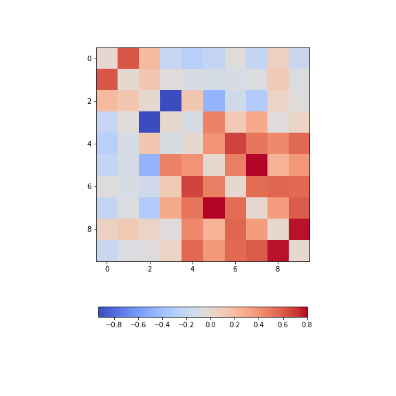
The diagonal is set to zero. This is done to improve the visual display. If it was left set to one, the diagonal would dominate the visual impression given, even though it is trivial and uninformative.
Looking at the non-diagonal elements, we find:
Two strongly correlated series (indices 5 and 7)
Two strongly anti-correlated series (indices 3 and 4)
A block of pronounced correlations (between series with indices 4 through 9)
Practice Exercise 3:
Display the correlation matrix for the seizure data
Calculate the correlation matrix for the seizure data and compare the correlation pattern to the one from the background data.
PYTHON
corr_matrix_epil = corrcoef(data_epil, rowvar=False)

fill_diagonal(corr_matrix_epil, 0)

fig, ax = subplots(figsize = (8,8))

im = ax.imshow(corr_matrix_epil, cmap='coolwarm');

fig.colorbar(im, orientation='horizontal', shrink=0.68);

show()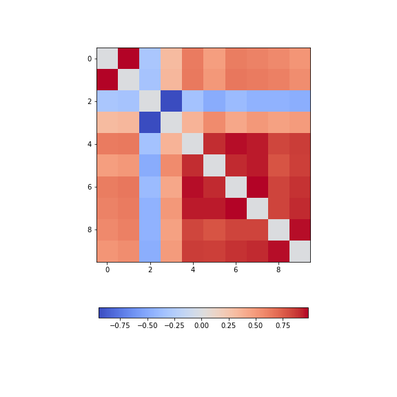
We find - a number of pairs of strongly correlated series - two strongly anti-correlated series (in- dices 3 and 4) - a block of pronounced correlations between series with indices 4 through 9).
So interestingly, while the time series changes dramatically in shape, the correlation pattern still shows some qualitative resemblance.
All results shown so far, represent the recording of the segment of 6 seconds we chose at the beginning of the lesson. The human brain produces time-dependent voltage changes 24 hours a day. Thus seeing only a few seconds provides only a partial view. The next step is therefore to investigate and demonstrate how the features found for one segment may vary over time.
Exercises
End of chapter Exercises
Look at the image of brain activity from a child at the start of an epileptic seizure. It shows 4 seconds of evolution of the first 10 channels of a seizure rhythm at sampling rate sr=1024.
PYTHON
path = 'data/P1_Seizure1.csv'

data = read_csv(path, delimiter=r"\s+")

data_P1 = data.to_numpy()

sr = 1024

period = 4

channels = 10

plot_series(data_P1[:sr*period, :channels], sr);

show()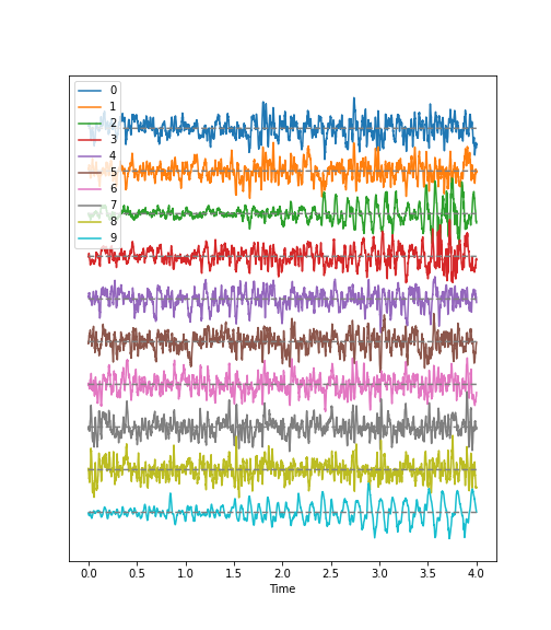
Using the code utilised in this lesson, import the data from the file
P1_Seizure1.csv and generate an overview of uni- and
multivariate features in the following form:
Pick the first two seconds of the recording as background, and the last two seconds as epileptic seizure rhythm. Use the first ten channels of data, in both cases. Using the shape attribute, the data should give a tuple of (2048, 10).
Filter the data to get rid of frequencies below 1 Hz and frequencies faster than 20 Hz.
Plot time series for both.
Fourier Transform both filtered datasets and display the Fourier spectra of the first 4 channels. What are the strongest frequencies in each of the two datasets?
Plot the correlation matrices of both datasets. Which channels show the strongest change in correlations?
Key Points
-
plot_seriesis a Python function we defined to display multiple time series plots. - Data filtering is applied to remove specific and irrelevant components.
- The Fourier spectrum decomposes the time series into a sum of sine waves.
- Cross-correlation matrices are used for multivariate analysis.