Content from DataFrames - Part 1
Last updated on 2024-09-07 | Edit this page
Download Chapter notebook (ipynb)
Mandatory Lesson Feedback Survey
Overview
Questions
- What is a Dataframe, and how can we read data into one?
- What are the different methods for manipulating data in Dataframes?
- What makes data visualisation simple, in Python?
Objectives
- Import a dataset as a Pandas Dataframe
- Inspect a Dataframe and access data
- Produce an overview of data features
- Create data plots using Matplotlib
Prerequisites
- Indexing of arrays
- For-loop through an array
- Basic statistics (distributions, mean, median and standard deviation)
Challenge: The diabetes dataset
Here is a screenshot of a diabetes dataset. It is taken from this webpage, and is one of the example datasets used to illustrate machine learning functionality in scikit-learn (Part II of the L2D course).

This figure captures only the top part of the data. On the webpage, you will need to scroll down considerably to view all of it. Thus, our first data science task, will be to obtain an overview of this datset.
The lesson
- Introduces code to read and inspect the data
- Works with a specific Dataframe and explains methods used to get an overview of the data
- Discusses the concept of ‘distribution’ as a way of summarising data within a single figure
To familiarise yourself with a dataset you need to:
- Access the data
- Check the content
- Produce a summary of basic properties
In this lesson we will look solely at univariate features, where each data columns are studied independently of the others in the datasets. Further properties and bivariate features will be the topic of the next lesson.
Work-Through Example
Reading data into a Pandas DataFrame
The small practice data file for this section is called
‘everleys_data.csv’, and can be downloaded using the link given above in
Summary and Setup for this Lesson. To start,
please create a subfolder called ‘data’ in the current directory and put
the data file in it. It can now be accessed using the relative path
data/everleys_data.csv or
data\everleys_data.csv, respectively.
The file everleys_data.csv contains serum concentrations of
calcium and sodium ions, sampled from 17 patients with Everley’s
syndrome - a rare genetic disorder that results in sufferers
experiencing developmental delays, intellectual and physical
abnormalities. The data are taken from a BMJ
statistics tutorial, and are stored as comma-separated values (csv):
with two values given for each patient.
To get to know a dataset, we will use the Pandas package and the Matplotlib plotting library. The Pandas package for data science is included in the Anaconda distribution of Python. Check this link for installation instructions to get started.
If you are not using the Anaconda distribution, please refer to these guidelines.
In order to use the functions contained in Pandas, they must first to be
imported. Since our dataset is in a ‘.csv’ file, we must first read it
from a csv file. For this, we must import the function
read_csv, which will create a Pandas DataFrame
from data provided in a ‘.csv’ file.
Executing this code does not lead to any output on the screen. However, the function is now ready to be used. To use it, we type its name and provide the required arguments. The following code should import the Everley’s data into your Python Notebook:
PYTHON
# For Mac OS X and Linux:
# (please go to the next cell if using Windows)

df = read_csv("data/everleys_data.csv")
Note the orientation of backward and forward slashes that differentiate
filepaths given between Unix-based systems, and Windows. This code uses
the read_csv function from Pandas to read data from a data
file, in this case a file with extension ‘.csv’. Note that the location
of the data file is specified within quotes by the relative path to the
subfolder ‘data’, followed by the file name. Use your file browser or
the browser in JupyterLab (or an ‘Explorer’-type pane in your IDE of
choice) to check that subfolder does indeed exists, and contains the
file within it.

After execution of the code, the data are contained in a variable
called df. This is a structure referred to as a Pandas
DataFrame.
A Pandas DataFrame is a 2-dimensional labelled data structure, with columns of (potentially different) types. You can think of it as a spreadsheet.
To see the contents of df, simply use:
OUTPUT
     calcium      sodium
0   3.455582  112.690980
1   3.669026  125.663330
2   2.789910  105.821810
3   2.939900   98.172772
4   5.426060   97.931489
5   0.715811  120.858330
6   5.652390  112.871500
7   3.571320  112.647360
8   4.300067  132.031720
9   1.369419  118.499010
10  2.550962  117.373730
11  2.894129  134.052390
12  3.664987  105.346410
13  1.362779  123.359490
14  3.718798  125.021060
15  1.865868  112.075420
16  3.272809  117.588040
17  3.917591  101.009870
(Compare with the result of print(df) which displays the
contents in a different format.)
The output shows in the first column an index, integers from 0 to 17; and the calcium and sodium concentrations in columns 2 and 3, respectively. The default indexing starts from zero (Python is a ‘zero-based’ programming language).
In a DataFrame, the first column is referred to as Indices, the first row is referred to as Labels. Note that the row with the labels is excluded from the row count. Similarly, the row with the indices is excluded from the column count.
For large datasets, the function head is a convenient
way to get a feel of the dataset.
OUTPUT
    calcium      sodium
0  3.455582  112.690980
1  3.669026  125.663330
2  2.789910  105.821810
3  2.939900   98.172772
4  5.426060   97.931489
Without any input argument, this displays the first five data lines of
data i the newly-created DataFrame. You can specify and alter the number
of rows displayed by including a single integer as argument,
e.g. head(10).
If you feel there are too many decimal places in the default view, you
can restrict their number by using the round method. The
numerical argument that you provide in the round parentheses controls
the number of decimal places the method rounds to, with digits up to 5
being rounded down, and above (and inclusive of) 5, being rounded up:
OUTPUT
   calcium  sodium
0     3.46  112.69
1     3.67  125.66
2     2.79  105.82
3     2.94   98.17
4     5.43   97.93
While it is possible to see how many rows there are in a DataFrame by displaying the whole DataFrame and looking at the last index, there is a convenient way to obtain this number, directly:
OUTPUT
DataFrame has 18 rowsYou could see above, that the columns of the DataFrame have labels. To see all labels:
OUTPUT
Index(['calcium', 'sodium'], dtype='object')Now we can count the labels to obtain the number of columns:
OUTPUT
DataFrame has 2 columns
And if you want to have both the number of the rows and the number
columns displayed together, you can use the shape method.
Shape returns a tuple of two numbers: the first is the number of rows,
and the second is the number of columns.
OUTPUT
DataFrame has 18 rows and 2 columnsNotice that shape (like columns) is not
followed by round parentheses. It is not a function that can take
arguments. Technically, shape is a ‘property’ of the
DataFrame.
To find out what data type is contained in each of the columns, us
dtypes, another ‘property’:
OUTPUT
calcium    float64
sodium     float64
dtype: object
In this case, both columns contain floating point (decimal) numbers.
Practice Exercise 1
Read data into a DataFrame
Download the data file ‘loan_data.csv’ using the link given above in Summary and Setup for this Lesson”. It contains data that can be used for the assessment of loan applications. Read the data into a DataFrame. It is best to assign it a name other than ‘df’ (to avoid overwriting the Evereley dataset).
Display the first ten rows of the Loan dataset to see its contents. It is taken from a tutorial on Data Handling in Python which you might find useful for further practice.
From this exercise we can see that a DataFrame can contain different types of data: real numbers (e.g. LoanAmount), integers (ApplicantIncome), categorical data (Gender), and strings (Loan_ID).
PYTHON
from pandas import read_csv
# dataframe from .csv file
df_loan = read_csv("data/loan_data.csv")
# display contents
df_loan.head(10)
OUTPUT
    Loan_ID  Gender Married  ... Loan_Amount_Term Credit_History Property_Area
0  LP001015    Male     Yes  ...            360.0            1.0         Urban
1  LP001022    Male     Yes  ...            360.0            1.0         Urban
2  LP001031    Male     Yes  ...            360.0            1.0         Urban
3  LP001035    Male     Yes  ...            360.0            NaN         Urban
4  LP001051    Male      No  ...            360.0            1.0         Urban
5  LP001054    Male     Yes  ...            360.0            1.0         Urban
6  LP001055  Female      No  ...            360.0            1.0     Semiurban
7  LP001056    Male     Yes  ...            360.0            0.0         Rural
8  LP001059    Male     Yes  ...            240.0            1.0         Urban
9  LP001067    Male      No  ...            360.0            1.0     Semiurban

[10 rows x 12 columns]
Accessing data in a DataFrame
If a datafile is large and you only want to check the format of data in a specific column, you can limit the display to that column. To access data contained in a specific column of a DataFrame, we can use a similar convention as in a Python dictionary, treating the column names as ‘keys’. E.g. to show all rows in column ‘Calcium’, use:
OUTPUT
0     3.455582
1     3.669026
2     2.789910
3     2.939900
4     5.426060
5     0.715811
6     5.652390
7     3.571320
8     4.300067
9     1.369419
10    2.550962
11    2.894129
12    3.664987
13    1.362779
14    3.718798
15    1.865868
16    3.272809
17    3.917591
Name: calcium, dtype: float64
To access individual rows of a column we use two pairs of square brackets:
OUTPUT
0    3.455582
1    3.669026
2    2.789910
Name: calcium, dtype: float64
Here all rules for slicing can be applied. As for lists and tuples, the indexing of rows is semi-inclusive, with the lower boundary included and upper boundary excluded. Note that the first pair of square brackets refers to columns, and the second pair refers to the rows. However, this is different from accessing items in a nested list, for instance.
Accessing items in a Pandas DataFrame is analogous to accessing the values in a Python dictionary by referring to its keys.
To access non-contiguous elements, we use an additional pair of square brackets (as if for a list within a list):
OUTPUT
1    3.669026
3    2.939900
7    3.571320
Name: calcium, dtype: float64
Another method for indexing and slicing a DataFrame is to use the
‘index location’ or iloc property. Note that properties in
Python differ from methods. Syntactically, they use the same dot
notation we are accustomed to with methods, but they differ in their use
of square brackets, rather than the round parentheses that methods
operate with. A property also refers directly to a specific
attribute of an object.
iloc refers first to the rows of data, and
then to columns - by index; all contained within a single pair of
brackets. For example, to obtain all the rows of the first column (index
0), you use:
OUTPUT
0     3.455582
1     3.669026
2     2.789910
3     2.939900
4     5.426060
5     0.715811
6     5.652390
7     3.571320
8     4.300067
9     1.369419
10    2.550962
11    2.894129
12    3.664987
13    1.362779
14    3.718798
15    1.865868
16    3.272809
17    3.917591
Name: calcium, dtype: float64
To display only the first three calcium concentrations, slicing is used: note that the upper boundary is excluded):
OUTPUT
0    3.455582
1    3.669026
2    2.789910
Name: calcium, dtype: float64
To access non-consecutive values, we can use a pair of square brackets within the outer pair of square brackets:
OUTPUT
2    2.78991
4    5.42606
7    3.57132
Name: calcium, dtype: float64
Similarly, we can access values from multiple columns:
OUTPUT
   calcium      sodium
2  2.78991  105.821810
4  5.42606   97.931489
7  3.57132  112.647360
To pick only the even rows from the two columns, note the following colon notation:
OUTPUT
     calcium      sodium
0   3.455582  112.690980
2   2.789910  105.821810
4   5.426060   97.931489
6   5.652390  112.871500
8   4.300067  132.031720
10  2.550962  117.373730
12  3.664987  105.346410
14  3.718798  125.021060
16  3.272809  117.588040
The number after the second colon indicates the stepsize.
Practice Exercise 2
Select data from DataFrame
Display the calcium and sodium concentrations of all patients - except the first. Check the model solution at the bottom for options.
OUTPUT
     calcium      sodium
1   3.669026  125.663330
2   2.789910  105.821810
3   2.939900   98.172772
4   5.426060   97.931489
5   0.715811  120.858330
6   5.652390  112.871500
7   3.571320  112.647360
8   4.300067  132.031720
9   1.369419  118.499010
10  2.550962  117.373730
11  2.894129  134.052390
12  3.664987  105.346410
13  1.362779  123.359490
14  3.718798  125.021060
15  1.865868  112.075420
16  3.272809  117.588040
17  3.917591  101.009870
Mixing the different methods of accessing specific data in a DataFrame can be confusing, and requires practice and diligence.
Search for missing values
Some tables contain missing entries. You can check a DataFrame for
such missing entries. If no missing entry is found, the function
isnull will return False.
OUTPUT
calcium    False
sodium     False
dtype: bool
This shows that there are no missing entries in our DataFrame.
Practice Exercise 3
Find NaN in DataFrame
In the Loan dataset, check the entry ‘Self-employed’ for ID LP001059. It shows how a missing value is represented as ‘NaN’ (not a number).
Verify that the output of isnull in this case is
True
Basic data features:
Summary Statistics
To get a summary of basic data features, it is possible to use the
function describe:
OUTPUT
         calcium      sodium
count  18.000000   18.000000
mean    3.174301  115.167484
std     1.306652   10.756852
min     0.715811   97.931489
25%     2.610699  107.385212
50%     3.364195  115.122615
75%     3.706355  122.734200
max     5.652390  134.052390
The describe function produces a new DataFrame (here called
‘description’) that contains the number of samples, the mean, the
standard deviation, 25th, 50th, 75th percentile, and the minimum and
maximum values for each column of the data. Note that the indices of the
rows have now been replaced by strings. To access rows, it is possible
to refer to those names using the loc property. Thus, in
order to access the mean of the calcium concentrations from the
description, each of the following is valid:
PYTHON
# Option 1
description.loc['mean']['calcium']

# Option 2
description.loc['mean'][0]

# Option 3
description['calcium']['mean']

# Option 4
description['calcium'][1]
OUTPUT
3.1743005405555555
3.1743005405555555
3.1743005405555555
3.1743005405555555
Practice Exercise 4
Use your own .csv dataset to practice. (If you don’t have a dataset at
hand, any excel table can be exported as .csv.) Firstly, read it into a
DataFrame, and proceed by checking its header, accessing individual
values or sets of values etc. Create a statistical summary using
describe, and check for missing values using
.isnull.
[ad libitum]
Iterating through the columns
Now we know how to access all data in a DataFrame and how to get a statistical summary statistics over each column.
Here is code to iterate through the columns and access the first two concentrations:
OUTPUT
0    3.455582
1    3.669026
Name: calcium, dtype: float64
0    112.69098
1    125.66333
Name: sodium, dtype: float64
As a slightly more complex example, we access the median (‘50%’) of each column in the description, and add it to a list:
PYTHON
conc_medians = list()

for col in df:

    conc_medians.append(df[col].describe()['50%'])

print('The columns are: ', list(df.columns))
print('The medians are: ', conc_medians)
OUTPUT
The columns are:  ['calcium', 'sodium']
The medians are:  [3.3641954, 115.122615]
This approach is useful for DataFrames with a larger number of columns. For instance, it is possible to follow this by creating a boxplot or histogram for the means, medians etc. of the DataFrame, thus giving a comprehensive overview of all (comparable) columns.
Selecting a subset based on a template
Often, an analysis of a dataset may required on only part of the data. This can often be formulated by using a logical condition which specifies the required subset.
For this we will assume that some of the data are labelled ‘0’ and some are labelled ‘1’. Let us therefore see how to add a new column to our Evereleys DataFrame, which contains the labels (which are, in this example, arbitrary).
Firstly, we can randomly create as many labels as we have rows in the DataFrame. We can use the randint function, which can be imported from the numpy.random module of the NumPy library. In its simplest form, the randint function accepts two arguments. Firstly, the upper bound of the integer needed, which defaults to zero. As Python is exclusive of the upper bound, providing ‘2’ will thus yield either ‘0’ or ‘1’ only.
PYTHON
from numpy.random import randint

no_rows = len(df)

randomLabel = randint(2, size=no_rows)

print('Number of rows:  ', no_rows)
print('Number of Labels:', len(randomLabel))
print('Labels:          ', randomLabel)
OUTPUT
Number of rows:   18
Number of Labels: 18
Labels:           [1 0 1 0 1 0 0 1 1 0 0 1 1 0 0 1 1 0]
Note how we obtain the number of rows (18) using len function and do not explicitly state it in the code.
Next, we must create a new data column in our df DataFrame
which contains the labels. In order to create a new column, you may
simply refer to a column name that does not yet exist, and subsequently
assign values to it. Let us call it ‘gender’, assuming that ‘0’
represents male and ‘1’ represents female.
As gender specification can include more than two labels, try to create a column with more than two randomly assigned labels e.g. (0, 1, 2).
OUTPUT
    calcium      sodium  gender
0  3.455582  112.690980       1
1  3.669026  125.663330       0
2  2.789910  105.821810       1
3  2.939900   98.172772       0
4  5.426060   97.931489       1
Now we can use the information contained in ‘gender’ to filter the data by gender. To achieve this, we use a conditional statement. Let us check which of the rows are labelled as ‘1’:
OUTPUT
0      True
1     False
2      True
3     False
4      True
5     False
6     False
7      True
8      True
9     False
10    False
11     True
12     True
13    False
14    False
15     True
16     True
17    False
Name: gender, dtype: bool
If we assign the result of the conditional statement (a boolean: True or False) to a variable, then this variable can act as a template to filter the data. If we call the DataFrame with that variable, we will only get the rows where the condition was found to be True:
OUTPUT
     calcium      sodium  gender
0   3.455582  112.690980       1
2   2.789910  105.821810       1
4   5.426060   97.931489       1
7   3.571320  112.647360       1
8   4.300067  132.031720       1
11  2.894129  134.052390       1
12  3.664987  105.346410       1
15  1.865868  112.075420       1
16  3.272809  117.588040       1
Using the boolean, we only pick the rows that are labelled ‘1’ and thus get a subset of the data according to the label.
Practice Exercise 5
Using a template
Modify the code to calculate the number of samples labelled 0 and check the number of rows of that subset.
Visualisation of data
It is easy to see from the numbers that the concentrations of sodium are much higher than those of calcium. However, to incorporate comparisons of medians, percentiles and the spread of the data, it is better to use visualisation.
The simplest way to visualise data, is to use Pandas’ functionality which offers direct methods of plotting your data. Here is an example where a boxplot is created for each column:
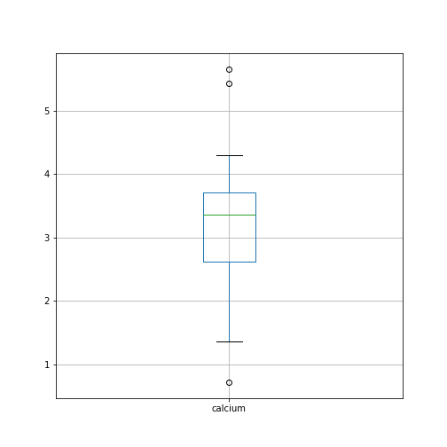
By default, boxplots are shown for all columns if no further argument is given to the function (empty round parentheses). As the calcium plot is quite condensed, we may wish to visualise it, separately. This can be done by specifying the calcium column as an argument:
Plots using Matplotlib
Matplotlib is a comprehensive library for creating static, animated and interactive visualizations in Python.
The above is an easy way to create boxplots directly on the DataFrame. It is based on the library Matplotlib and specifically uses the pyplot library. For simplicity, this code is put into a convenient Pandas function.
However, we are going to use Matplotlib extensively later on in the course, and we will therefore start by introducing a more direct and generic way of using it.
To do this, we import the function subplots from the pyplot library:
The way to use subplots is to first set up a figure environment (below referred to in the code as an object titled ‘fig’) and an empty coordinate system (below referred to as object ‘ax’). The plot is then created using one of the many methods available in Matplotlib. We will proceed by applying it to the coordinate system, ‘ax’.
As an example, let us create a boxplot of the calcium variable. As an argument of the function we need to specify the data. We can use the values of the ‘calcium’ concentrations from the column with the same name:
PYTHON
fig, ax = subplots()

ax.boxplot(df['calcium'])

ax.set_title('Boxplot of Everley Calcium')

show()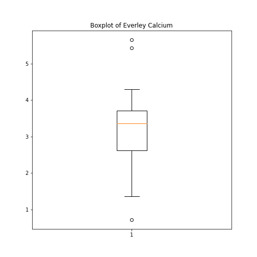
Note how we define the title of the plot by referring to the same
coordinate system ax.
The value of subplots becomes apparent when it is used to generate more than one plot as part of a single figure: one of its many useful features.
Here is an example whereby we create two boxplots adjacent to each other. The keyword arguments to use is ‘ncols’ which is the number of figures per row. ‘ncols=2’ indicates that you are plotting two plots adjacent to each other.
PYTHON
fig, ax = subplots(ncols=2)

ax[0].boxplot(df['calcium'])
ax[0].set_title('Calcium')

ax[1].boxplot(df['sodium'])
ax[1].set_title('Sodium');

show()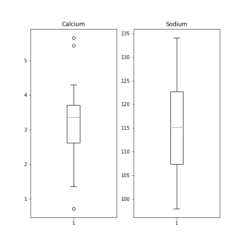
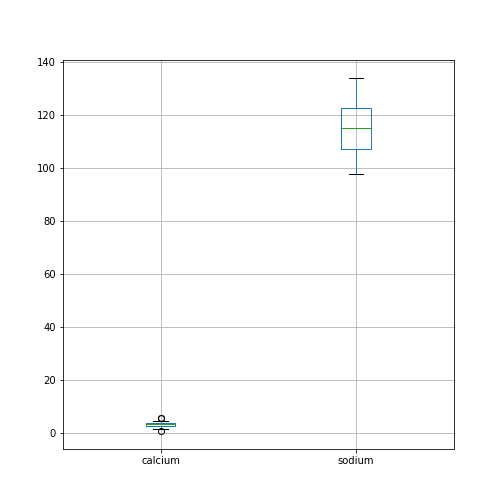
Each of these subplots must now be referred to using indexing the coordinate system ‘ax’. This figure gives a good overview of the Everley’s data.
If you prefer to have the boxplots of both columns in a single figure, this can also be done:
PYTHON
fig, ax = subplots(ncols=1, nrows=1)

ax.boxplot([df['calcium'], df['sodium']], positions=[1, 2])
ax.set_title('Boxplot of Calcium (left) and Sodium (right)')

show()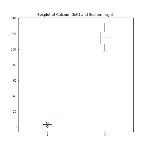
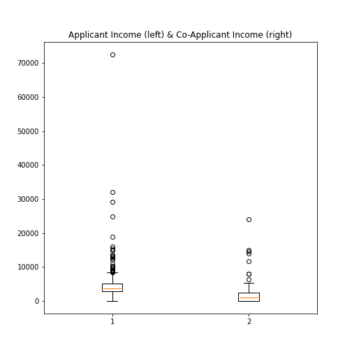
Practice Exercise 6
Boxplot from Loan data
Plot the boxplots of the ‘ApplicantIncome’ and the ‘CoapplicantIncome’ in the Loan data using the above code.
Histogram
Another good visual overview for data is the histogram. Containers or ‘bins’ are created over the range of values found within a column, and the count of the values for each bin is plotted on the vertical (y-)axis.
PYTHON
fig, ax = subplots(ncols=2, nrows=1)

ax[0].hist(df['calcium'])
ax[0].set(xlabel='Calcium', ylabel='Count');

ax[1].hist(df['sodium'])
ax[1].set(xlabel='Sodium', ylabel='Count');

fig.suptitle('Histograms of Everley concentrations', fontsize=15);

show()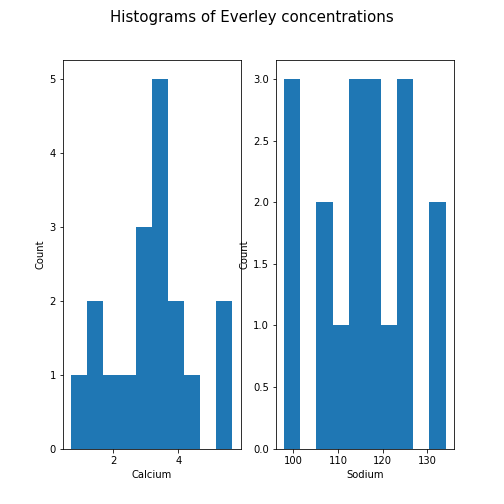
This example code also demonstrates how to use methods from within subplots to add labels to the axes, together with a title for the overall figure.
Unless specified, a default value is used for the generation of the bins. It is set to 10 bins over the range of which values are found. The number of bins in the histogram can be changed using the keyword argument ‘bins’:
PYTHON
fig, ax = subplots(ncols=2, nrows=1)

ax[0].hist(df['calcium'], bins=5)
ax[0].set(xlabel='Calcium, 5 bins', ylabel='Count');

ax[1].hist(df['calcium'], bins=15)
ax[1].set(xlabel='Calcium, 15 bins', ylabel='Count');
fig.suptitle('Histograms with Different Binnings', fontsize=16);

show()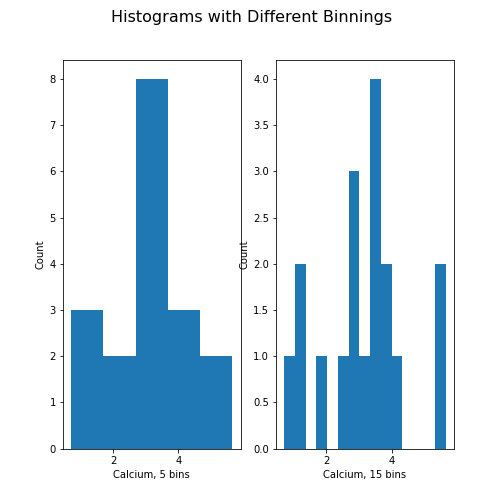
Note how the y-axis label of the right figure is slightly misplaced,
and overlapping the border of the left figure. In order to correct for
the placement of the labels and the title, you can use
tight_layout automatically adjust for this:
PYTHON
fig, ax = subplots(ncols=2, nrows=1)

ax[0].hist(df['calcium'], bins=5)
ax[0].set(xlabel='Calcium, 5 bins', ylabel='Count');

ax[1].hist(df['calcium'], bins=15)
ax[1].set(xlabel='Calcium, 15 bins', ylabel='Count');
fig.suptitle('Histograms with Different Binnings', fontsize=16);
fig.tight_layout()

show()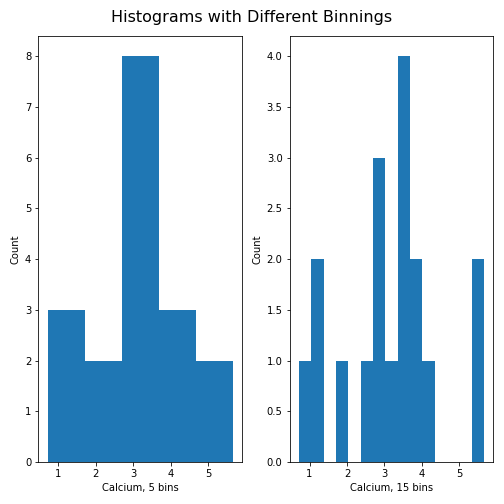
Practice Exercise 7:
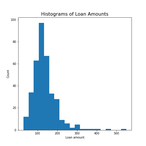
Create the histogram of a column
Take the loan data and display the histogram of the loan amount that people asked for. (Loan amounts are divided by 1000, i.e. in k£ on the horizontal axis). Use 20 bins, as an example.
Handling the Diabetes Dataset
Let us return to the dataset that commenced our exploration of the handling of data within a DataFrame.
Next, we will:
- Import the diabetes data from ‘sklearn’
- Check the shape of the DataFrame and search for NANs
- Get a summary plot of one of its statistical quantities (i.e. mean) for all columns
Firstly, let’s import the dataset and check its head. In
some cases, this may take a moment: please be patient, and wait for the
numbers to appear as output below your code cell (if you’re using an
IDE).
PYTHON
from sklearn import datasets

diabetes = datasets.load_diabetes()

X = diabetes.data

from pandas import DataFrame

df_diabetes = DataFrame(data=X)

df_diabetes.head()
OUTPUT
          0         1         2  ...         7         8         9
0  0.038076  0.050680  0.061696  ... -0.002592  0.019907 -0.017646
1 -0.001882 -0.044642 -0.051474  ... -0.039493 -0.068332 -0.092204
2  0.085299  0.050680  0.044451  ... -0.002592  0.002861 -0.025930
3 -0.089063 -0.044642 -0.011595  ...  0.034309  0.022688 -0.009362
4  0.005383 -0.044642 -0.036385  ... -0.002592 -0.031988 -0.046641

[5 rows x 10 columns]
If you don’t see all the columns, use the cursor to scroll to the right. Next, let’s check the number of columns and rows.
PYTHON
no_rows = len(df_diabetes)
no_cols = len(df_diabetes.columns)

print('Rows:', no_rows, 'Columns:', no_cols)
OUTPUT
Rows: 442 Columns: 10There are 442 rows organised in 10 columns.
In order o obtain an overview, let us extract the mean of each column using the describe and plot all means as a bar chart. The Matplotlib function to plot a bar chart is called bar:
PYTHON
conc_means = list()

for col in df_diabetes:
    conc_means.append(df_diabetes[col].describe()['mean'])

print('The columns are: ', list(df_diabetes.columns))
print('The medians are: ', conc_means, 2)
OUTPUT
The columns are:  [0, 1, 2, 3, 4, 5, 6, 7, 8, 9]
The medians are:  [-2.511816797794472e-19, 1.2307902309192911e-17, -2.2455642172282577e-16, -4.7975700837874414e-17, -1.3814992387869595e-17, 3.918434204559376e-17, -5.7771786349272854e-18, -9.042540472060099e-18, 9.293722151839546e-17, 1.1303175590075123e-17] 2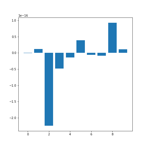
Note how the bars in this plot go up and down. The vertical axis, however, has values ranging from -10(-16) to +10(-16). This means that, for all practical purposes, all means are zero which is not a coincidence. The original values have been normalised to mean zero for the purpose of applying a machine learning algorithm to them.
In this example, we can clearly observe the importance of checking the data before working with them.
Exercises
End of chapter Exercises
Download the cervical cancer dataset provided, import it using
read_csv.
How many rows and columns are there?
How many columns contain floating point numbers (type float64)?
How many of the subjects are smokers?
Calculate the percentage of smokers
Plot the age distribution (with, for instance, 50 bins)
Get the mean and standard distribution of age of first sexual intercourse
Key Points
- Pandas package contains useful functions to work with DataFrames.
- The iloc property is used to index and slice a DataFrame.
- describe function is used to obtain a statistical summary of basic data features.
- The simplest method for data visualisation, is to use Pandas’ in-built functionality.
-
Matplotlibis a comprehensive library for creating static, animated, and interactive visualizations, in Python.
Content from Data Frames - Part 2
Last updated on 2024-09-22 | Edit this page
Download Chapter notebook (ipynb)
Mandatory Lesson Feedback Survey
Overview
Questions
- What is bivariate or multivariate analysis?
- How are bivariate properties of data interpreted?
- How can a bivariate quantity be explained?
- When to use a correlation matrix?
- What are ways to study relationships in data?
Objectives
- Practise working with Pandas DataFrames and NumPy arrays.
- Bivariate analysis of Pandas DataFrame / NumPy array.
- The Pearson correlation coefficient (\(PCC\)).
- Correlation Matrix as an example of bivariate summary statistics.
Prerequisites
- Python Arrays
- Basic statistics, in particular, the correlation coefficient
- Pandas DataFrames: import and handling
Remember
Any dataset associated with this lesson is present in
Data folder of your assignment repository, and can also be
downloaded using the link given above in Summary
and Setup for this Lesson.
The following cell contains functions that need to be imported, please execute it before continuing with the Introduction.
PYTHON
# To import data from a csv file into a Pandas DataFrame
from pandas import read_csv

# To import a dataset from scikit-learn
from sklearn import datasets

# To create figure environments and plots
from matplotlib.pyplot import subplots, show

# Specific numpy functions, description in the main body
from numpy import corrcoef, fill_diagonal, triu_indices, arange
Note
In many online tutorials you can find the following convention when importing functions:
(or similar). In this case, the whole library is imported and any
function in that library is then available using
e.g. pd.read_csv(my_file)
We don’t recommend this as the import of the whole library uses a lot of working memory (e.g. on the order of 100 MB for NumPy).
Introduction
In the previous lesson, we obtained some basic data quantifications using the describe function. Each of these quantities was calculated for individual columns, where each column contained a different measured variable. However, in data analysis in general (and in machine learning in particular), one of the main points of analysis is to try and exploit the presence of information that lies in relationships between variables (i.e. columns in our data).
Quantities that are based on data from two variables are referred to as bivariate measures. Analyses that make use of bivariate (and potentially higher order) quantities are referred to as bivariate or more broadly, multivariate data analyses.
When we combine uni- and multivariate analyses, we can often obtain a thorough, comprehensive overview of the basic properties of a dataset.
Example: The diabetes dataset
Using the diabetes dataset (introduced in the Data Handling 1 lesson), we can begin by looking at the data from three of its columns: The upper row of the below figure shows three histograms. A histogram is a summarising plot of the recordings of a single variable. The histograms of columns with indices 3, 4, and 5 have similar means and variances, which can be explained by prior normalisation of the data. The shapes differ, but this does not tell us anything about a relationship between the measurements.
Before the application of any machine learning methods, its is important to understand whether there is evidence of any relationships between the individual variables in a DataFrame. One potential relationships is that the variables are ‘similar’. One way to check for the similarity between variables in a dataset, is to create a scatter plot. The bottom row of the figure below contains the three scatter plots between variables used to create the histograms in the top row.
(Please execute the code in order to generate the figures. We will describe the scatter plot and its features, later.)
PYTHON
# Figure Code

diabetes = datasets.load_diabetes()

diabetes_data = diabetes.data

fig, ax = subplots(figsize=(21, 10), ncols=3, nrows=2)

# Histograms
ax[0,0].hist(diabetes_data[:,3], bins=20)
ax[0,0].set_ylabel('Count', fontsize=20)

ax[0,1].hist(diabetes_data[:,4], bins=20)
ax[0,1].set_ylabel('Count', fontsize=20)

ax[0,2].hist(diabetes_data[:,5], bins=20)
ax[0,2].set_ylabel('Count', fontsize=20)

# Scatter plots
ax[1,0].scatter(diabetes_data[:,3], diabetes_data[:,4]);
ax[1,0].set_xlabel('Column 3', fontsize=20)
ax[1,0].set_ylabel('Column 4', fontsize=20)

ax[1,1].scatter(diabetes_data[:,4], diabetes_data[:,5]);
ax[1,1].set_xlabel('Column 4', fontsize=20)
ax[1,1].set_ylabel('Column 5', fontsize=20)

ax[1,2].scatter(diabetes_data[:,5], diabetes_data[:,3]);
ax[1,2].set_xlabel('Column 5', fontsize=20)
ax[1,2].set_ylabel('Column 3', fontsize=20);

show()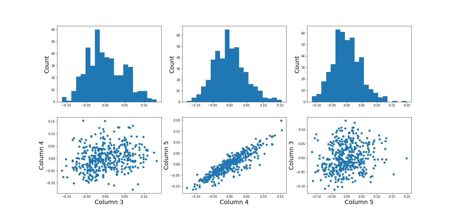
When plotting the data against each other in pairs (as displayed in the bottom row of the figure), data column 3 plotted against column 4 (left) and column 5 against 3 (right) both show a fairly uniform circular distribution of points. This is what would be expected if the data in the two columns were independent of each other.
In contrast, column 4 against 5 (centre, bottom) shows an elliptical, pointed shape along the main diagonal. This shows that there is a clear relationship between these data. Specifically, it indicates that the two variables recorded in these columns (indices 4 and 5) are not independent of each other. They exhibit more similarity than would be expected of independent variables.
In this lesson, we aim to obtain an overview of the similarities in a dataset. We will firstly introduce bivariate visualisation using Matplotlib. We will then go on to demonstrate the use of NumPy functions in calculating correlation coefficients and obtaining a correlation matrix, as a means of introducing multivariate analysis. Combined with the basic statistics covered in the previous lesson, we can obtain a good overview of a high-dimensional dataset, prior to the application of machine learning algorithms.
Work-Through: Properties of a Dataset
Univariate properties
For recordings of variables that are contained, for example, in the columns of a DataFrame, we often assume the independence of samples: the measurement in one row does not depend on the recording present in another row. Therefore results of the features obtained under the output of the describe function, for instance, will not depend on the order of the rows. Also, while the numbers obtained from different rows can be similar (or even the same) by chance, there is no way to predict the values in one row based on the values of another.
Contrastingly, when comparing different variables arranged in columns, this is not necessarily the case. Let us firstly assume that they are consistent: that all values in a single row are obtained from the same subject. The values in one column can be related to the numbers in another column and, specifically, they can show degrees of similarity. If, for instance, we have a number of subjects investigated (some of whom have an inflammatory disease and some of whom are healthy controls) an inflammatory marker might be expected to be elevated in the diseased subjects. If several markers are recorded from each subject (i.e. more than one column in the data frame), the values of several inflammatory markers may be elevated simultaneously in the diseased subjects. Thus, the profiles of these markers across the whole group will show a certain similarity.
The goal of multivariate data analysis is to find out whether or not any relationships exist between recorded variables.
Let us first import a demonstration dataset and check its basic statistics.For a work-through example, we can start with the ‘patients’ dataset. Let’s firstly import the data from the .csv file using the function read_csv from Pandas and load this into a DataFrame. We can then assess the number of columns and rows using the len function. We can also determine the data type of each column, which will reveal which columns can be analysed, quantitatively.
PYTHON
# Please adjust path according to operating system & personal path to file
df = read_csv('data/patients.csv')

df.head()
print('Number of columns: ', len(df.columns))
print('Number of rows: ', len(df))
df.head()
OUTPUT
   Age  Height  Weight  Systolic  Diastolic  Smoker  Gender
0   38      71   176.0     124.0       93.0       1    Male
1   43      69   163.0     109.0       77.0       0    Male
2   38      64   131.0     125.0       83.0       0  Female
3   40      67   133.0     117.0       75.0       0  Female
4   49      64   119.0     122.0       80.0       0  Female
Number of columns:  7
Number of rows:  100
   Age  Height  Weight  Systolic  Diastolic  Smoker  Gender
0   38      71   176.0     124.0       93.0       1    Male
1   43      69   163.0     109.0       77.0       0    Male
2   38      64   131.0     125.0       83.0       0  Female
3   40      67   133.0     117.0       75.0       0  Female
4 49 64 119.0 122.0 80.0 0 FemaleOUTPUT
The columns are of the following data types:
Age            int64
Height         int64
Weight       float64
Systolic     float64
Diastolic    float64
Smoker         int64
Gender        object
dtype: object
Out of the seven columns, three contain integers, three contain floating-point (decimal) numbers, and the last one contains gender specification as ‘female’ or ‘male’ - held as string data. The sixth column in this dataset contains a binary classification, with a value of ‘0’ indicating a non-smoker individual and ‘1’ indicating a smoker. Numerical analysis can thus be restricted to columns with indices 0 to 4.
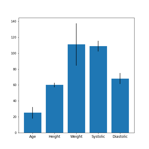
Practice Exercise 1
Univariate properties of the patients dataset
Obtain the basic statistical properties of the first five columns using the
describefunction.Plot a bar chart of the means of each column. To access a row by its name, you can use the convention
df_describe.loc['name'].Optional: In the bar chart of the means, try to add the standard deviation as an errorbar, using the keyword argument
yerrin the formyerr = df_describe.loc['std'].
PYTHON
df = read_csv('data/patients.csv')
df_describe = df.iloc[:, :5].describe()
df_describe.round(2)
OUTPUT
          Age  Height  Weight  Systolic  Diastolic
count  100.00  100.00  100.00    100.00     100.00
mean    38.28   67.07  154.00    122.78      82.96
std      7.22    2.84   26.57      6.71       6.93
min     25.00   60.00  111.00    109.00      68.00
25%     32.00   65.00  130.75    117.75      77.75
50%     39.00   67.00  142.50    122.00      81.50
75%     44.00   69.25  180.25    127.25      89.00
max     50.00   72.00  202.00    138.00      99.00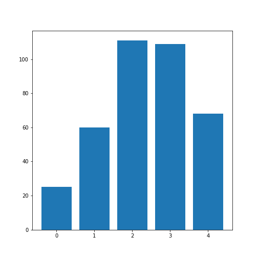
Visual Search for Similarity: the Scatter Plot
In Matplotlib, the function scatter allows a user to plot
one variable against another. This is a common way to visually eyeball
your data for relationships between individual columns in a DataFrame.
PYTHON
# Scatter plot
fig, ax = subplots();

ax.scatter(df['Weight'], df['Height']);
ax.set_xlabel('Weight (pounds)', fontsize=16)
ax.set_ylabel('Height (inches)', fontsize=16)

show()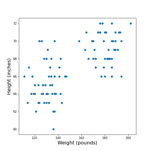
The data points appear to be grouped into two clouds. We will not deal with this qualitative aspect further, at this point. Grouping will be discussed in more detail in L2D’s later lessons on Unsupervised Machine Learning and Clustering.
However, from the information shown on the plot, it is reasonable to suspect a trend where heavier people are also taller. For instance, we note that there are no points in the lower right corner of the plot (weight >160 pounds and height < 65 inches).
## Practice Exercise 2
DIY2: Scatter plot from the patients data
Plot systolic against diastolic blood pressure. Do the two variables appear to be independent, or related?
Scatter plots are useful for the inspection of select pairs of data. However, they are only qualitative and thus, it is generally preferred to have a numerical quantity.
PYTHON
fig, ax = subplots();
ax.scatter(df['Systolic'], df['Diastolic']);
ax.set_xlabel('Systolic', fontsize=16)
ax.set_ylabel('Diastolic', fontsize=16)

show()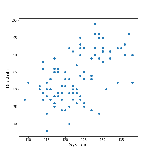
From the plot one might suspect that a larger systolic value is connected with a larger diastolic value. However, the plot in itself is not conclusive in that respect.
The Correlation Coefficient
Bivariate measures are quantities that are calculated from two variables of data. Bivariate features are the most widely used subset of multivariate features - all of which require more than one variable in order to be calculated.
The concept behind many bivariate measures is to quantify “similarity” between two datasets. If any similarity is observed, it is assumed that there is a connection or relationship in the data. For variables exhibiting similarity, knowledge of one understandably leads to an expectation surrounding the other.
Here we are going to look at a specific bivariate quantity: the Pearson correlation coefficient \(PCC\).
The formula for the \(PCC\) is set up such that two identical datasets yield a \(PCC\) of 1. Technically, this is achieved by normalising all variances to be equal to 1. This also implies that all data points in a scatter plot of one variable plotted against itself are aligned along the main diagonal (with a positive slope).
In two perfectly antisymmetrical datasets, where one variable can be obtained by multiplying the other by -1, a value of -1 is obtained. This implies that all data points in a scatter plot are aligned along the negative, or anti diagonal, (with a negative slope). All other possibilities lie in between. A value of 0 refers to precisely balanced positive and negative contributions to the measure. However - strictly speaking - the latter does not necessarily indicate that there is no relationship between the variables.
The \(PCC\) is an undirected measure. This means that its value for the comparison between dataset 1 and dataset 2 is exactly the same as the \(PCC\) between dataset 2 and dataset 1.
A method to directly calculate the \(PCC\) of two datasets, is to use the
function corr and apply this to your DataFrame. For
instance, we can apply it to the Everleys dataset:
OUTPUT
          calcium    sodium
calcium  1.000000 -0.258001
sodium  -0.258001  1.000000
The result as a matrix of two-by-two numbers. Along the diagonal (top left and bottom right) are the values for the comparison of a column to itself. As any dataset is identical with itself, the values are one by definition.
The non-diagonal elements indicate that \(CC \approx-0.26\) for the two datasets. Both \(CC(12)\) and \(CC(21)\) are given in the matrix, however because of the symmetry, we would only need to report one out of the two.
Note
In this lesson we introduce how to calculate the \(PCC\) but do not discuss its significance. For example, interpreting the value above requires consideration of the fact that we only have only 18 data points. Specifically, we refrain from concluding that because the \(PCC\) is negative, a high value for the calcium concentration is associated with a small value for sodium concentration (relative to their respective means).
One quantitative way to assess whether or not a given value of the \(PCC\) is meaningful or not, is to use surrogate data. In our example, we could create random numbers in an array with shape (18, 2), for instance - such that the two means and standard deviations are the same as in the Everley dataset, but the two columns are independent of each other. Creating many realisations, we can check what distribution of \(PCC\) values is expected from the randomly generated data, and compare this against the values obtained from the Everleys dataset.
Much of what we will cover in the Machine Learning component of L2D will involve NumPy arrays. Let us, therefore, convert the Everleys dataset from a Pandas DataFrame into a NumPy array.
OUTPUT
array([[  3.4555817 , 112.69098   ],
       [  3.6690263 , 125.66333   ],
       [  2.7899104 , 105.82181   ],
       [  2.9399    ,  98.172772  ],
       [  5.42606   ,  97.931489  ],
       [  0.71581063, 120.85833   ],
       [  5.6523902 , 112.8715    ],
       [  3.5713201 , 112.64736   ],
       [  4.3000669 , 132.03172   ],
       [  1.3694191 , 118.49901   ],
       [  2.550962  , 117.37373   ],
       [  2.8941294 , 134.05239   ],
       [  3.6649873 , 105.34641   ],
       [  1.3627792 , 123.35949   ],
       [  3.7187978 , 125.02106   ],
       [  1.8658681 , 112.07542   ],
       [  3.2728091 , 117.58804   ],
       [  3.9175915 , 101.00987   ]])
We can see that the numbers remain the same, but the format has changed; we have lost the names of the columns. Similar to a Pandas DataFrame, we can also make use of the shape function to see the dimensions of the data array.
OUTPUT
(18, 2)We can now use the NumPy function corrcoef to calculate the Pearson correlation:
PYTHON
from numpy import corrcoef

corr_matrix = corrcoef(everley_numpy, rowvar=False)

print(corr_matrix)
OUTPUT
[[ 1.         -0.25800058]
 [-0.25800058  1.        ]]
The function corrcoef takes a two-dimensional array as its
input. The keyword argument rowvar is True by default,
which means that the correlation will be calculated along the rows of
the dataset. As we have the data features contained in the columns, the
value of rowvar needs to be set to False. (You can check
what happens if you set it to ‘True’. Instead of a 2x2 matrix for two
columns you will get a 18x18 matrix for eighteen pair comparisons.)
We mentioned that the values of the \(PCC\) are calculated such that they must lie between -1 and 1. This is achieved by normalisation with the variance. If, for any reason, we don’t want the similarity calculated using this normalisation, what results is the so-called covariance. In contrast to the \(PCC\), its values will depend on the absolute size of the numbers in the data array. From the NumPy library, we can use the function cov in order to calculate the covariance:
OUTPUT
[[  1.70733842  -3.62631625]
 [ -3.62631625 115.70986192]]
The result shows how covariance is strongly dependent on the actual numerical values in a data column. The two values along the diagonal are identical with the variances obtained by squaring the standard deviation (calculated, for example, using the describe function).
Practice Exercise 3
Correlations from the patients dataset
Calculate the Pearson \(PCC\) between the systolic and the diastolic blood pressure from the patients data using:
The Pandas DataFrame and
The data as a NumPy array.
PYTHON
df_SysDia_numpy = df[['Systolic', 'Diastolic']].to_numpy()

df_SysDia_corr = corrcoef(df_SysDia_numpy, rowvar=False)

print('Correlation coefficient between Systole and Diastole:', round(df_SysDia_corr[0, 1], 2))
OUTPUT
Correlation coefficient between Systole and Diastole: 0.51
It is worth noting that it is equally possible to calculate the
correlation between rows of a two-dimension array
(i.e. rowvar=True) but the interpretation will differ.
Imagine a dataset where for two subjects a large number, call it \(N\), of metabolites were determined
quantitatively (a Metabolomics dataset). If that dataset is of shape (2,
N) then one can calculate the correlation between the two rows. This
would be done to determine the correlation of the metabolite profiles
between the two subjects.
The Correlation Matrix
If we have more than two columns of data, we can obtain a Pearson correlation coefficient for each pair. In general, for N columns, we get \(N^2\) pairwise values. We will omit the correlations of each column relative to itself, of which there are \(N\), which means we are left with \(N*(N-1)\) pairs. Since each value appears twice, due to the symmetry of the calculation, we can ignore half of them, leaving us with \(N*(N-1) / 2\) coefficients for \(N\) columns.
Here is an example using the ‘patients’ data:
OUTPUT
ValueError: could not convert string to float: 'Male'If we do the calculation with the Pandas DataFrame, the ‘Gender’ is automatically ignored and, by default, we get \(6*5/2=15\) coefficients for the remaining six columns. Note that the values that involves the ‘Smoker’ column are meaningless, since they represent a True/False-like binary.
Let us now convert the DataFrame into a NumPy array, and check its shape:
OUTPUT
(100, 7)Next, we can try to calculate the correlation matrix for the first five columns of this data array. If we do this directly to the array, we get an AttributeError: ‘float’ object has no attribute ‘shape’.
This is amended by converting the array to a floating point prior to
using the corrcoef function. For this, we can convert the
data type using the method astype(float):
PYTHON
cols = 5

patients_numpy_float = patients_numpy[:, :cols].astype(float)

patients_corr = corrcoef(patients_numpy_float, rowvar=False)

patients_corr
OUTPUT
array([[1.        , 0.11600246, 0.09135615, 0.13412699, 0.08059714],
       [0.11600246, 1.        , 0.6959697 , 0.21407555, 0.15681869],
       [0.09135615, 0.6959697 , 1.        , 0.15578811, 0.22268743],
       [0.13412699, 0.21407555, 0.15578811, 1.        , 0.51184337],
       [0.08059714, 0.15681869, 0.22268743, 0.51184337, 1.        ]])
The result is called the correlation matrix. It contains all the bivariate comparisons possible for the five chosen columns.
In the calculation above, we used the \(PCC\) in order to calculate the matrix. In general, any bivariate measure can be used to obtain a matrix of the same shape.
Heatmaps in Matplotlib
To get an illustration of the correlation pattern in a dataset, we can plot the correlation matrix as a heatmap.
Below are three lines of code, that make use of functionality within
Matplotlib, to plot a heatmap of the correlation matrix
from the ‘patients’ dataset. We make use of the function
imshow:
Note: we have specified the colour map coolwarm, using the
keyword argument cmap. For a list of
Matplotlib colour maps, please refer to the gallery
in the documentation. The names to use in the code are on the left
hand side of the colour bar.
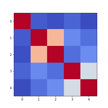
Firstly, in order to highlight true correlations stand out (rather than the trivial self-correlations along the diagonal, which are always equal to 1) we can deliberately set the diagonal as being equal to 0. To achieve this, we use the NumPy function fill_diagonal.
Secondly, the imshow function, by default, will scale the
colours to the minimum and maximum values present in the array. As such,
we do not know what red or blue means. To see the colour bar, it can be
added to the figure environment ‘fig’ using colorbar.
PYTHON
from numpy import fill_diagonal

fill_diagonal(patients_corr, 0)

fig, ax = subplots(figsize=(7,7))

im = ax.imshow(patients_corr, cmap='coolwarm');

fig.colorbar(im, orientation='horizontal', shrink=0.7);

show()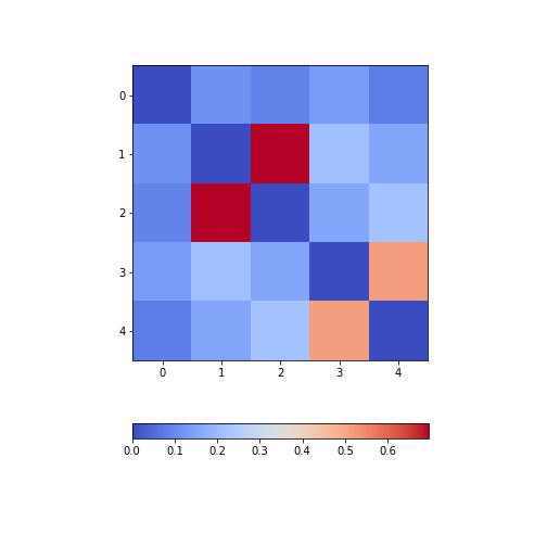
The result is that the correlation between columns ‘Height’ and ‘Weight’ is the strongest, and presumably higher than would be expected if these two measures were independent. We can confirm this by plotting a scatter plot for these two columns, and refer to the scatter plot for columns 2 (Height) and 5 (Diastolic blood pressure):
Practice Exercise 4
Calculate and plot the correlation matrix of the first five columns, as above, based on the Spearman rank correlation coefficient. This is based on the ranking of values instead of their numerical values as for the Pearson coefficient. Spearman therefore tests for monotonic relationships, whereas Pearson tests for linear relationships.
To import the function in question:
from scipy.stats import spearmanrYou can then apply it:
data_spearman_corr = spearmanr(data).correlationPYTHON
from scipy.stats import spearmanr
patients_numpy = df.to_numpy()
cols = 5

patients_numpy_float = patients_numpy[:, :cols].astype(float)
patients_spearman = spearmanr(patients_numpy_float).correlation

patients_spearman
OUTPUT
array([[1.        , 0.11636668, 0.09327152, 0.12105741, 0.08703685],
       [0.11636668, 1.        , 0.65614849, 0.20036338, 0.14976559],
       [0.09327152, 0.65614849, 1.        , 0.12185782, 0.19738765],
       [0.12105741, 0.20036338, 0.12185782, 1.        , 0.48666928],
       [0.08703685, 0.14976559, 0.19738765, 0.48666928, 1.        ]])
PYTHON
from numpy import fill_diagonal
fill_diagonal(patients_spearman, 0)

fig, ax = subplots(figsize=(7,7))

im = ax.imshow(patients_spearman, cmap='coolwarm');
fig.colorbar(im, orientation='horizontal', shrink=0.7);

show()
Analysis of the Correlation matrix
The Correlation Coefficients
To analyse the correlations in a dataset, we are only interested in the \(N*(N-1)/2\) unduplicated correlation coefficients. Here is a way to extract them and assign them to a variable.
Firstly, we must import the function triu_indices. It provides the indices of a matrix with specified size. The required size is obtained from our correlation matrix, using len. It is identical to the number of columns for which we calculated the \(CCs\).
We also need to specify that we do not want the diagonal to be included. For this, there is an offset parameter ‘k’, which collects the indices excluding the diagonal, provided it is set to 1. (To include the indices of the diagonal, it would have to be set to 0).
PYTHON
from numpy import triu_indices

# Get the number of rows of the correlation matrix
no_cols = len(patients_corr)

# Get the indices of the 10 correlation coefficients for 5 data columns
corr_coeff_indices = triu_indices(no_cols, k=1)

# Get the 10 correlation coefficients
corr_coeffs = patients_corr[corr_coeff_indices]

print(corr_coeffs)
OUTPUT
[0.11600246 0.09135615 0.13412699 0.08059714 0.6959697  0.21407555
 0.15681869 0.15578811 0.22268743 0.51184337]
Now we plot these correlation coefficients as a bar chart to see them one next to each other.
If there are a large number of coefficients, we can also display their histogram or boxplot as summary statistics.
The Average Correlation per Column
On a higher level, we can calculate the overall, or average correlation per data column. This can be achieved by averaging over either the rows or the columns of the correlation matrix. Because our similarity measure is undirected, both ways of summing yield the same result.
However, we need to consider whether the value is positive or negative.
Correlation coefficients can be either positive or negative. As such,
adding for instance +1 and -1 would yield an average of 0, even though
both indicate perfect correlation and anti-correlation, respectively.
This can be addressed by using the absolute value abs, and
ignoring the sign.
In order to average, we can use the NumPy function: mean. This function defaults to averaging over all values of the matrix. In order to obtain the five values by averaging over the columns, we specify the ‘axis’ keyword argument must be specified as 0.
PYTHON
from numpy import abs, mean

# Absolute values of correlation matrix
corr_matrix_abs = abs(patients_corr)

# Average of the correlation strengths
corr_column_average = mean(corr_matrix_abs, axis=0)

fig, ax = subplots()

bins = arange(corr_column_average.shape[0])

ax.bar(bins, corr_column_average );

print(corr_column_average)

show()
OUTPUT
[0.08441655 0.23657328 0.23316028 0.20316681 0.19438933]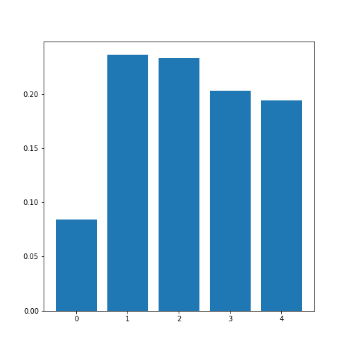
The result is that the average column correlation is on the order of 0.2 for the columns with indices 1 to 4, and less than 0.1 for the column with index 0 (which is age).
The Average Dataset Correlation
The sum over rows or columns has given us a reduced set of values to look at. We can now take the final step and average over all correlation coefficients. This will yield the average correlation of the dataset. It condenses the full bivariate analysis into a single number, and can be a starting point when comparing different datasets of the same type, for example.
PYTHON
# Average of the correlation strengths
corr_matrix_average = mean(corr_matrix_abs)

print('Average correlation strength: ', round(corr_matrix_average, 3))
OUTPUT
Average correlation strength: 0.19Application: The Diabetes Dataset
We now return to the dataset that began our enquiry into DataFrames in the previous lesson. Let us apply the above, and perform a summary analysis of its bivariate features.
Firstly, import the data. This is one of the example datasets from scikit-learn: a Python library used for Machine Learning. It is already included in the Anaconda distribution of Python, and can therefore be directly imported, if you have installed this.
PYTHON
from sklearn import datasets

diabetes = datasets.load_diabetes()

data_diabetes = diabetes.data
For the bivariate features, let us get the correlation matrix and plot it as a heatmap. We can make use of code that introduced above.
PYTHON
from numpy import fill_diagonal

data_corr_matrix = corrcoef(data_diabetes, rowvar=False)

fill_diagonal(data_corr_matrix, 0)

fig, ax = subplots(figsize=(8, 8))

im = ax.imshow(data_corr_matrix, cmap='coolwarm');

fig.colorbar(im, orientation='horizontal', shrink=0.5);

show()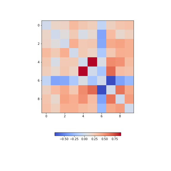
There is one strongly correlated pair (column indices 4 and 5) and one strongly anti-correlated pair (column indices 6 and 7).
Let’s calculate the \(10*9/2 = 45\) correlation coefficients and plot them as a histogram:
PYTHON
from numpy import triu_indices

data_corr_coeffs = data_corr_matrix[triu_indices(data_corr_matrix.shape[0], k=1)]

fig, ax = subplots()

ax.hist(data_corr_coeffs, bins=10);

show()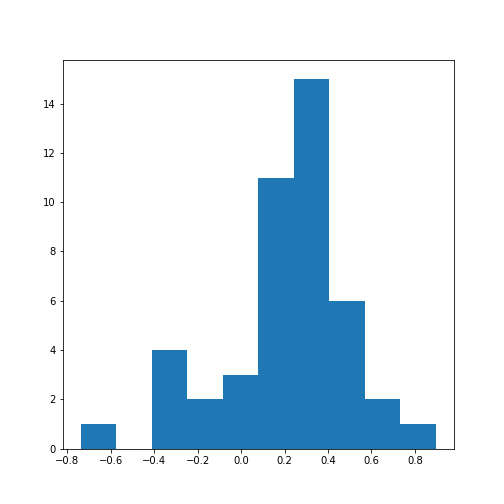
This histogram shows that the data have a distribution that is shifted towards positive correlations. However, only four values are (absolutely) larger than 0.5 (three positive, one negative).
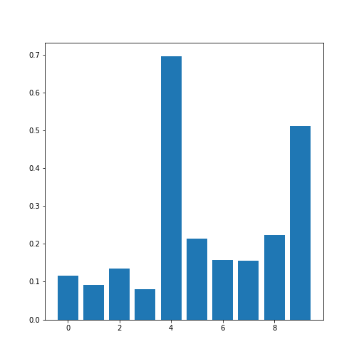
Next, let’s obtain the average (absolute) correlation per column.
PYTHON
data_column_average = mean(abs(data_corr_matrix), axis=0)

fig, ax = subplots()

bins = arange(len(data_column_average))

ax.bar(bins, data_column_average);
ax.set_title('Average Correlation Strength per Column')
ax.set_xticks(arange(len(diabetes.feature_names)))
ax.set_xticklabels(diabetes.feature_names);

show()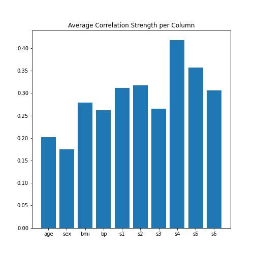
In the plot, note how the column names were extracted from the
‘diabetes’ data using diabetes.feature_names.
Finally, let’s obtain the average correlation of the entire dataset.
PYTHON
# Average of the correlation strengths
data_corr_matrix_average = mean(abs(data_corr_matrix))

print('Average Correlation Strength: ', round(data_corr_matrix_average, 3))
OUTPUT
Average Correlation Strength: 0.29Exercises
End of chapter Exercises
Assignment: The Breast Cancer Dataset
Import the breast cancer dataset using read_csv. Based on the code in this lesson, try to do the following:
Get the summary (univariate) statistics of columns 2-10 (accessing indices 1:10) using describe
Plot the means of each column as a bar chart with standard deviations displayed as error bars. Why are some bars invisible?
Extract the values as a NumPy array using the to_numpy function. The shape of the array should be (569, 31).
Calculate the correlation matrix using corrcoef from NumPy and plot it as a heatmap. The shape of the matrix should be (31, 31). Use
fill_diagonalto set the diagonal elements to 0.Calculate the average column correlation and plot it as a bar chart.
Calculate the average correlation strength of the dataset.
In case of doubt, try to get help from the respective documentation available for Pandas DataFrames, NumPy and Matplotlib.
Key Points
- Quantities based on data from two variables are referred to as bivariate measures.
- Bivariate properties can be studied and visualised using
matplotlibandNumPy. - Multivariate data analyses can help to uncover relationships between recorded variables.
- The functions
corrandcorrcoefcan be used to calculate the \(PCC\). - A correlation matrix can be visualised as a heatmap.
Content from Image Handling
Last updated on 2024-10-18 | Edit this page
Download Chapter notebook (ipynb)
Mandatory Lesson Feedback Survey
Overview
Questions
- How to read and process images in Python?
- How is an image mask created?
- What are colour channels in images?
- How do you deal with big images?
Objectives
- Understanding 2-dimensional greyscale images
- Learning image masking
- 2-dimensional colour images and colour channels
- Decreasing memory load when dealing with images
Prerequisites
- NumPy arrays
- Plots and subplots with matplotlib
Practice Exercises
This lesson has no explicit practice exercises. At each step, use images of your own choice to practice. There are many image file formats, different colour schemes etc for which you can try to find similar or analogous solutions.
Challenge
Reading and Processing Images
In biology, we often deal with images; for example, microscopy and different medical imaging modalities often output images and image data for analysis. In many cases, we wish to extract some quantitative information from these images. The focus of this lesson is to read and process images in Python. This will include:
- Working with 2-dimensional greyscale images
- Creating and applying binary image masks
- Working with 2-dimensional colour images, and interpreting colour channels
- Decreasing the memory for further processing by reducing resolution or patching
- Working with 3-dimensional images
Image Example
The example in Figure 1 is an image from the cell image library with the following description:
“Midsaggital section of rat cerebellum, captured using confocal imaging. Section shows inositol trisphosphate receptor (IP3R) labelled in green, DNA in blue, and synaptophysin in magenta. Honorable Mention, 2010 Olympus BioScapes Digital Imaging Competition®.”
Given this information, we might want to determine the relative amounts of IP3R, DNA and synaptophysin in this image. This tutorial will guide you through some of the steps to get you started with processing images of all types, using Python. You can then refer back to this image analysis example, and perform some analyses of your own.

Work-Through Example
Reading and Plotting a 2-dimensional Image
Firstly, we must read an image in. To demonstrate this we can use the
example of a histological slice through an axon bundle. We use
Matplotlib’s image module, from which we import the function
imread, used to store the image in a variable that we will
name img. The function imread can interpret
many different image formats, including .jpg, .png and .tif images.
OUTPUT
PIL.UnidentifiedImageError: cannot identify image file 'fig/axon_slice.jpg'We can then check what type of variable is, using the type() function:
OUTPUT
NameError: name 'img' is not definedThis tells us that the image is stored in a NumPy array;
ndarray here refers to an N-dimensional array. We can check
some other properties of this array, for example, what the image
dimensions are, using the .shape attribute:
OUTPUT
NameError: name 'img' is not defined
This tells us that our image is composed of 2300 by 3040 data units, or
pixels as we are dealing with an image. The total number of
pixels in the image, is equivalent to its resolution. In digital
imaging, a pixel is simply a numerical value that represents either
intensity, in a greyscale image; or colour in a colour image. Therefore,
as data, a two-dimensional (2-D) greyscale image comprises a 2-D array
of these intensity values, or elements; hence the name ‘pixel’ is an
amalgamation of ‘picture’ and ‘element’. The array in our example has
two dimensions, and so we can expect the image to be 2-D as well. Let us
now use matplotlib.pyplot’s imshow function to plot the
image to see what it looks like. We can set the colour map to
gray in order to overwrite the default colour map.
PYTHON
from matplotlib.pyplot import subplots, show

fig, ax = subplots(figsize=(25, 15))

ax.imshow(img, cmap='gray');
imshow has allowed us to plot the NumPy array of our image
data as a picture. The figure is divided up into a number of pixels, and
each of these is assigned an intensity value, which is held in the NumPy
array. Let’s have a closer look by selecting a smaller region of our
image and plotting that.
PYTHON
from matplotlib.pyplot import subplots, show

fig, ax = subplots(figsize=(25, 15))

ax.imshow(img[:50, :70], cmap='gray');
OUTPUT
NameError: name 'img' is not defined
By using img[:50, :70] we can select the first 50 values
from the first dimension, and the first 70 values from the second
dimension. Note that using a colon denotes ‘all’, where ‘:50’ is
inclusive of every number up to 50, for example. Thus, the image above
shows a very small part of the upper left corner of our original image.
As we are now zoomed in quite close to that corner, we can easily see
the individual pixels here.
OUTPUT
NameError: name 'img' is not defined
We have now displayed an even smaller section from that same upper left
corner of the image. Each square is a pixel and it has a single grey
value. Thus, the pixel intensity values are assigned by the numbers
stored in the NumPy array, img. Let us have a look at these
values by producing a slice from the array.
OUTPUT
NameError: name 'img' is not definedEach of these numbers corresponds to an intensity in the specified colourmap. These numbers range from 0 to 255, implying 256 shades of grey.
We chose cmap = gray, which assigns darker grey colours to
smaller numbers, and lighter grey colours to higher numbers. However, we
can also pick a non-greyscale colour map to plot the same image. We can
even display a colourbar to keep track of the intensity values.
Matplotlib has a diverse palette of colour maps that you can look
through, linked here.
Let’s take a look at two commonly-used Matplotlib colour maps called
viridis and magma:
PYTHON
fig, ax = subplots(nrows=1, ncols=2, figsize=(25, 15))

p1 = ax[0].imshow(img[:20, :15], cmap='viridis')
p2 = ax[1].imshow(img[:20, :15], cmap='magma')
fig.colorbar(p1, ax=ax[0], shrink = 0.8)
fig.colorbar(p2, ax=ax[1], shrink = 0.8);

show()
Note, that even though we can plot our greyscale image with colourful
colour schemes, it still does not qualify as a colour image. These are
just false-colour, Matplotlib-overlayed interpretations of rudimentary
intensity values. The reason for this is that a pixel in a standard
colour image actually comprises three sets of
intensities per pixel; not just the one, as in this greyscale example.
In the case above, the number in the array represented a grey value and
the colour was assigned to that grey value by Matplotlib.
These represent ‘false’ colours.
Creating an Image Mask
Now that we know that images essentially comprise arrays of numerical intensities held in a NumPy array, we can start processing images using these numbers.
As an initial approach, we can plot a histogram of the intensity values
that comprise an image. We can make use of the .flatten()
method to turn the original 2300 x 3040 array into a one-dimensional
array with 6,992,000 values. This rearrangement allows the numbers
within the image to be represented by a single column inside a matrix or
DataFrame.
The histogram plot shows how several instances of each intensity make up this image:
PYTHON
fig, ax = subplots(figsize=(10, 4))

ax.hist(img.flatten(), bins = 50)
ax.set_xlabel("Pixel intensity", fontsize=16);

show()
The image displays a slice through an axon bundle. For the sake of example, let’s say that we are now interested in the myelin sheath surrounding the axons (the dark rings). We can create a mask that isolates pixels whose intensity value is below a certain threshold (because darker pixels have lower intensity values). Everything below this threshold can be assigned to, for instance, a value of 1 (representing True), and everything above will be assigned a value of 0 (representing False). This is called a binary or Boolean mask.
Based on the histogram above, we might want to try adjusting that threshold somewhere between 100 and 200. Let’s see what we get with a threshold set to 125. Firstly, we must implement a conditional statement in order to create the mask. It is then possible to apply this mask to the image. The result can be that we plot both the mask and the masked image.
PYTHON
threshold = 125

mask = img < threshold

img_masked = img*mask

fig, ax = subplots(nrows=1, ncols=2, figsize=(20, 10))

ax[0].imshow(mask, cmap='gray')
ax[0].set_title('Binary mask', fontsize=16)
ax[1].imshow(img_masked, cmap='gray')
ax[1].set_title('Masked image', fontsize=16)

show()
The left subplot shows the binary mask itself. White represents values where our condition is true, and black where our condition is false. The right image shows the original image after we have applied the binary mask, it shows the original pixel intensities in regions where the mask value is true.
Note that applying the mask means that the intensities where the condition is true are left unchanged. The intensities where the condition is false are multiplied by zero, and therefore set to zero.
Let’s have a look at the resulting image histograms.
PYTHON
fig, ax = subplots(nrows=1, ncols=2, figsize=(20, 5))

ax[0].hist(img_masked.flatten(), bins=50)
ax[0].set_title('Histogram of masked image', fontsize=16)
ax[0].set_xlabel("Pixel intensity", fontsize=16)

ax[1].hist(img_masked[img_masked != 0].flatten(), bins=25)
ax[1].set_title('Histogram of masked image after zeros are removed', fontsize=16)
ax[1].set_xlabel("Pixel intensity", fontsize=16)

show()
The left subplot displays the values for the masked image. Note that there is a large peak at zero, as a large part of the image is masked. The right subplot histogram, however, displays only the non-zero pixel intensities. From this, we can see that our mask has worked as expected, where only values up to 125 are found. This is because our threshold causes a sharp cut-off at a pixel intensity of 125.
Colour Images
So far, our image has had a single intensity value for each pixel. In colour images, we have multiple channels of information per pixel; most commonly, colour images are RGB, comprising three corresponding to intensities of red, green and blue. There are many other formats of colour image, but these will be beyond the scope of this lesson. In a RGB colour image, any colour will be a composite of the intensity value for each of these colours. Our chosen example for a colour image is one of the rat cerebellar cortex. Let us firstly import it and check its shape.
OUTPUT
PIL.UnidentifiedImageError: cannot identify image file 'fig/rat_brain_low_res.jpg'OUTPUT
NameError: name 'img_col' is not definedOur image array now contains three dimensions: the first two are the spatial dimensions corresponding to the pixel positions as x-y coordinates. The third dimension contains the three colour channels, corresponding to three layers of intensity values (red, blue and green) on top of each other, per pixel. First, let us plot the entire image using Matplotlib’s imshow method.
First, let us plot the whole image.
OUTPUT
NameError: name 'img_col' is not defined
We can then visualise the three colour channels individually by slicing the NumPy array comprising our image. The stack with index 0 corresponds to ‘red’, index 1 corresponds to ‘green’ and index 2 corresponds to ‘blue’:
OUTPUT
NameError: name 'img_col' is not definedOUTPUT
NameError: name 'img_col' is not definedOUTPUT
NameError: name 'img_col' is not definedPYTHON
fig, ax = subplots(nrows=1, ncols=3, figsize=(20, 10))

imgplot_red = ax[0].imshow(red_channel, cmap="Reds")
imgplot_green = ax[1].imshow(green_channel, cmap="Greens")
imgplot_blue = ax[2].imshow(blue_channel, cmap="Blues")

fig.colorbar(imgplot_red, ax=ax[0], shrink=0.4)
fig.colorbar(imgplot_green, ax=ax[1], shrink=0.4)
fig.colorbar(imgplot_blue, ax=ax[2], shrink=0.4);

show()
This shows what colour combinations each of the pixels is made up of. Notice that the intensities go up to 255. This is because RGB (red, green and blue) colours are defined within an intensity range of 0-255. This gives a vast total 16,777,216 possible colour combinations.
We can plot histograms of each of the colour channels.
PYTHON
fig, ax = subplots(nrows=1, ncols=3, figsize=(20, 5))

ax[0].hist(red_channel.flatten(), bins=50)
ax[0].set_xlabel("Pixel intensity", fontsize=16)
ax[0].set_xlabel("Red channel")
ax[1].hist(green_channel.flatten(), bins=50)
ax[1].set_xlabel("Pixel intensity", fontsize=16)
ax[1].set_xlabel("Green channel")
ax[2].hist(blue_channel.flatten(), bins=50)
ax[2].set_xlabel("Pixel intensity", fontsize=16)
ax[2].set_xlabel("Blue channel")

show()
Dealing with Large Images
Often, we encounter situations where we have to deal with very large images that are composed of many pixels. Images such as these are often difficult to process, as they can require a lot of computer memory when they are processed. We will explore two different strategies for dealing with this problem - decreasing resolution, and using patches from the original image. To demonstrate this, we can make use of the full-resolution version of the rat brain image in the previous example.
OUTPUT
PIL.UnidentifiedImageError: cannot identify image file 'fig/rat_brain.jpg'
NameError: name 'img_hr' is not defined
When attempting to read the image in using the imread() function, we receive a warning from python indicating that the “Image size (324649360 pixels) exceeds limit of 178956970 pixels, could be decompression bomb DOS attack.” This is alluding to a potential malicious file, designed to crash or cause disruption by using up a lot of memory.
We can get around this by changing the maximum pixel limit, as follows.
To do this, we will need to the Image module from the Python Image Library (PIL), as follows:
Let’s try again. Please be patient, as this might take a moment.
OUTPUT
PIL.UnidentifiedImageError: cannot identify image file 'fig/rat_brain.jpg'OUTPUT
NameError: name 'img_hr' is not definedNow we can plot the full high-resolution image:
OUTPUT
NameError: name 'img_hr' is not defined
Although now we can plot this image, it does still consist of over 300 million pixels, which could run us into memory problems when attempting to process it. One approach is simply to reduce the resolution by importing the image using the Image module from the PIL library: which we imported in the code given, above. This library gives us a wealth of tools to process images, including methods to decrease an image’s resolution. PIL is a very rich library with a multitude of useful tools. As always, having a look at the official documentation and playing around with it yourself is highly encouraged.
We can make use of the resize method to downsample the
image, providing the desired width and height as numerical arguments, as
follows:
PYTHON
img_pil = Image.open('fig/rat_brain.jpg')
img_small = img_pil.resize((174, 187))

print(type(img_small))
OUTPUT
PIL.UnidentifiedImageError: cannot identify image file 'fig/rat_brain.jpg'
NameError: name 'img_pil' is not defined
NameError: name 'img_small' is not defined
Plotting should now be considerably quicker.
OUTPUT
NameError: name 'img_small' is not defined
Using the above code, we have successfully resized the image to a
resolution of 174 x 187 pixels. It is, however, important to note that
our image is no longer in the format of a NumPy array, but rather it now
has the type PIL.Image.Image. We can, however, easily
convert it back into a NumPy array using the array function, if we so
wish.
OUTPUT
NameError: name 'img_small' is not definedOUTPUT
NameError: name 'img_numpy' is not definedDespite the above, it is often desired to keep images in their full resolution, as resizing effectively results in a loss of information. An commonly used, alternative approach to such downsampling is to patch the images. Patching an image essentially divides the picture up into smaller chunks that are termed patches.
For this, we can implement functionality from the Scikit-Learn machine learning library.
The extract_patches_2d function is used to extract parts
of the image. The shape of each patch, together with the maximal number
of patches, can be specified, as follows:
OUTPUT
NameError: name 'img_hr' is not definedOUTPUT
NameError: name 'patches' is not defined
When using the .shape attribute, the output given here
shows that the image has been successfully subdivided into 100 patches,
with resolution 174 x 187 pixels, across three channels: red, blue and
green (as this is an RGB, colour image). Note that patching itself can
be a memory-intensive task. Extracting lots and lots of patches may take
a long time. To look at the patches, we can make use of a for loop to
iterate through the first element of the .shape array (the
100 patches), and visualise each one on its own subplot using the
.imshow method, as follows:
PYTHON
fig, ax = subplots(nrows=10, ncols=10, figsize=(25, 25))

ax = ax.flatten()

for index in range(patches.shape[0]):
    ax[index].imshow(patches[index, :, :, :])
OUTPUT
NameError: name 'patches' is not defined
Working with these smaller, individual patches will be much more manageable and computationally resourceful.
3D Images
So far, we have covered how to handle two-dimensional image data in a variety of ways. But scenarios will often arise whereby the analysis of three-dimensional image data is required. A good example of such 3-D images that is commonly encountered, is MRI scans. These don’t natively exist as .csv format, but are often delivered in specialised image formats. One such format is nii: the Neuroimaging Informatics Technology Initiative (NIfTI) open file format. Handling these types of images requires specialised software. In particular, we will be using an open-source library called nibabel. Documentation for this package is available at https://nipy.org/nibabel/.
As it is not contained in your Python installation by default, it needs to be installed first.
Two methods for installing this, are given here. If you have previously installed the Anaconda distribution of Python, paste the following onto your command line or terminal, and hit return:
conda install -c conda-forge nibabelAlternatively, you can also install it using Python’s default package installer ‘pip’ by pasting the following onto your command line or terminal, and hitting return:
pip install nibabelin your command line or terminal.
The package is now available for use. To shorten how we call on the
nibabel package in our code, we can use the above import statement,
using the alias nib to refer to nibabel. Thus we can call
on any function in nibabel, by using nib is followed by a
period and the name of that specific function, as follows:
OUTPUT
<class 'numpy.memmap'>OUTPUT
(256, 256, 124)We can see that the .shape attribute revelas that this image has three dimensions, and a total of 256 x 256 x 124 volume pixels (or voxels). To visualise our image, we can plot one slice at a time. The example below shows three different slices, in the transverse direction (from chin to the top of the head). To access an image across the transverse orientation, a single value is selected from the third dimension of the image, as follows. As always, the colons indicate that all data on the remaining two axes is selected and visualised:
PYTHON
fig, ax = subplots(ncols=3, figsize=(25, 15))

p1 = ax[0].imshow(img_data[:, :, 60], cmap='gray')
p2 = ax[1].imshow(img_data[:, :, 75], cmap='gray')
p3 = ax[2].imshow(img_data[:, :, 90], cmap='gray')

fig.colorbar(p1, ax=ax[0], shrink=0.4)
fig.colorbar(p2, ax=ax[1], shrink=0.4)
fig.colorbar(p3, ax=ax[2], shrink=0.4);

show()
These look fairly dark. We can improve the contrast, by adjusting the
intensity range. This requires intentionally overriding the default
values, and specifying our own for the keyword arguments
vmin and vmax.
The vmin and vmax parameters in matplotlib
define the data range that the colormap (in our case the
grey map) covers; thus they control the range of data
values indicated by the colormap in use. By default, the colormap covers
the complete value range of the supplied data. For instance, in many
images this will typically be somewhere between 0 and 255. If we want to
brighten up the darker shades of grey in our example MRI slices, for
example, we can reduce the value of the vmax parameter.
Expanding upon the above code:
PYTHON
fig, ax = subplots(ncols=3, figsize=(25, 15))

p1 = ax[0].imshow(img_data[:, :, 60], cmap='gray', vmin=0, vmax=150)
p2 = ax[1].imshow(img_data[:, :, 75], cmap='gray', vmin=0, vmax=150)
p3 = ax[2].imshow(img_data[:, :, 90], cmap='gray', vmin=0, vmax=150)

fig.colorbar(p1, ax=ax[0], shrink=0.4)
fig.colorbar(p2, ax=ax[1], shrink=0.4)
fig.colorbar(p3, ax=ax[2], shrink=0.4);

show()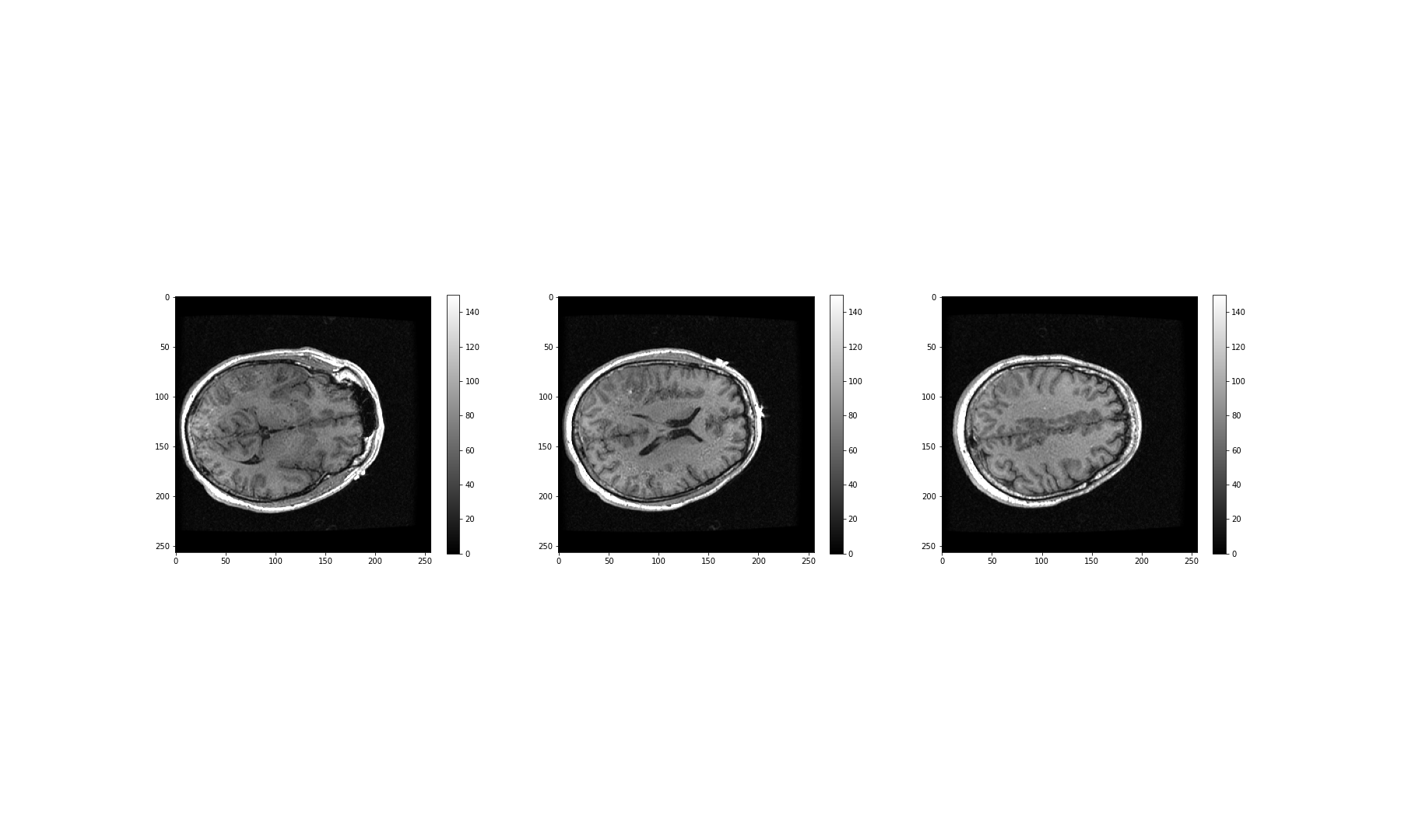
What about the other dimensions? We can also plot coronal and sagittal slices, for example. But take note that, in this case, the respective slices have different pixel resolutions. Let us expand our code even further, to display all three desired viewing planes in our MRI scan, as follows:
PYTHON
fig, ax = subplots(nrows=3, ncols=5, figsize=(26, 18))

t1 = ax[0, 0].imshow(img_data[:, :, 45].T, cmap='gray', vmin=0, vmax=150, origin='lower')
t2 = ax[0, 1].imshow(img_data[:, :, 60].T, cmap='gray', vmin=0, vmax=150, origin='lower')
t3 = ax[0, 2].imshow(img_data[:, :, 75].T, cmap='gray', vmin=0, vmax=150, origin='lower')
t4 = ax[0, 3].imshow(img_data[:, :, 90].T, cmap='gray', vmin=0, vmax=150, origin='lower')
t5 = ax[0, 4].imshow(img_data[:, :, 105].T, cmap='gray', vmin=0, vmax=150, origin='lower')

c1 = ax[1, 0].imshow(img_data[:, 50, :].T, cmap='gray', vmin=0, vmax=150, origin='lower')
c2 = ax[1, 1].imshow(img_data[:, 75, :].T, cmap='gray', vmin=0, vmax=150, origin='lower')
c3 = ax[1, 2].imshow(img_data[:, 90, :].T, cmap='gray', vmin=0, vmax=150, origin='lower')
c4 = ax[1, 3].imshow(img_data[:, 105, :].T, cmap='gray', vmin=0, vmax=150, origin='lower')
c5 = ax[1, 4].imshow(img_data[:, 120, :].T, cmap='gray', vmin=0, vmax=150, origin='lower')

s1 = ax[2, 0].imshow(img_data[75, :, :].T, cmap='gray', vmin=0, vmax=150, origin='lower')
s2 = ax[2, 1].imshow(img_data[90, :, :].T, cmap='gray', vmin=0, vmax=150, origin='lower')
s3 = ax[2, 2].imshow(img_data[105, :, :].T, cmap='gray', vmin=0, vmax=150, origin='lower')
s4 = ax[2, 3].imshow(img_data[120, :, :].T, cmap='gray', vmin=0, vmax=150, origin='lower')
s5 = ax[2, 4].imshow(img_data[135, :, :].T, cmap='gray', vmin=0, vmax=150, origin='lower');

show()
The result is that we have clearly visualised slices of our 3-D image, representing all three viewing planes in this 3-dimensional brain scan.
Exercises
End of chapter Exercises
Assignment
Using the image from the beginning of this lesson (rat_cerebellum.jpg) to perform the following tasks:
Import the image and display it.
Show histograms for each of the colour channels and plot the contributions of each of the RGB colours to the final image, separately.
Create three different binary masks using manually determined thresholds: one for mostly red pixels, one for mostly green pixels, and one for mostly blue pixels. Note that you can apply conditions that are either greater or smaller than a threshold of your choice.
Plot the three masks and the corresponding masked images.
Using your masks, approximate the relative amounts of synaptophysin, IP3R, and DNA in the image. To do this, you can assume that the number of red pixels represents synaptophysin, green pixels represents IP3R and blue pixels represent DNA. The results will vary depending on the setting of the thresholds. How do different threshold values change your results?
Change the resolution of your image to different values. How does the resolution affect your results?
Key Points
- The
imreadfunction can be used to read in and interpret multiple image formats. - Masking isolates pixels whose intensity value is below a certain threshold.
- Colour images typically comprise three channels (corresponding to red, green and blue intensities).
- Python Image Library (PIL) helps to set and raise default pixel limits for reading in and handling larger images.
Content from Time Series
Last updated on 2024-10-18 | Edit this page
Download Chapter notebook (ipynb)
Mandatory Lesson Feedback Survey
Overview
Questions
- How is time series data visualised?
- Why is it necessary to filter the data?
- How do we study correlation among time series data points?
Objectives
- Learning ways to display multiple time series.
- Understanding why filtering is required.
- Explaining the Fourier spectrum of a time series.
- Acquiring knowledge of correlation matrices of time series data.
Prerequisites
PYTHON
from pandas import read_csv

from numpy import arange, zeros, linspace, sin, pi, c_, mean, var, array
from numpy import correlate, corrcoef, fill_diagonal, amin, amax, asarray
from numpy import around
from numpy.ma import masked_less, masked_greater

from matplotlib.pyplot import subplots, yticks, legend, axis, figure, show
Python Function
Please execute code below, which defines a function of our own called
plot_series, before proceeding any further. This function
code takes data and creates a plot of all columns as time series, laid
out one above the other. When you execute the function code nothing
happens. Similar to an import statement, running a function code will
only activate it, making it available subsequent use. To action the
function itself, you must call this after it has been successfully
defined
PYTHON
def plot_series(data, sr):
    '''
    Time series plot of multiple time series
    Data are normalised to mean=0 and var=1

    data: nxm numpy array. Rows are time points, columns are recordings
    sr: sampling rate, same time units as period
    '''

    samples = data.shape[0]
    sensors = data.shape[1]

    period = samples // sr

    time = linspace(0, period, period*sr)

    offset = 5 # for mean=0 and var=1 normalised data

    # Calculate means and standard deviations of all columns
    means = data.mean(axis=0)
    stds = data.std(axis=0)

    # Plot each series with an offset
    fig, ax = subplots(figsize=(7, 8))

    ax.plot(time, (data - means)/stds + offset*arange(sensors-1,-1,-1));

    ax.plot(time, zeros((samples, sensors)) + offset*arange(sensors-1,-1,-1),'--',color='gray');

    yticks([]);

    names = [str(x) for x in range(sensors)]
    legend(names)

    ax.set(xlabel='Time')

    axis('tight');

    return fig, ax
Example: Normal and Pathological EEG
As an example, let us import two sets of time series data and convert these into NumPy arrays, that we will call data_back and data_epil. They represent a human electroencephalogram (EEG), as recorded during normal background activity and during an epileptic seizure, referred to as an absence seizure.
PYTHON
df_back = read_csv("data/EEG_background.txt", delim_whitespace=True)
df_epil = read_csv("data/EEG_absence.txt", delim_whitespace=True)

sr = 256     # 1 / seconds
period = 6   # seconds
channels = 10

d1 = df_back.to_numpy()
d2 = df_epil.to_numpy()

data_back = d1[:period*sr:, :channels]
data_epil = d2[:period*sr:, :channels]
The read_csv function is called in combination with the
keyword argument delim_whitespace. When its value is set to
True, this allows the user to import data that are
space-separated (rather than comma-separated). If you eyeball the
contents of the data .txt files, you will notice that the
numbers (which represent voltages) are indeed separated by spaces, not
commas.
Next, three constants are assigned: The sampling rate (sr) is given in the number of samples recorded per second; the duration of the recording (period) which is given in seconds; and the number of columns (channels), to be extracted from the recording. Let’s make use of the first 10 columns of data for the remainder of this lesson.
The data are then converted from Pandas DataFrame into a NumPy array.
To see the names of the channels (or recording sensors) we can use
the head method as follows:.
OUTPUT
       FP1      FP2        F3       F4  ...      EO2      EM1      EM2      PHO
0  -7.4546  22.8428   6.28159  15.6212  ...  13.7021  12.9109  13.7034  9.37573
1 -11.1060  21.4828   6.89088  15.0562  ...  13.7942  13.0194  13.7628  9.44731
2 -14.4000  20.0907   7.94856  14.1624  ...  13.8982  13.1116  13.8239  9.51796
3 -17.2380  18.7206   9.36857  13.0093  ...  14.0155  13.1927  13.8914  9.58770
4 -19.5540  17.4084  11.06040  11.6674  ...  14.1399  13.2692  13.9652  9.65654

[5 rows x 28 columns]
The row indices and column names for the seizure data look the same. The names of the recording channels are from the commonly used 10-20 system used to record voltages of brain activity from the human scalp. As an example, ‘F’ stands for the frontal lobe.
Next, we can call and make use of the plot function that we defined in the first block of code, above, in order to plot the data. If we examine the code in which we defined this function, you can see that we have set it to require the specification of two input arguments: these correspond to the dataset and sampling rate.
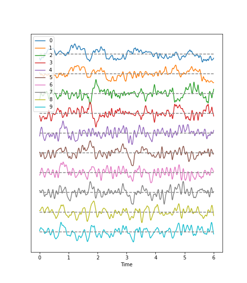
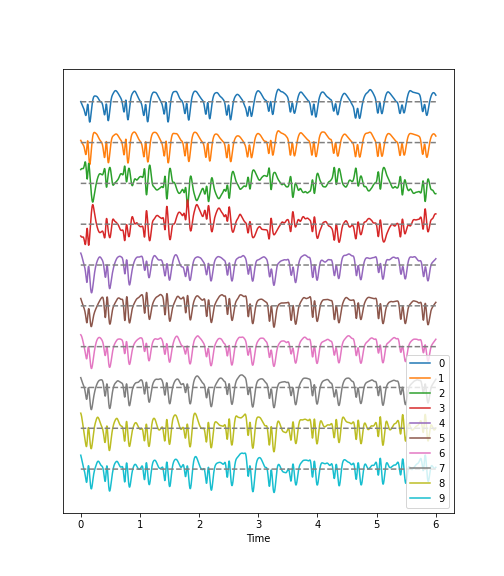
Observations
- Background:
There are irregular oscillations of all recorded brain potentials.
Oscillations recorded at different locations above the brain, differ.
Oscillations are not stable, but are modulated over time.
There are different frequency components evident in each trace.
- Epileptic Seizure:
There are regular oscillations.
Oscillations recorded at different locations are not identical but similar or at least related in terms of their shape.
Despite some modulation, the oscillations are fairly stable over time.
There are repetitive motifs comprising two major components throughout the recording, a sharp spike and a slow wave.
Task
Quantify features of these time series data to obtain an overview of the data. For a univariate feature we can use the frequency content. This takes into account the fact that the rows (or samples) are not independent of each other but are organised along the time axis. In consequence, there are correlations between data points along the rows of each column and the Fourier spectrum can be used to identify these.
The Fourier spectrum assumes that the data are stationary and can be thought of as a superposition of regular sine waves with different frequencies. Its output will show which of the frequencies are present in the data and also their respective amplitudes. The Fourier spectrum is obtained through mathematical processes collectively known as the Fourier Transform, where a signal is decomposed into its constituent frequencies, allowing each individual frequency component to be analysed and inferences to be made regarding its periodic characteristics.
For a bivariate feature, we can use the cross-correlation matrix.
Work-Through Example
Check the NumPy array containing the background and seizure data.
OUTPUT
(1536, 10) (1536, 10)There are 1536 rows and 10 columns.
Display data with offset
Take a look at the code used to define the function
plot_series. Again, this is the function we are using to
create the time series plot. It requires the input of a data file where
the row index is interpreted as time. In addition, the sampling rate
(sr) is required in order to extract the time scale. The sampling rate
specifies the number of samples recorded per unit time.
The sensors, or recording channels, are assumed to be in the columns.
PYTHON
def plot_series(data, sr):
    '''
    Time series plot of multiple time series
    Data are normalised to mean=0 and var=1

    data: nxm numpy array. Rows are time points, columns are channels
    sr: sampling rate, same time units as period
    '''

    samples = data.shape[0]
    sensors = data.shape[1]

    period = samples // sr

    time = linspace(0, period, period*sr)

    offset = 5 # for mean=0 and var=1 normalised data

    # Calculate means and standard deviations of all columns
    means = data.mean(axis=0)
    stds = data.std(axis=0)

    # Plot each series with an offset
    fig, ax = subplots(figsize=(7, 8))

    ax.plot(time, (data - means)/stds + offset*arange(sensors-1,-1,-1));

    ax.plot(time, zeros((samples, sensors)) + offset*arange(sensors-1,-1,-1),'--',color='gray');

    yticks([]);

    names = [str(x) for x in range(sensors)]
    legend(names)

    ax.set(xlabel='Time')

    axis('tight');

    return fig, ax
The declaration syntax def is followed by the function
name and, in parentheses, the input arguments. This is completed with a
colon.
Following the declaration line, the function’s documentation or docstring is contained within two lines of triple backticks. This explains the function’s operation, arguments and use – and can contain any other useful information pertaining to the operation of the defined function.
Followin the docstring, the main lines of code that operate on the arguments provided by the user, when the function is called.
The function can then be closed using the optional output syntax
return and any number of returned variables, anything that
might be used as a product of running the function.
In our example, the figure environment and the coordinate system are ‘returned’ and can, in principle, be used to further modify the plot.
The code below illustrates how to call the function and then add a title and the sensor names to the displayed output:
PYTHON
(fig, ax) = plot_series(data_epil, sr)

names = df_back.columns[:channels]

fig.suptitle('Recording of Absence Seizure', fontsize=16);

legend(names);

show()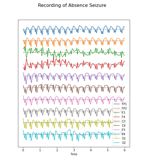
The variable(s) given to a function, and those produced by it, are referred to as input arguments, and outputs respectively. A function ordinarily accepts data or variables in the form of one or several such input arguments, processes these, and subsequently produces a specific output.
There are different ways to create functions in Python. In this course,
we will be using the keyword def to define our own
functions. This is the easiest, and by far the most common method for
defining functions. The structure of a typical function defined using
def can be see in the plot_series example:
There are several key points about functions that are worth noting:
The name of a function follows same principles as that of any other variable. It must be in lower-case characters, and it is strongly suggested that its name bears resemblance to the processes it undertakes.
The input arguments of a function, e.g. data and sr in our example, are essentially variables whose scope is confined only to the function. That is, they are only accessible within the function itself, and not from outside the function.
Variables defined inside of a function, should not use the same name as variables defined outside. Otherwise they may override each other.
When defining a function, it is important and best practice to write that function to perform only one specific task. As such, it can be used independent of the current context. Try to avoid incorporating separable tasks into a single function.
Once you start creating functions for different purposes you can start to build your own library of ready-to-use functions. This is the primary principle of a popular programming paradigm known as functional programming.
Filtering
Datasets with complex waveforms contain many different components which may or may not be relevant to a specific question.In such situations it can be useful to filter your data, ensuring that you are removing specific components from the dataset that are not relevant to your analyses or question. In this context, the term component refers to ‘frequency’, i.e. the number of cycles the waveform completes per unit of time. A small number refers to low frequencies with long periods (cycles), and a large number refers to high frequencies with short periods.
Let’s explore a simple example, demonstrating how both low- and high-frequency components can be filtered (suppressed) in our example time series.
Let’s begin by defining a simple function which takes two additional input arguments: low and high cut-off.
PYTHON
def data_filter(data, sr, low, high):
    """
    Filtering of multiple time series.

    data: nxm numpy array. Rows are time points, columns are recordings
    sr: sampling rate, same time units as period

    low:  Low cut-off frequency (high-pass filter)
    high: High cut-off frequency (low-pass filter)

    return: filtered data
    """

    from scipy.signal import butter, sosfilt

    order = 5

    filter_settings = [low, high, order]

    sos = butter(order, (low,high), btype='bandpass', fs=sr, output='sos')

    data_filtered = zeros((data.shape[0], data.shape[1]))

    for index, column in enumerate(data.transpose()):
        forward = sosfilt(sos, column)
        backwards = sosfilt(sos, forward[-1::-1])
        data_filtered[:, index] = backwards[-1::-1]

    return data_filtered
PYTHON
data_back_filt = data_filter(data_back, sr, 8, 13)

(fig, ax) = plot_series(data_back_filt, sr)

fig.suptitle('Filtered Recording of Background EEG', fontsize=16);

legend(names);

show()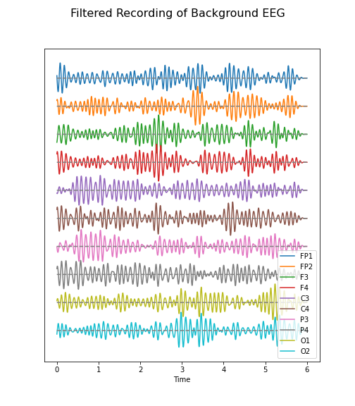
The frequency range from 8 to 13 Hz is referred to as alpha band in our EEG. It is thought that this represents a type of idling rhythm in the brain where the brain is not actively processing sensory input.
Practice Exercise 1
Band-pass filtered data
Create figures of the delta (1-4 Hz) band for both the background and the seizure EEG. Note the differences.
PYTHON
data_back_filt = data_filter(data_back, sr, 1, 4)

(fig, ax) = plot_series(data_back_filt, sr)

fig.suptitle('Delta Band of Background EEG', fontsize=16);

legend(names);

show()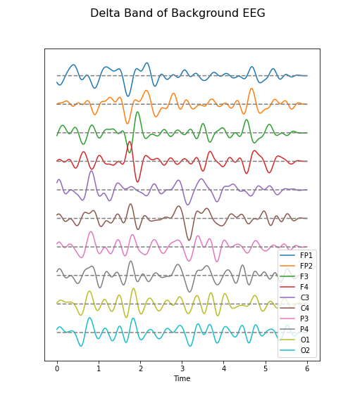
PYTHON
data_epil_filt = data_filter(data_epil, sr, 1, 4)

(fig, ax) = plot_series(data_epil_filt, sr)

fig.suptitle('Delta Band of Seizure EEG', fontsize=16);

legend(names);

show()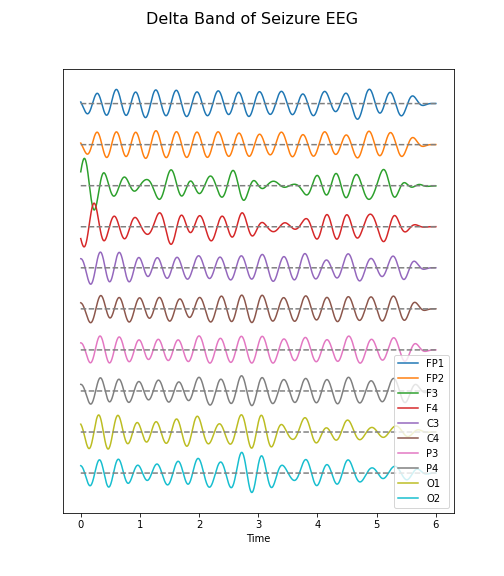
Fourier Spectrum
The Fourier spectrum decomposes the time series into a sum of sine waves. The spectrum gives the coefficients of each of the sine wave components. The coefficients are directly related to the amplitudes required to optimally fit the sum of all sine waves, in order to recreate the original data.
However, the assumption behind the Fourier Transform, is that the data are provided as an infinitely long, stationary time series. These assumptions are invalid, as the data are finite and stationarity of a biological system is rarely guaranteed. Thus, interpretation needs to be approached cautiously.
Fourier Transform of EEG data
We import the Fourier Transform function fft from the
library scipy.fftpack where it can be used to transform
all columns at the same time.
Firstly, we must obtain a Fourier spectrum for every data column. Thus, we need to define how many plots we want to have. If we take only the columns in our data, we should be able to display them all, simultaneously.
Secondly, the Fourier Transform results in twice the number of complex coefficients; it produces both positive and negative frequency components, of which we only need the first (positive) half.
Lastly, the Fourier Transform outputs complex numbers. To display the ‘amplitude’ of each frequency, we take the absolute value of the complex numbers, using the abs() function.
PYTHON
no_win = 2

rows = data_back.shape[0]

freqs = (sr/2)*linspace(0, 1, int(rows/2))

amplitudes_back = (2.0 / rows) * abs(data_back_fft[:rows//2, :2])


fig, axes = subplots(figsize=(6, 5), ncols=1, nrows=no_win, sharex=False)

names = df_back.columns[:2]

for index, ax in enumerate(axes.flat):
    axes[index].plot(freqs, amplitudes_back[:, index])
    axes[index].set_xlim(0, 8)
    axes[index].set(ylabel=f'Amplitude {names[index]}')

axes[index].set(xlabel='Frequency (Hz)');

show()
In these two channels, we can clearly see that the main amplitude contributions lie in the low frequencies, below 2 Hz.
Let us compare the corresponding figure for the case of seizure activity:
PYTHON
fig, axes = subplots(figsize=(6, 5), ncols=1, nrows=no_win, sharex=False)

names = df_epil.columns[:2]

amplitudes_epil = (2.0 / rows) * abs(data_epil_fft[:rows//2, :2])

for index, ax in enumerate(axes.flat):
    axes[index].plot(freqs, amplitudes_epil[:, index])
    axes[index].set_xlim(0, 12)
    axes[index].set(ylabel=f'Amplitude {names[index]}')

axes[index].set(xlabel='Frequency (Hz)');

show()
As we can see from the Fourier spectra generated above, the amplitudes are high for low frequencies, and tend to decrease as the frequency increases. Thus, it can sometimes be useful to see the high frequencies enhanced. This can be achieved with a logarithmic plot of the powers.
PYTHON
fig, axes = subplots(figsize=(6, 6), ncols=1, nrows=no_win, sharex=False)

for index, ax in enumerate(axes.flat):

    axes[index].plot(freqs, amplitudes_back[:, index])
    axes[index].set_xlim(0, 30)
    axes[index].set(ylabel=f'Amplitude {names[index]}')
    axes[index].set_yscale('log')

axes[no_win-1].set(xlabel='Frequency (Hz)');
fig.suptitle('Logarithmic Fourier Spectra of Background EEG', fontsize=16);

show()
And for the seizure data:
PYTHON
fig, axes = subplots(figsize=(6, 10), ncols=1, nrows=no_win, sharex=False)

for index, ax in enumerate(axes.flat):

    axes[index].plot(freqs, amplitudes_epil[:, index])
    axes[index].set_xlim(0, 30)
    axes[index].set(ylabel=f'Power {names[index]}')
    axes[index].set_yscale('log')

axes[no_win-1].set(xlabel='Frequency (Hz)');
fig.suptitle('Logarithmic Fourier Spectra of Seizure EEG', fontsize=16);

show()
In the spectrum of the absence data, it is now more obvious that there are further maxima at 6, 9, 12 and perhaps 15Hz. These are integer multiples or ‘harmonics’ of the basic frequency at around 3Hz, which we term as the fundamental frequency.
A feature that can be used as a summary statistic, is to caclulate the band power for each channel. Band power is the total power of a signal within a specific frequency range. The band power can be obtained by calculating the sum of all powers within a specified range of frequencies; this range is also referred to as the ‘band’. The band power, thus, is given as a single number.
Practice Exercise 2
Fourier spectra of filtered data
Calculate and display the Fourier spectra of the first two channels filtered between 4 and 12 Hz for the absence seizure data. Can you find any harmonics?
PYTHON
data_epil_filt = data_filter(data_epil, sr, 4, 12)

data_epil_fft = fft(data_epil_filt, axis=0)

rows = data_epil.shape[0]

freqs = (sr/2)*linspace(0, 1, int(rows/2))

amplitudes_epil = (2.0 / rows) * abs(data_epil_fft[:rows//2, :no_win])

fig, axes = subplots(figsize=(6, 10), ncols=1, nrows=no_win, sharex=False)

for index, ax in enumerate(axes.flat):
    axes[index].plot(freqs, amplitudes_epil[:, index])
    axes[index].set_xlim(0, 12)
    axes[index].set(ylabel=f'Amplitudes {names[index]}')
axes[no_win-1].set(xlabel='Frequency (Hz)');

fig.suptitle('Fourier Spectra of Seizure EEG', fontsize=16);

show()
Cross-Correlation Matrix
As one example of a multivariate analysis of time series data, we can also calculate the cross-correlation matrix.
Let us calculate it for the background:
PYTHON
corr_matrix_back = corrcoef(data_back, rowvar=False)

fill_diagonal(corr_matrix_back, 0)

fig, ax = subplots(figsize = (8,8))

im = ax.imshow(corr_matrix_back, cmap='coolwarm');

fig.colorbar(im, orientation='horizontal', shrink=0.68);

show()
The diagonal is set to zero. This is done to improve the visual display. If it was left set to one, the diagonal would dominate the visual impression given, even though it is trivial and uninformative.
Looking at the non-diagonal elements, we find:
Two strongly correlated series (indices 5 and 7)
Two strongly anti-correlated series (indices 3 and 4)
A block of pronounced correlations (between series with indices 4 through 9)
Practice Exercise 3:
Display the correlation matrix for the seizure data
Calculate the correlation matrix for the seizure data and compare the correlation pattern to the one from the background data.
PYTHON
corr_matrix_epil = corrcoef(data_epil, rowvar=False)

fill_diagonal(corr_matrix_epil, 0)

fig, ax = subplots(figsize = (8,8))

im = ax.imshow(corr_matrix_epil, cmap='coolwarm');

fig.colorbar(im, orientation='horizontal', shrink=0.68);

show()
We find - a number of pairs of strongly correlated series - two strongly anti-correlated series (in- dices 3 and 4) - a block of pronounced correlations between series with indices 4 through 9).
So interestingly, while the time series changes dramatically in shape, the correlation pattern still shows some qualitative resemblance.
All results shown so far, represent the recording of the segment of 6 seconds we chose at the beginning of the lesson. The human brain produces time-dependent voltage changes 24 hours a day. Thus seeing only a few seconds provides only a partial view. The next step is therefore to investigate and demonstrate how the features found for one segment may vary over time.
Exercises
End of chapter Exercises
Look at the image of brain activity from a child at the start of an epileptic seizure. It shows 4 seconds of evolution of the first 10 channels of a seizure rhythm at sampling rate sr=1024.
PYTHON
path = 'data/P1_Seizure1.csv'

data = read_csv(path, delimiter=r"\s+")

data_P1 = data.to_numpy()

sr = 1024

period = 4

channels = 10

plot_series(data_P1[:sr*period, :channels], sr);

show()
Using the code utilised in this lesson, import the data from the file
P1_Seizure1.csv and generate an overview of uni- and
multivariate features in the following form:
Pick the first two seconds of the recording as background, and the last two seconds as epileptic seizure rhythm. Use the first ten channels of data, in both cases. Using the shape attribute, the data should give a tuple of (2048, 10).
Filter the data to get rid of frequencies below 1 Hz and frequencies faster than 20 Hz.
Plot time series for both.
Fourier Transform both filtered datasets and display the Fourier spectra of the first 4 channels. What are the strongest frequencies in each of the two datasets?
Plot the correlation matrices of both datasets. Which channels show the strongest change in correlations?
Key Points
-
plot_seriesis a Python function we defined to display multiple time series plots. - Data filtering is applied to remove specific and irrelevant components.
- The Fourier spectrum decomposes the time series into a sum of sine waves.
- Cross-correlation matrices are used for multivariate analysis.